(1) List your various requirements elicited from the user research.
- This step should be earlier in the process, as you know, but it is useful for focusing your work
- it should be easy to understand how to follow tutorial
- the most basic information should me explained/shown on each step
- each feature in the down section of app has to be explained
- by the end of tutorial user should be able to use the Smoke Free app on their own
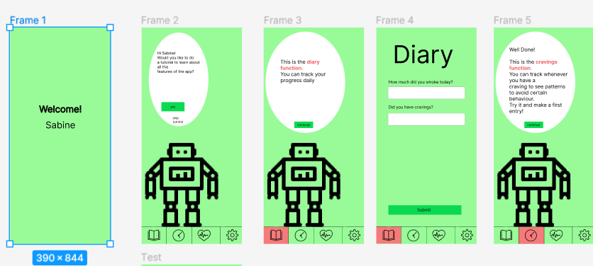
- Step-by-step instructions: The user wants simple and clear instructions to guide them through the registration process and tutorial. It should be clear that one has to swipe up to continue.
- Skipping steps: There should be a button that allows the user to skip certain steps in the tutorial.
- Show button functions: The users would like the ability to click on the highlighted button to view the functions while other buttons are disabled.
- Additional information: In addition to health status, some users would like the ability to indicate other information such as cravings for certain foods.
- Cancel tutorial: The user should be able to cancel the tutorial at any point.
- Skip text inputs: It should be possible to skip certain input steps instead of having to enter something.
- Go back to previous step: Users would like the ability to return to the previous step in the tutorial.
- Clearer highlighting of buttons: The color of buttons should stand out more clearly to make them easier to see, especially for the colorblind.
- Adaptations for people with visual impairments: Measures should be taken to ensure that colorblind people can easily recognize the buttons and markers.
- Highlighting the save button: In the tutorial, the save button to save entered values should be highlighted more prominently, for example by making it larger.
- Clarity and understandability: The tutorial should be easy to understand and comfortable for users.
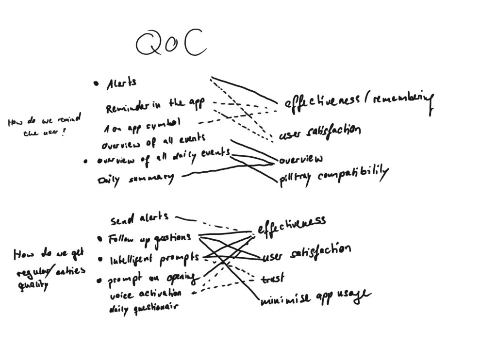
(2) Decide based on your requirements and the insights from the low-fi prototype-testing what functionality to include in your high-fidelity prototype.
- Consider your problem statement
- What insights did you gain from the testing? What are your main takeaways?
- Decide on an approach to select the most appropriate requirements (whatever appropriate means in your context)
- asy to follow as you’re guided step-by-step through the process.
- Skip step button.
- Ability to click on the highlighted button to view its functions. Other buttons disabled.
- Ability to cancel the tutorial at any point.
- Option to skip input; not mandatory.
- Option to go back to the previous step.
- The color of the buttons is not prominent enough. Can be difficult for color-blind users to recognize see it.
- Make the save button more noticeable (for example, larger), as this is a tutorial and it’s not clearly indicated that something needs to be entered.
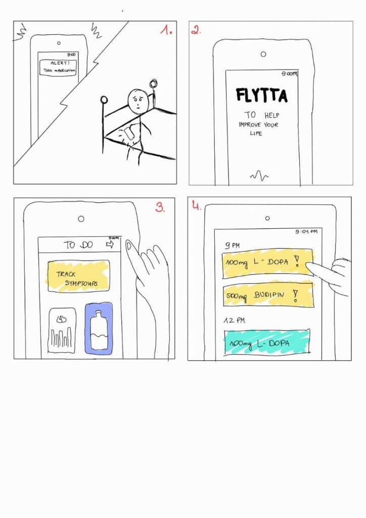
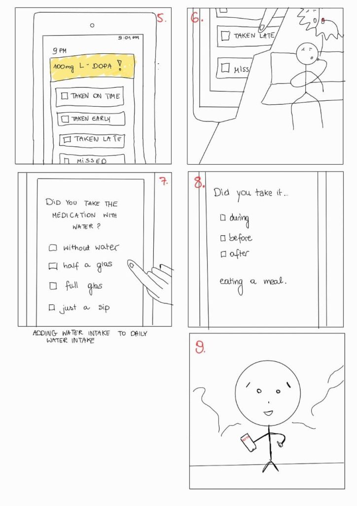
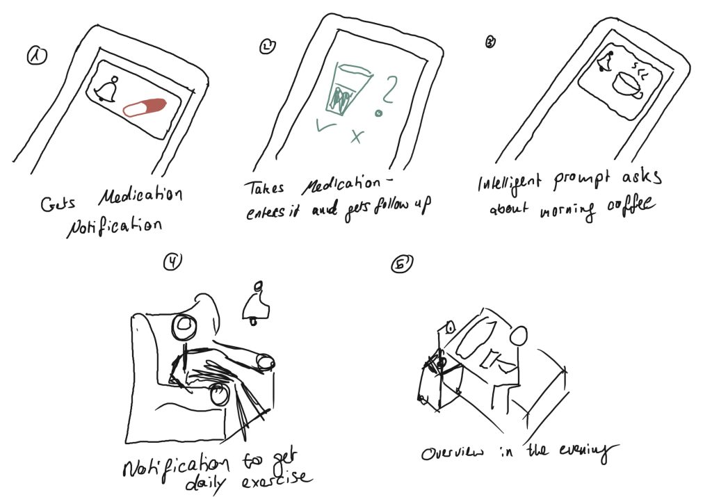
(3) Define the major task flow you want to support.
- Based on your scenario, describe at least two major task flows.
- These descriptions will serve as task descriptions for the evaluators within heuristic evaluation next week.
Task Flow 1: Simplified Introduction
- User opens the SmokeFree app for the first time.
- After successful registration, the user is guided through the onboarding tutorial.
- The tutorial provides step-by-step instructions on using the app, including features like tracking smoking habits, setting goals, and accessing resources.
- The user completes each tutorial step, following the instructions and interacting with the app accordingly.
- Once the tutorial is finished, the user is directed to the app’s main dashboard, where they can access the full range of features and functionalities to aid in their smoking cessation journey.
minor task flow:
Task Flow 2: Revisiting Tutorial Steps
- User is actively using the SmokeFree app.
- While navigating through the app, the user realizes they have missed certain tutorial steps or information related to a specific page or feature.
- On the current page, the user looks for a dedicated option or button to revisit the tutorial steps.
- The user locates the „Tutorial Recap“ or similar option on the page and clicks on it.
- The app presents a recap of the tutorial steps associated with that specific page or feature.
- The user reviews the instructions, explanations, and interactive elements presented in the tutorial recap.
- If necessary, the user follows the instructions and interacts with the app to practice the steps covered in the tutorial.
- Once the tutorial recap is completed, the user can continue using the app with the refreshed knowledge and understanding of the missed information.
- If the user encounters another page or feature where they feel they have missed tutorial steps, they can repeat this process by finding the „Tutorial Recap“ option on that particular page.
(4) Start building your prototype. The UI should be clearly developed (consider all interaction, visual, and information design)