[A#10, T4] Usability Test preparation

Prototype

We continued to improve our prototype by adding more interactivity to facilitate exploring of our UI. Additionally, we now have emergency informations, more help details and an option to share a „Befund“.

Summative Evaluation

  • What documents do you need?
    • Standardised Questionnaire (NASA-TLX) 9 Kopien
    • Testskript
    • Consent Form
  • This time, you will also measure the satisfaction of users, by using a post-task or post-test questionnaire. Please choose independently what suits your project.
    • We chose to use a post-task questionnaire
  • Which standardized questionnaire did you choose and why?
    • We chose the NASA TLX questionnaire
    • We chose post task, because our tasks are relatively independent from each other and therefore more likely to produce differing intersting insights, that might be lost if not captured immediately
    • We chose NASA TLX because our domain is in the area of accessability features. As such we are very interested not only in the general difficulty of a task.
      But also in other more specific metrics relating to the difficulty of task completion (physical, frustration, etc. )
  • What could be improved for the tasks?
    • Make the goal less specific
      (Share Document X to doctor Y vs Share a document to a doctor)
    • Write Task more like a scenario

Material

Prototype:

https://www.figma.com/proto/FGW7aa5zIfj257zIb1JG90/FirstPrototypeHCIePA?type=design&node-id=184-937&t=Q7rj4hkNwnfT9fPT-1&scaling=min-zoom&page-id=184%3A936&starting-point-node-id=184%3A937&mode=design

Task 1:

Sie sind beim Arzt (Dr. Example) und er muss Ihr Großes Blutbild einsehen.

Task 2:

Sie haben eine schlechte Erfahrung mit Dr. Example gemacht. Entziehen Sie ihm den Zugang zu Ihren Röntgenbildern.

Task 3:

Sie sind im Haus Ihrer Großmutter und sie hat Atemprobleme. Für diese Fälle haben Sie Zugriff auf die biometrischen Daten ihres Telefons und können es entsperren. Finden Sie Informationen über ihre Allergien.

Evaluation:

https://forms.gle/H1k6a2RTzdXJTL8QA

Consent:

[A#9, T4] High-Fidelity Prototype and Reflection on Feedback

Reflect on the results of the heuristic evaluation you conducted in class.

Heuristic Evaluation

The heuristic evaluation was done by us three and kindly also by Prof Müller-Birn.

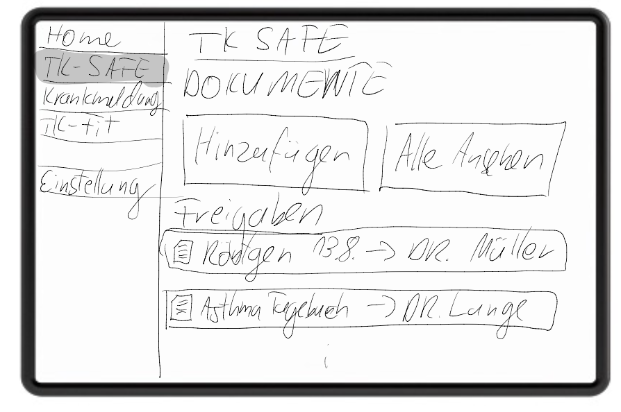
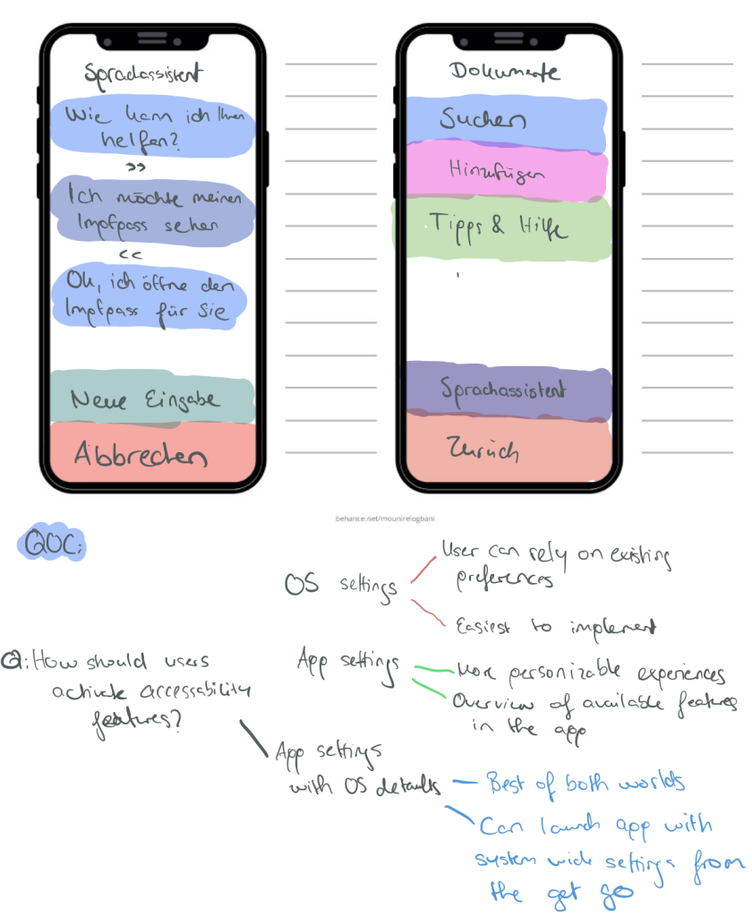
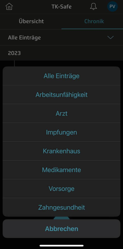
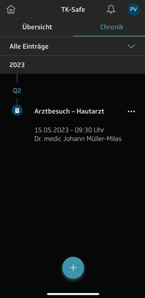
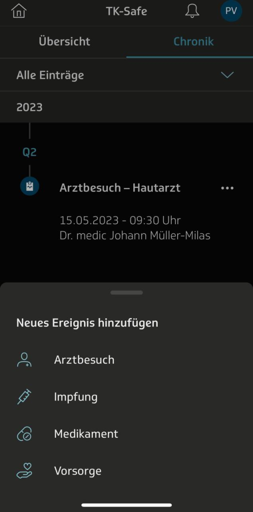
The main violations of our Prototype found by the evaluators are situated in the process of sharing and finding documents. The prototype does neither give information about the person I am sharing documents with nor about the duration for which it is being shared. Furthermore, the cards in the document overview do not display their sharing status. When searching for a document the user first has to choose what type of document to search, which assumes that the user can assign the searched document, for example a vaccination, to the category that actually contains it, in the case of a vaccination it is „Ausweise“. It would be much better to allow to search in all documents regardless of their type. Generally, our hierarchy of documents seams to not be very helpful but instead confusing.

Reflecting on Comments and explaining our problems and decisions

We received comments below our previous blogpost and will use this post to summarise and reflect on them.

Throughout the first 3 weeks, we were struggling to decide on a narrow enough topic and considered different options, like an asthma app. The comments try to remind us to really consider the principles of humanity centred design „Design with the community, not for them.“ And yes indeed we struggled to find stakeholders we could talk to and ask for their perspective and needs, even after we narrowed down our topic.

In the first couple of weeks we had two main problems: first, we were not able to decide on a topic to focus on and after finally deciding for the TK ePA, we still were not able to narrow down our focus. This problem coexisted with our lack of interview partners. So in other words, we were not able to decide what to do and additionally found no interview partners that could point us to the right direction and give us a good topic. So we tried to decide only relying on researched information from articles and our personal experiences.

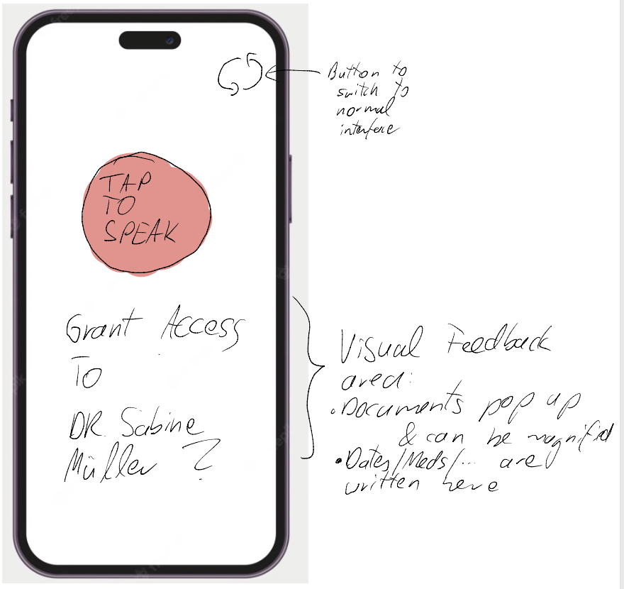
We finally had an interview with Marcel who told us that it’s important that developers implement accessibly features and guidelines supplied by the operating system.

The problem with the interview was, that the interviewed Person mostly uses voice assistant. And this is hard to implement and showcase in a UI Prototyping software. The same applies to some of the guidelines to implement accessibility features, because we do not interact with system libraries and there’s nothing like button numbering and information hierarchy on code level when using Figma. Thus, we focused more on the design guidelines that are actually visible and experienceable in a click dummy.

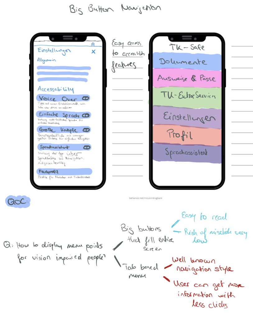
While exploring the TK app, we found that it lacks several „best practices“. It also does not handle accessibility features appropriately. In some cases, parts of the UI are not visible due to overflow and non-responsiveness. Also, there’s no dedicated iPad app.

The design of the App works good for the average user as can be seen in the app stores (4.8 Stars with 300k+ reviews). But there is no „simple“ mode. So we decided to do just that, a mode that can be turned on and completely redesigns the app to make it more accessible and responsive to accessibility features. It is true that this decision was not really based on the information we gained in the previous weeks but more on the limitations and problems we faced. This is indeed a bit frustrating and should have been mentioned in our weekly reflections.

As the following research shows, most of the people are not aware of accessibility features built into the OS. Overall, 15.7% of participants had the idea to fid a solution in their settings of which on average 12.1% identified the correct setting. For readability issues, roughly 20% would have searched for a solution on their phone of which almost all identified the right setting. They also show that it can be beneficial and feasible to detect the users accessibility needs. Based on this detection, a recommendation can be made to the user. For example, if a user tends to hold his/her phone closer to his/her face than the average person, it is likely that a larger font size could benefit the user.

Jason Wu, Gabriel Reyes, Sam C. White, Xiaoyi Zhang, and Jeffrey P. Bigham. 2021. When can accessibility help? an exploration of accessibility feature recommendation on mobile devices. In Proceedings of the 18th International Web for All Conference (W4A ’21). Association for Computing Machinery, New York, NY, USA, Article 21, 1–12. https://doi.org/10.1145/3430263.3452434

Our Prototype mainly aims at readability, clear navigation and simple information hierarchy. As the research shows, the way of presenting this option is crucial for users to actually use it. A possible approach is to ask everyone in the onboarding process if a „simple mode“ is wanted. If possible an implementation of the detection mechanism proposed in the paper would be beneficial, if this is not provided by the system. On the other hand the TK app could also listen for system settings. If users are already using a larger font size or other accessibility features our app can switch from the normal to the simple layout based on a threshold or prompt the user if this is wanted.

Continue to improve your high-fidelity prototype.

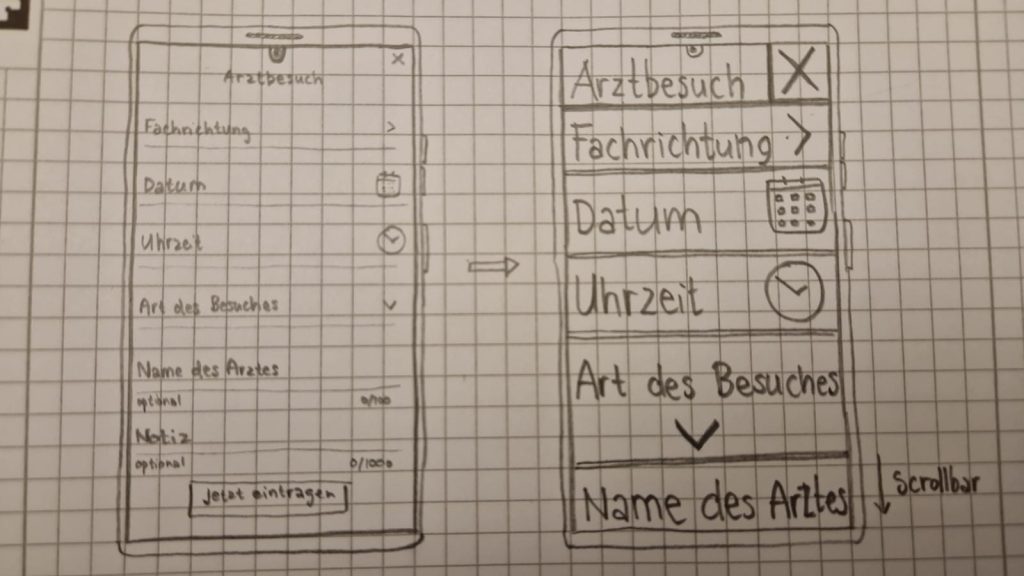
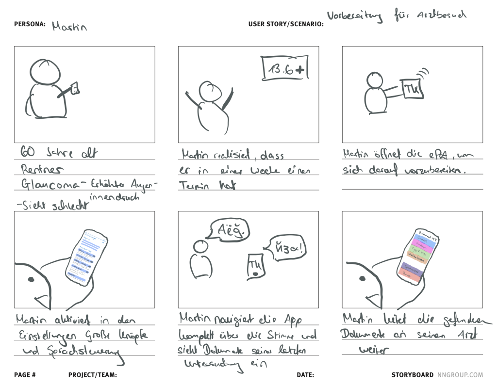
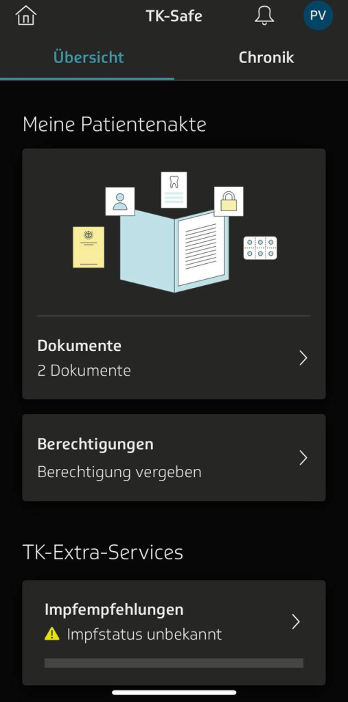
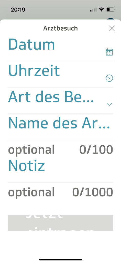
Our Prototype focuses on the items needed for the tasks for the heuristic evaluation. In addition it features items necessary to convey the feeling of a functioning and complete app, although not all routes and buttons actually work.

In the past week we reworked the flow of sharing a document adding choices for how long and to whom one shares a document. A search for potential recipients was integrated. In addition we restructured the categorisation of documents by adding to search in all documents and by giving more specific categories like „impfpass“, „Briefe“ etc. The emergency data was moved to the first level of the hierarchy.

We also adjusted the tasks accordingly.

Heuristic Evaluation material

Prototype:

https://www.figma.com/proto/FGW7aa5zIfj257zIb1JG90/FirstPrototypeHCIePA?type=design&node-id=184-937&scaling=min-zoom&page-id=184%3A936&starting-point-node-id=184%3A937&mode=design

Feedback Formular: https://forms.gle/HD7S7pVTN8AELKxRA

Aufgaben:

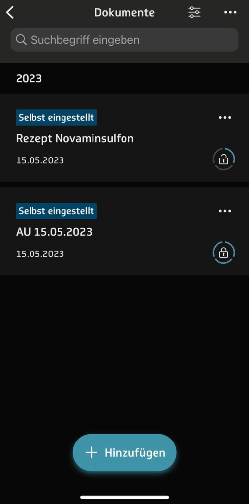
1. Teilen Sie das Rezept für Novaminsulfon mit Herr Dr. Example for 2 weeks.

2. Finden Sie Ihre Covid-19 Impfungen. 

Reflection

Mit der Zeit hat sich in unserer Gruppe eine schnelle Kommunikation entwickelt. Das ist notwendig, da wir selten alle gleichzeitig an den Aufgaben arbeiten, da wir alle unterschiedliche Vorlesungen und Termine haben. Auch eine etwas klarere Arbeitsteilung ist deswegen notwendig.

Diese Woche haben wir viel Feedback zu verarbeiten gehabt. Einerseits die Kommentare unter den vorherigen aufgaben und andererseits die Heuristic Evaluation. Diese Ergebnisse haben uns dazu gebracht unseren gesamten Prozess bis hier her zu reflektieren. Die Ergebnisse davon sehen sie oben in „Reflecting on Comments and explaining our problems and decisions„.

[A#8, T4] High Fidelity Prototype

List your various requirements elicited from the user research.

  1. Document management: The app should allow users to view a list of documents stored in their ePA and provide options to sort the documents by different criteria, such as date.
  2. Document navigation: The app should enable users to open specific documents, such as PDF files, and provide options to navigate back to the list of documents.
  3. Document selection and sharing: The app should allow users to select multiple documents for sharing and provide options to share them securely with specific recipients, such as the user’s ophthalmologist. It should also allow users to set time limits for access to the shared documents.
  4. Be able to upload own documents do digitize them.

Decide based on your requirements and the insights from the low-fi prototype-testing what functionality to include in your high-fidelity prototype.

Our Feedback from the last Lab session included:

  1. Access to hep should always be available in static states
  2. Description of Buttons should be ehanced with icons and clear labeling
  3. Filter categories in searches make the screen crowded

These points combined with the user requirements has lead to the following implementation of the HiFi-Prototype:

1. Document management: The user has the ability to search for existing documents within pre defined categories. The user can then authorize the document to be accessable to professionals such as doctors.

2. Medical Passports: The user has the ability to create and maintain their vaccination status within the app.

3. Examinations & Prescriptions: The user can see documents associated with prior doctors visits and prescriptions in the document management

The UI implementation follows the idea of “Big-Button-Interfaces”.
The goal is to remove small and nested UI elements and instead provide big and visible buttons, that promote a clear and understandable route towards the users goal.

This idea is mainly influenced by the following three sources:

Mobile Gesture-Based User Interfaces for People with Disabilities
Shaun K. Kane introduces the term “Slide Rule” which states that contrary to common UI practice: One should always make buttons that fit the entire screen on its horizontal axis and provide clear messaging.
This approach has been tested by Kane with disabled users to great success, reducing the error rate and increase satisfaction.

Apple previews Live Speech, Personal Voice, and more new accessibility features

“Assistive Access” is Apples adaptation of the “Slide Rule” and similar ideas put forward by Kane. The snapshots of common apps from the iOS eco system provided additonal ideas such as the implementation of the back button and the creation of visual hierachy.

User Interview – Disabled person that uses accessability features

We coonducted a user interview two weeks ago with a person that is dependent on multiple accessability features. These are mainly focused on properly navigating the app without using the fingers as much. F.e. numbering buttons and using VoiceOver to navigate that way.
He stressed that Big Buttons derived from the “Slide Rule” could be a great additon, as it could save users in moments where VoiceOver or similar approaches might fall short.

Additonally some users might not be comfortable/unable to use voice assist and would greatly benefit from “Slide Rule” based navigation.

Define the major task flow you want to support.

  1. Share the prescription of Novaminsulfon to to a doctor
  2. Find your Covid-19 Vaccinations

Start building your prototype.

https://www.figma.com/proto/FGW7aa5zIfj257zIb1JG90/FirstPrototypeHCIePA?type=design&node-id=78-70&scaling=min-zoom&page-id=77%3A69&starting-point-node-id=78%3A70&show-proto-sidebar=1

[A#6, T4] Developing first Prototypes

Problem Statement

Martin (pensioner) needs a way to effectively use the ePA of the TK, while making use of his accessibility tools because he is unable to use the current interface with his fontsize and it is not yet possible to integrate text-to-speech or speech-to-text programs.
We will know this to be true when we see Martin using the full functionality of the ePA. When prompted how his experience with the App is, he should say: “Da kann man nicht meckern.”

Hypothesis Statement

We believe that by improving the TK ePA app to work better with accessibility tools for Martin, we will achieve greater usability for this app, especially for the elderly and people that use the accessibility tools that are provided on their devices.

Sketches

Storyboard

Reflection

[A#5, T4] Personas and Scenarios

Gathering data using bing, chatGPT and Bard

Our goal was to explore possible the usefulness of LLM’s for finding information about the ePA’s usability and accessibility. We looked at the free version chatGPT provided on https://chat.openai.com, at the bing chat mode and at the recently released LLM by google, Bard.

We soon found that google’s Bard is far from remembering the context of a conversation as good as the GPT based chatbots. We were not able to keep up a useful conversation.

ChatGPT’s major flaw for our use case is its lack of recent information (up until 2021) and internet access.

Bings chatbot, which is based on GPT4, does not have either limitation, but a conversation is limited to 20 prompts. However, bing states it is not able „to find any specific information about the usability of the German ePA (elektronische Patientenakte) or its accessibility for people with impaired vision.

Indeed, our research we did for exercise 2 showed that there is not much information about this on the internet. Additionally, the ability of LLM’s to find niche information, which might only occur a handful of times in the entire internet, is very limited.

Creative tasks seem to be more suited than finding rare information. Bing is able to generate personas and scenarios based on the context that I created when prompting bing for information about the usability of the ePA.

https://sl.bing.net/bpYTyTkKyzY (3 personas, 3 scenarios)

Using Reddit to gain insights

Out of curiosity, we published a post on a German developer thread and received plenty of feedback and strong opinions.

The opinions varied from strong rejection due to data security and data centralisation concerns to people welcoming the change and digitalisation of the German health system. People complained about the registration process of the TK app while others shared very positive experience about the ePA and the TK App.

An interesting idea was to contact journalists writing about the ePA and related topics to gain more insights and potentially find an interview partner.

Persona (generated by bing)

Name: Martin Schmidt

Age: 60

Occupation: Retired

Location: Hamburg

Generated using Stable diffusion locally.

Health status: Glaucoma (increased pressure within eyeball), has severe vision impairment and needs a cane to walk, can use digital services with difficulty and assistance

Goals: To maintain his independence and dignity, to get support and care when needed, to stay informed and connected with his family and friends, to enjoy his hobbies and interests

Frustrations: Low vision aids and devices, inaccessible or complex websites and apps, lack of empathy or awareness from others, social isolation or stigma, loss of mobility or freedom

Motivations: Accessibility, simplicity, reliability, safety, comfort

EPA usage: Martin uses the ePA app on his tablet with a large font size and high contrast mode. He also uses a text-to-speech software and a speech-to-text software to interact with the app. He uploads his eye pressure measurements and medication schedule to his ePA occasionally. He also downloads his test results and doctor’s notes from his ePA and listens to them with headphones. He grants access to his ePA data to his ophthalmologist, his general practitioner, and his son. He dislikes the ePA app because it has many usability issues for him, such as small buttons, unclear icons, long texts, confusing menus, and inconsistent layouts. He also complains that the ePA app does not work well with his assistive software and sometimes crashes or freezes. He wishes the ePA app could be more user-friendly and accessible for people with low vision. He also hopes the ePA app could offer some features like voice control, audio feedback, zoom function, and help function.

Scenario

Martin has an appointment with his ophthalmologist next week. He wants to check his eye pressure and see if his medication needs to be adjusted. He decides to use the ePA app to prepare for his visit. He opens the app on his tablet and turns on his text-to-speech and speech-to-text software. He says “Login” and the app asks him to enter his PIN. He says his PIN and the app confirms that he is logged in. He says “Show me my documents” and the app displays a list of documents that he has in his ePA. He says “Sort by date” and the app sorts the documents from newest to oldest. He says “Open the latest document” and the app opens a PDF file that contains his last test results from his general practitioner. He says “Read aloud” and the app reads the document to him with a synthetic voice. He listens carefully and tries to understand the numbers and terms. He says “Stop” and the app stops reading. He says “Go back” and the app returns to the list of documents. He says “Open the second latest document” and the app opens another PDF file that contains his last eye pressure measurements from his home device. He says “Read aloud” and the app reads the document to him. He listens and compares his current measurements with his previous ones. He says “Stop” and the app stops reading. He says “Go back” and the app returns to the list of documents.

He wants to share these two documents with his ophthalmologist before his appointment, so he can review them and give him some feedback. He says “Select the latest document” and the app selects the document. He says “Select the second latest document” and the app selects another document. He says “Share with my ophthalmologist” and the app asks him to confirm his choice. He says “Yes” and the app asks him to enter a time limit for the access. He says “One week” and the app confirms that he has granted access to his ophthalmologist for one week. He says “Send a message to my ophthalmologist” and the app opens a message window. He says “Hello, I have shared my latest test results and eye pressure measurements with you via ePA. Please take a look at them and let me know if you have any questions or concerns. Thank you.” The app transcribes his speech into text and shows it on the screen. He says “Send” and the app sends the message to his ophthalmologist.

He hopes that his ophthalmologist will reply soon and give him some advice on how to manage his glaucoma better. He says “Logout” and the app logs him out of his ePA account. He closes the app and puts away his tablet.

[A#4, T4] Interviewing chatGPT

Based on the feedback from the exercise, conduct three to five interviews.

Wir haben verschiedene Versuche unternommen, an Interviewpartner*innen zu kommen, die leider alle fehlschlugen. Weder die Gäst*innen im Restaurant von Petrits Eltern, noch die (Groß-)Eltern von unseren Berliner Freund*innen sahen sich selber als Teil unserer Zielgruppe oder hatten etwas zur Usability der ePA der TK zu sagen. Auch Menschen für eine etwas allgemeinere Umfrage zum Thema Usability in den mobilen Apps von Krankenkassen haben wir in dieser Woche nicht auf die Beine stellen können. Vermutlich werden wir in der nächsten Woche versuchen, noch allgemeinere Interviews zum Thema „Erfahrungen von Menschen mit der usability von Gesundheitsanwendungen“ machen.

Um trotzdem weitere Informationen zu unserer Fragestellung zu bekommen, haben wir chatGPT damit beauftragt, Interviews zu generieren. Als input gaben wir unseren Interview-Leitfaden.

Das erste generierte Interview war uninteressant, die „Person“ war gut informiert, nutzte die ePA und hat nur generische Aussagen getätigt.

Deswegen baten wir chatGPT ein Interview zu generieren mit einer Person, die weniger Medienkompetenz hat. Diese „Person“ konnte unsere Fragen kaum beantworten, da sie weder Digitale Gesundheitsanwendungen noch Bedienhilfen nutzte. Sie benutze ihr Handy in der „Standard Konfiguration“.

Der/die letzte Interviewte sollte eine „Person“ sein, die detailliertes Feedback Usability von Apps gibt und Verbesserungsvorschläge liefert. Das Interview war etwas inhaltlicher, allerdings waren auch hier die Aussagen sehr allgemein und typische Usability guidelines. Die „Person“ beschwerte sich zum Beispiel über zu kleine Schrift, zu wenig Kontrast, unklare Menüführung und fehlende Alternativtexte für Bilder. Interessant war, das gefordert wurde, die WCAG (Web Content Accessibility Guidelines) einzuhalten. Dies sei besonders bei der Entwicklung von Gesundheitsanwendungen wichtig.

Zusammenfassend haben wir aus den generierten Interviews nicht sonderlich viel gelernt. Wir brauchen echte Nutzererfahrungen von Menschen, die Digitale Gesundheitsanwendungen nutzen und auf Bedienungshilfen angewiesen sind. Leute zu finden, die die ePA tatsächlich benutzen gestaltet sich schwierig, da wenige Leute bescheid wissen und kaum Ärzte/Ärztinnen die ePA einbinden können.

Analyze your (qualitative) data using affinity diagramming

Connect your insights from the secondary data analysis and the interviews

In den Interviews, die wir mit chatGPT geführt haben, kamen ähnliche Ergebnisse heraus, wie bei unserer secondary Datenanalyse. Es geht um die typischen Punkte die beim Design von UI oft vergessen werden, Kontraste, Schriftgröße, Farbauswahl, Alternativtexte etc. Auch ist uns beim nutzen unserer Handys mit Bedienungshilfen aufgefallen, das die wenigsten Apps gut mit Bedienungshilfen umgehen können oder eigene Lösungen anbieten. Zum Beispiel bei der Kleinanzeigen App passen sich nur kleine Teile des Interfaces an Bedienungshilfen an. Die Corona Warnapp hingegen geht aus unserer Sicht gut mit dieser Herausforderung um.

Reflektion

Wir sind mit den Aufgaben nicht hinterher gekommen, eine längere Zeit zum vereinbaren dieser Interviews wäre hilfreich. Wir werden unsere Interviews in der kommenden Woche führen.

Die Arbeit unserer Gruppe funktioniert gut, wir sprechen uns fast täglich ab, können unsere Aufgaben gut aufteilen und die Ergebnisse dann zusammentragen und besprechen.

[A#3, T4] Usability der ePA in Kombination mit Bedienungshilfen.

Define the goals of your data collection session.

  1. Welche Bedienhilfen werden genutzt und wie sind die Erfahrungen damit.
  2. Nutzen Menschen mit großer Schriftgröße häufig schlecht gestaltete Apps?
  3. Ist die TK ePA Implementierung in der Lage vom System kommende Einstellungen gut umzusetzen?
  4. Gibt es weitere Einstellungen in der TK app?

Based on your goal, derive the stakeholders you want to collect data from.

  1. Menschen die wahrscheinlich große Schriftgröße eingestellt haben
  2. Menschen die eingeschränkt sehen aber trotzdem Regelmäßig im Alltag digitale Anwendungen nutzen.

Start with collecting information without approaching your stakeholders

The TK App

The ePA of the Techniker Krankenkasse is called “TK Safe Patientenakte” is embedded within the offical service app of the health insurance provider, alongside other features related to health insurance services.
The ePA alongside the complete app are developed in-house by developers of Techniker Krankenkasse.

The ePA itself is divided into two main tabs within the “TK Safe Patientenakte”. In the first, a user can look at documents associated with prior visits. If they do not exist yet or were provided on paper, the user can add them manually themselves.

The second provides a history of all the doctor visits that a patient did that were recorded in the ePA. Here the user can also add prior visits that have not been digitalised yet.

Additionally, users can get assistance by the “TK-Safe Patientenakte” via the “TK-Extra-Services. Which provides suggestions for possible vaccines and check ups, based on age, sex, and the users medical history.

To use the ePA the regular TK app has to be installed, there is no standalone solution. After registering for the TK application to log-in, the user has to undergo a second registration process for the ePA feature, which is more strict and requires more input than the TK app overall.
The “TK-Safe Patientenakte” can also be used for more than one health insured person, multiple ePAs can be managed in one app instance, f.e. for relatives, etc.

Flaws that we want to address

While the TK app is generally well designed and also has incredibly good ratings (4.8/5 #rating>300k), we found issues when using the systems accessibility features. The app derives the light/dark mode and the fontsize from the system. But complex interfaces get really hard to read when setting the fonts very large.

It was not possible to find reliable data on how many people actually increase their fontsize but from our personal experience, many do.

Furthermore the app neither provides a setting for „simple language“ nor a high contrast mode.

Prepare an interview study with your primary stakeholders.

Semi strukturiert(offene und geschlossene fragen). Wir brauchen erstmal ein Gefühl dafür, wie und wie viele Menschen Bedienhilfen nutzen und wie die Erfahrungen mit existierenden Apps sind. Auch wollen wir ein grundsätzliches Bild davon bekommen, ob und was Menschen von der ePA wissen und ob sie bereits Digitale Gesundheitsanwendungen, wie die TK App, nutzen.

Das interview ist in vier Hauptfragen gegliedert, zu denen jeweils mögliche nachfragen notiert sind. Eine Person wird das Interview führen und eine Person hört zu und schreibt mit. Wenn es geht, nehmen wir Audio auf.

  1. Intro
    1. Vielen Dank für ihre Zeit.
    2. Datenschutz Erlärung:
      1. Wir werden keine personenbezogenen Daten speichern.
      2. sie haben jederzeit die Möglichkeit, ihre Zustimmung zu widerrufen.
      3. Wir werden ihre antworten aufzeichnen und anonymisiert weiterverarbeiten.
    3. Vorstellung wir sind studis
    4. Wir untersuchen die Nutzbarkeit der elektronische Patienten Akte (ePA) der Techniker Krankenkasse. Speziell schauen wir auf die Umsetzung von Design Guidelines für Bedienungshilfen wie extra große Schrift, Kontrast und einfache Sprache.
    5. WarmUp: Was wissen sie über die ePA?
  2. Nutzen sie digitale Gesundheitsapps?
    1. Nutzen sie die App der TK?
    2. Haben sie Zugang zur ePA?
    3. Wollen sie die ePA in Zukunft nutzen?
  3. Welche Bedienungshilfe Funktionen nutzen sie?
    1. Wie groß ist ihre Schrift eingestellt?
    2. Wissen sie, das man sowas einstellen kann?
    3. Hatten sie schon Probleme mit Designs von Apps?
  4. Outro:
    1. Vielen Dank für ihre Zeit.
    2. Haben sie noch fragen?
    3. Wenn sie später noch Rückfragen haben, kontaktieren sie uns gerne.
Reflection

Diese Woche war unser Zeitmanagement deutlich besser und wir hatten „schon“ am Montag einen Call um unser Thema zu definieren und ein grobes Interview zu entwickeln. Petrit ist aktuell der einzige mit Zugriff auf die ePA der TK und hat daher die App mit uns ausprobiert, Screenshots gemacht und gleich seinen Arzttermin eingetragen.

[A#2, T4] ePA or DiGA Part 2?

Reflection of last week

Instead of investigating a non existing DiGA or an existing Health app that is not registered as a DiGA tackling Asthma, we decided to go for an existing DiGA or even switch to the ePA. The ePA is more interesting to us three and also affects all of us. It will soon be relevant to the entire German society and thus have a big impact. Additionally, the ePA is easily (we all see about that) accessible to all of us and brings some interesting questions. Some points of interest are the acceptance and usage of the ePA among doctors and the meaning and consequences for the elderly or other groups not that are less familiar with or able to use digital services.

Humanity centered design

The main take away from the article is the concept of Humanity Centered Design, meaning a design approach that is not focused on the individual user but on the society or humanity as a whole. The goal of a humanity centred design is to benefit the global good and wellbeing. This concept is hard to apply to apps that are specifically developed to fit the German law that defines the DiGA.

The German laws regarding medical devices and DiGA’s create a narrow scope in which any software has to reside to be deemed eligable. Such constraints can cause friction with the concept of Humanity Centered Design.
An important area regarding our project goals is Monoculture. Since our DiGA is developed and distributed in Germany specifically, it is easy to fall into the trap of defaulting to a classic Western/German view on design and usability. But Germany is not a monocultural place but instead very diverse and increasingly so. Additionally health care is intended to impact and help every part of society, no matter their cultural background. Understanding the access to health care as a universal right, also implies that the health care service’s (i.e. the DIGA’s) usability is universal too.

The aim of the ePA itself is to benefit the German society, its health system and medical staff by making processes more efficient and transparent. Everyone living in Germany is a potential stakeholder of the ePA. As mentioned for the DiGA, the ePA should not be designed with a German/western focus because Germany is a diverse place and many people from different cultural and social backgrounds will be using the ePA apps.

Ressources

TK DiGA Report:

https://www.tk.de/resource/blob/2125136/dd3d3dbafcfaef0984dcf8576b1d7713/tk-diga-report-2022-data.pdf

AOK DiGA Umfrage:

https://www.aok.de/pk/cl/rh/inhalt/apps-auf-rezept-insgesamt-positiv-bewertet-aber-fuer-viele-verzichtbar/

LinkedIn zu UX in DiGAs:

https://de.linkedin.com/pulse/usability-und-user-experience-ux-von-digitalen-diga-hosun-lee?trk=articles_directory

Bewertung einiger DiGAs von Stiftung Warentest:

https://www.test.de/Digitale-Gesundheitsversorgung-Apps-vom-Arzt-verordnet-was-steckt-dahinter-5552344-0/

what?

We aim to improve the experience of the user that is interested in using the Kaia COPD application. Currently the app only allows users to create an account and either type in an authentication code provided by the users health insurance, or a print out to get a prescription for the app, that can directly be signed by the users doctor.
There is no way, to get additional information on the app itself and its features. Instead it feels more like an ad campaign within the app itself. This is especially off putting as the direct advertisement (i.e. tv/radio/… commercials) for prescription-mandated medicine is banned in Germany and therefor the approach by Kaia COPD feels misplaced.

Uns würde auch interessieren, wie Ärzt*innen, Praxispersonal oder Apotheken mit der ePa umgehen. Auch die Nutzung für ältere Menschen stellen wir uns schwierig vor – wie gehen Menschen mit einer solchen App um, die nicht zu den „digital natives“ zählen?

why?

Kaia COPD is currently the only DiGA in the respiratory disease category and therefore the first and only valid stop for patients diagnosed with COPD. Improving the registration and exploration phase can improve the satisfaction and trust of the user, especially since DiGA’s are not widely adopted yet.

We are interested in how well doctors are already handling the ePA, especially because they are overwhelmed by work most of the time and are using different and often old software to manage their patients. Elderly are an interesting group because they rely very strongly on the health system but at the same time are often insecure about using digital services.

who?

Direct stakeholders: patients with COPD diagnosis
Indirect stakeholders: doctors, health insurances

The stakeholders of our specific questions are doctors, pharmacists, elderly and people insured at TK.

where?

The user interacts with the software whenever the active component (i.e. exercising) is appropiate. This can include the gym, your own home on a yoga mat, in the park, or other sport friendly spaces.

The ePA, especially as an opt-out app, will be used by many people in many situations. Wether it is at the doctor, the dentist, the hospital, the pharmacy or at home.

Reflektion

Entscheidungsprozess nimmt viel Zeit ein. Auch weil uns die genauen Anforderungen etwas unklar sind.

Zeitmanagement muss besser werden. Arbeitsteilung läuft gut 🙂

Arbeit mit Trello hilft, weil man zusammenarbeiten kann.

Wir müssen unser Thema, Stakeholder etc stark einschränken bis nächste Woche.

[A#1, T4] ePA or DiGa?

  • Choose a team name: Digital Natives

Summarize your insights with a short description (about 150 words).

ePA stands for electronic patient record and is a digital platform used in the healthcare sector to store and manage patient health information. The ePA provides doctors, nurses, and other healthcare providers with access to a patient’s medical history, diagnoses, test results, and treatment plans. The ePA also enables patients to access their medical records, monitor their health status, and share information with their healthcare providers.

DiGA stands for Digital Health Applications and refers to medical apps or digital tools that can be prescribed by doctors and reimbursed by health insurance providers. DiGAs are intended to improve patient care and health outcomes by supporting prevention, diagnosis, treatment, and rehabilitation. DiGAs can address a wide range of health issues, including mental health, chronic conditions, and physical disabilities.

Both the ePA and the DiGA are part of the attempt to digitise the German healthcare system such that it benefits healthcare workers (doctors, nurses etc), patients and science.

Some questions

How will be ensured that every user, no matter their digital capabilities, will be able to handle the ePA?

In what way will they visualise who has when access to what data?

Why does every BKK implement its own ePA?

How hard is the development and licensing of a DiGA?

How Are the developers payed?

What is the challenge you would like to tackle?

Currently, there are 45 active DiGAs. They tackle different medical topics such as depression, COPD, insomnia etc. But many illnesses which could potentially be eased by a DiGA.

Our case is asthma. Asthma is an inflammatory disease of the airways which cannot be cured as of today. It can be controlled by medication and various other factors. There is a device, called a Peak-Flow, which is often used to measure ones conditions at home to get more than a subjective feeling of the state of ones asthma.

To support people in taking their meds, using their peak-flow and filling in their asthma diary, a DiGA could be very helpful.

We want to checkout current asthma apps, find out why they are not a DiGA and try to improve their approach to the problem

Why do you expect your engagement to be useful?

One of our group members has asthma and remembers the annoying asthma diary and how his doctor was always annoyed by him not taking care of it with more discipline.

Since there are digital approaches which are not in the DiGA register yet, there might be problems with these apps or with the DiGA registration process.

Who are your intended stakeholders?

Asthma patients, doctors, developers of asthma apps

Reflection

Wer hat welchen Beitrag geleistet?

Nachdem wir uns alle eingelesen und unser neues Wissen miteinander geteilt haben, haben wir länger über ein mögliches interessantes Thema gesprochen. Ausformuliert hat den text Simon.

Was habt ihr gelernt?

Vieles über die ePA und warum diese nur so schleppend voran kommt. Einige von uns hatten noch nie von DiGAs gehört.

Was lief gut?

Die Kommunikation in unsere Chatgruppe lief reibungslos, obwohl 2/3 krank im Bett lagen.

Was möchtet ihr verbessern?

Entscheidungsfindung in einer Gruppe ist oft nicht so einfach, so auch bei uns. Allerdings kostet es den Grossteil der Zeit, darüber zu diskutieren, obwohl niemand eine starke Meinung hat. Wir hätten früher mit der Aufgabe beginnen sollen, was allerdings wegen Krankheit nicht möglich war. Das schreiben in diesem Blocksystem ermöglich leider kein gemeinsames Bearbeiten eines Posts.