[#A11, P1] Final Thoughts

(1) Summarize the project goals, context, and stakeholders

We decided to look at the Flytta app to get a broad overview of it and find areas that could be improved upon. The app in its then state had poor usability. The diary functions were inconsistent and cumbersome to use. It was easy to slip and make errors and too hard to correct them afterwards. Some of the app’s functions were hard to find.
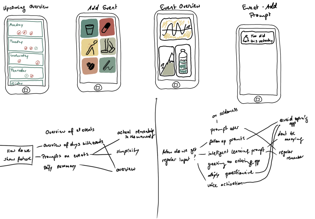
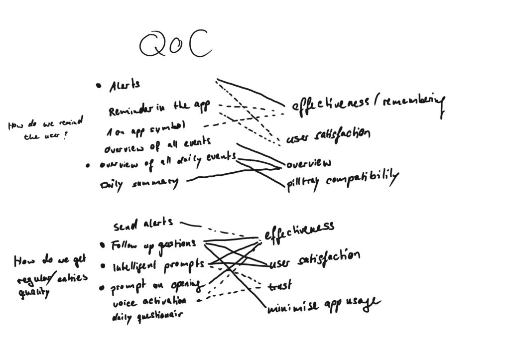
We decided to focus on the diary aspect of the app. Logging things is boring and can be tedious, but provides better insights when done regularly. As a result a diary needs to be easy, intuitive and simple, to allow for users to form a habit of using it.
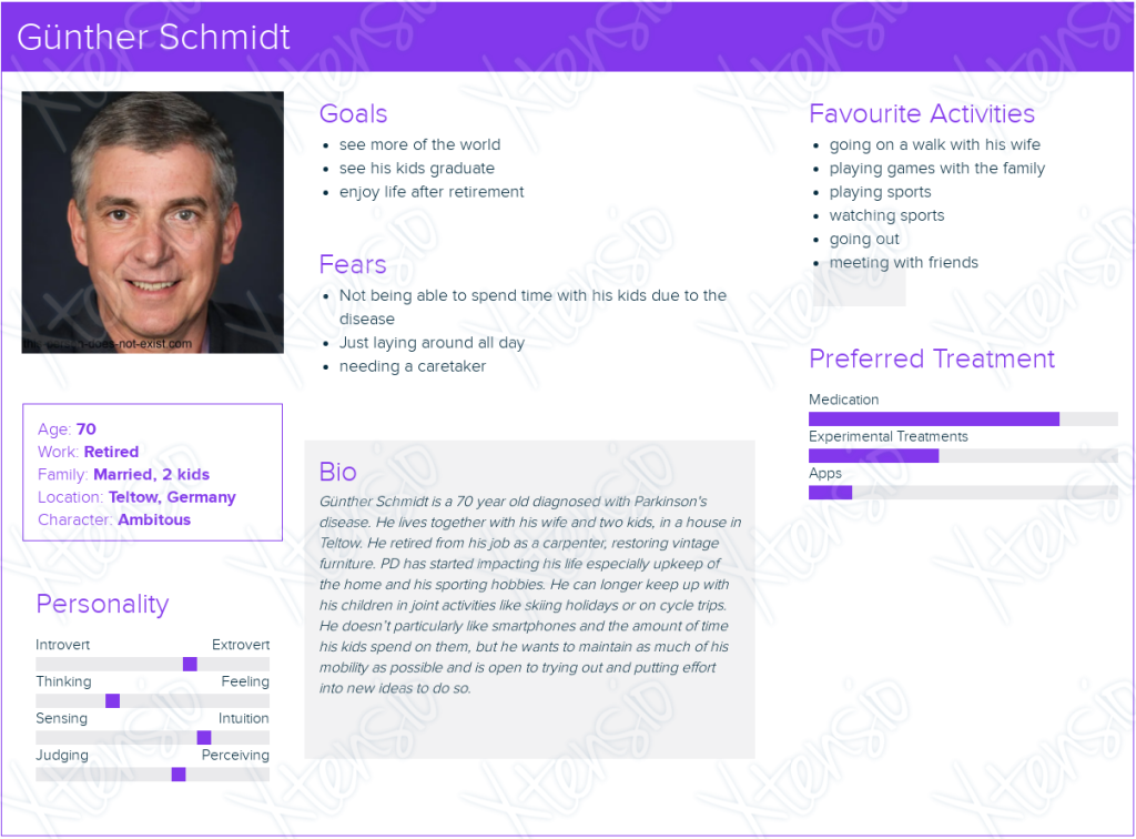
We used data from Flytta as a starting point, but in the course of the project we shifted our focus from an app for people with Parkinson’s disease, to a more general aid for people who need to take medication regularly and keep a diary for certain things like water or exercise.
In this context we formulated the following problem and hypothesis statements:

Problem Statement:
Gunther needs a way to track his daily symptoms and risk factors as well as medication and daily water intake, because they can give him new insights into the nature of his disease. We will know this to be true when we see regular high quality data recorded in the app.

Hypothesis Statement:
We believe that by giving Gunter an easy to use diary app that builds a use habit, we will achieve high quality data which can be used to give him better and more helpful insights.

The direct stakeholders are people who benefit from logging their risk factors and medication. There are many indirect stakeholders of a diary function: health insurers, doctors, care workers, relatives, politicians, etc..
On the basis of our statements and user research we created a persona and scenario and the requirements for the app.
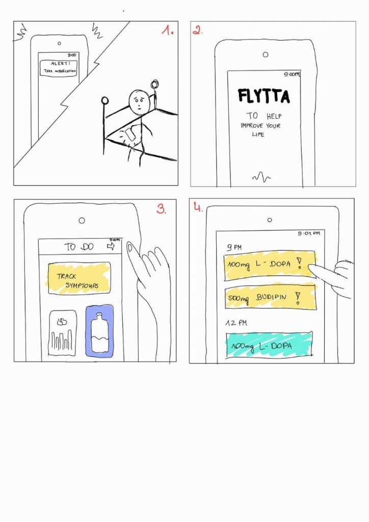
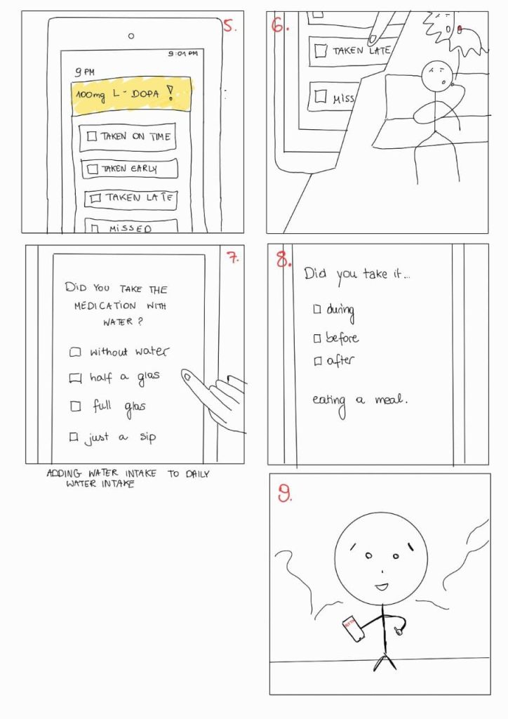
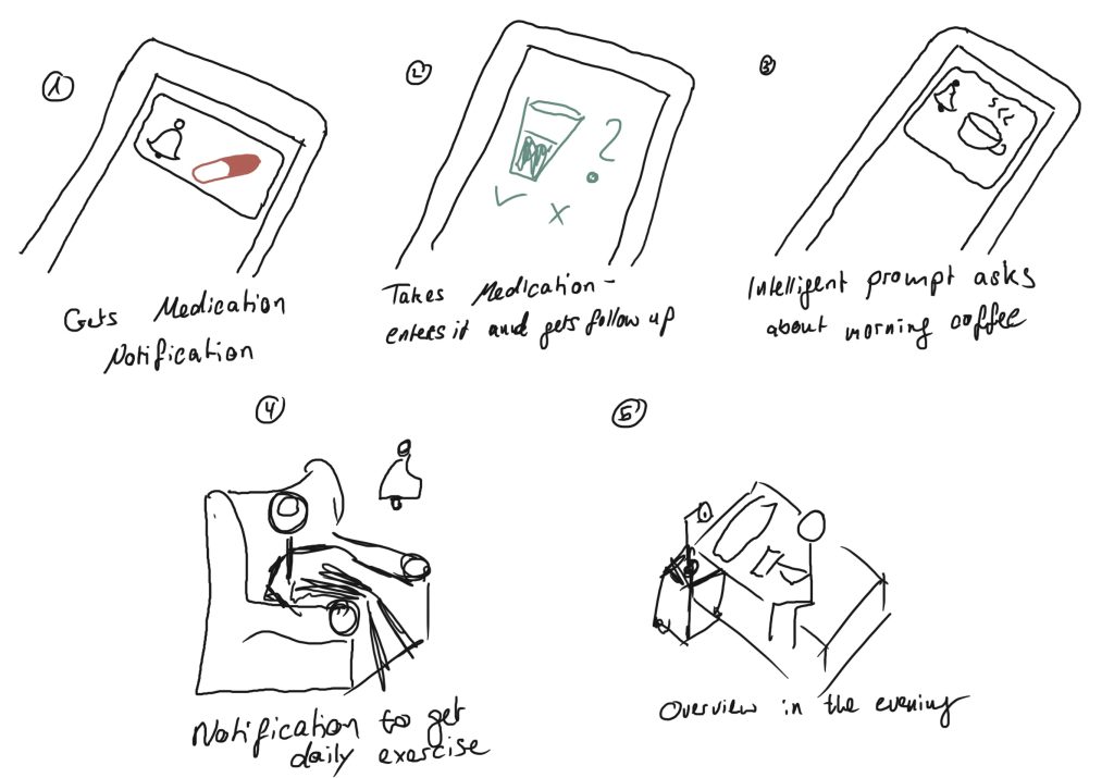
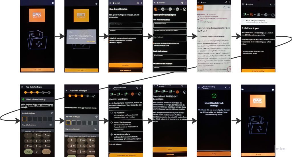
We used those for a storyboard, sketches, lo-fi, and finally hi-fi prototyping, refining the functionality and deciding on which requirements to implement based on testing after each stage.
Finally we prepared and executed usability testing, with outsiders to the project to gain new insight and a different perspective.

(2) Summarize your test results.

The testers were asked to think aloud as they work on the tasks, and we documented those thoughts and their feedback.
We timed each task but the values were influenced more by the thinking aloud process and commenting on the design than the actual task execution times, so we didn’t evaluate the measurements any further.
We used a single ease question answered after each finished task to measure satisfaction.

We chose to evaluate the following five tasks:

Task 1 – Please add a glass of water.
SEQ Average: 7
Feedback:

  • Glass Sizes not clear
  • Info Icon not interactive, one extra step required -> might be unnecessary 
  • People could associate log with maths

Task 2 – Please log a medication you have taken.
SEQ Average: 6,3
Feedback: 

  • Design not consistent with the Calendar
  • The display of the time is misleading 

Task 3 – Please view your water consumption statistics.
SEQ Average: 6,7
Feedback:

  • Water Intake not Consumption 
  • Multiple ways to access was appreciated 

Task 4 – Please view your medication statistics.
SEQ Average: 5
Feedback:

  • Difficult to find 
  • Overview not clear and confusing
  • No real value of the graphic
  • Confused over headlines (change the word diary)
  • Connection on the front page was requested

Task 5 – Please check your medication schedule for today and tomorrow.
SEQ Average: 5
Feedback:

  • The calendar had no information on the first page
  • Not easy to find
  • Time for the medication not visible 
  • Confusion about the amount of pills that should be taken
  • Takes 3 steps to really see your medication plan -> should be less

The prototype still a many smaller errors and issues to consider like for example:

  • Water Intake instead of Water Consumption
  • Changing the word diary in the medication overview
  • Changing logging because of the resemblance to maths

The medication schedule and the medication logging function are very similar in many ways, but not quite the same. They need to be more consistent and either integrated into one function or two more clearly different functions.
The graphs we have for evaluating the different logs, especially the medication log, need more consideration, as they offer little information at the moment.
The calendar is hard to find and is only integrated into the medication part of the diary and not with the other functions, which is quite inconsistent and needs work.

(3) Compare your results with the defined problem (problem statement) you wanted to solve.

We have made significant progress toward our goals from where we started. The diary functions for tracking water or medication and finding the visualisation of past records worked well in the evaluations. 
Our visualisations are fairly basic both in terms of method and amount of factors visualised. The insights that can be gained from them are limited and not sufficient enough for understanding the nature of an underlying disease. 
Without longer term testing we can’t evaluate how regular the data recording would be, or whether the user would form a habit of recording things. We haven’t implemented any mechanisms to directly promote habit building, other than making the diary as easy to use as possible and notifying the user about due medication.

Our next step would be to implement our takeaways from usability testing: resolving errors that were found in the design, designing a new, possibly unified, medication schedule and logging page and increasing calendar functionality.
To continue this project we would need to do more research on how to visualise the data, to allow insights and how to help users build a habit of using the app.
We would need a first implementation of the app to be able to evaluate habit building and use over time.

[#A10, P1] A summative Evaluation

(1) Continue to improve your high-fidelity prototype.

Results:

https://docs.google.com/spreadsheets/d/1fW1MYyrUwSITGhz2V_1H6n1PmRVpDaRMVDso2aDWLNM/edit?usp=sharing

Prototype:

https://www.figma.com/proto/j5P5kcYLb1StcVuOEkYtGC/HiFi-v3?page-id=0%3A1&type=design&node-id=1-2&viewport=1429%2C307%2C0.44&t=9bebyXeIHdi1tIw7-1&scaling=scale-down&starting-point-node-id=1%3A2&mode=design

(2) Prepare for a summative evaluation

Skript:

Hi, ___. My name is Niklas and his name is Alfred, and I’m going to be walking you through this session today. Before we begin, I have some information for you, and I’m going to read it to make sure that I cover everything. You probably already have a good idea of why we asked you here, but let me go over it again briefly. We’re asking people to try using an app design that we’re working on so we can see whether it works as intended. The session should take about 25 minutes. The first thing I want to make clear right away is that we’re testing the design, not you. You can’t do anything wrong here. In fact, this is probably the one place today where you don’t have to worry about making mistakes. As you use the site, I’m going to ask you as much as possible to try to think out loud: to say what you’re looking at, what you’re trying to do, and what you’re thinking. This will be a big help to us. Also, please don’t worry that you’re going to hurt our feelings. We’re doing this to improve the design, so we need to hear your honest reactions. If you have any questions as we go along, just ask them. I may not be able to answer them right away, since we’re interested in how people do when they don’t have someone sitting next to them to help. But if you still have any questions when we’re done I’ll try to answer them then. And if you need to take a break at any point, just let me know. With your permission, we would like to document this session on paper so we can look at it again. If you would, I’m going to ask you to sign a simple permission form for us. It just says that we have your permission to document this session. Great, now we are done with the formalities and can start with the app design.
(Hand the user the prototype)
(Give them one task after the other)
(After each tasks give them the evaluation)

Tasks:

1) Please add a glass of water.

2) Please log a medication you have taken.

3) Please view your water consumption statistics.

4) Please view your medication statistics.

5) Please check your medication schedule for today and tomorrow.

Consent Form:

Coding Form:

SEQ:

The task we have are different from each other and the aspects of the app they test are very different, so a task level questionnaire gives us better insights. We have choosen SEQ, as we like it’s simplicity and believe the information will be sufficient in this case, because the task we have are quite simple and having more questins will make the test slower with a low reward.

Who contributed what?

We prepared the evaluation together. Niklas paid for the printer.

What have we learnt?

The printer service works surprisingly well.

What went well?

Printing.

What can be improved upon?

Cost per page

[#A9, P1] Improving after a first heuristic evaluation

(1) Reflect on the results of the heuristic evaluation you conducted in class.

Outstanding – Upcoming – Occasional metaphor is not great.
Alert button not very attention catching.
There is no guide to abstract amounts of water.
While there is a notification for success it has no undo button.
There are no error messages at all.
Adding a medication should also allow for scheduling a new one in the same window.
There is no option to choose a custom time, or custom amount of water.

We need to improve the general user error prevention and error explanation, extend the functionality of some screens. Some of the metaphors are not quite clear in the medication part of the prototype. While there might be some aesthetic issues they are not that critical at the moment.

2) Continue to improve your high-fidelity prototype.

We have implemented:

  • custom time and amount while logging water
  • overview of medication
  • custom time for medication
  • error screen for unimplemented functions
  • undo button in confirmation prompt
  • info button in water log screen (needs some more work)
  • the alert is more prominent
  • changed schedule icon

    We plan to improve the metaphor for the medication logging screen and change it from Upcoming – Outstanding – Occasional, but it still needs more thought we havn’t come up with a better metaphor so far.

    The water info screen is very basic and need more information/function

(3) Prepare another round of heuristic evaluation  (this time you test the interface of another group)

Heuristic Evaluation:

https://docs.google.com/forms/d/e/1FAIpQLSdJ4Q0nTYRRnkr9JLkPJGNet9RmhNW3AH0Xj8hp6A2hLOgXXg/viewform?usp=sf_link

Figma Prototype:

https://www.figma.com/proto/ONmVu304UbP1EqQErFBFY5/HiFi-v2?page-id=0%3A1&type=design&node-id=1-2&viewport=1461%2C350%2C0.52&scaling=scale-down&starting-point-node-id=1%3A2&mode=design

Who contributed what?

We worked on the prototype together.

What have we learnt?

It was fun using a design tool, they are more complex than we first assumed.

What went well?

Coordination of teamwork, our time management was also very good this week.

What can be improved upon?

This week nothing.

[#A8, P1] A first Hifi Prototype

(1) List your various requirements elicited from the user research.

  • PwP need to form healthy habits
  • Show PwP correlation between habits and symptoms
  • User wants to see report on their use of the app
  • User need simple way to track risk factors
  • User needs a way to log the medication they take in the app

(2) Decide based on your requirements and the insights from the low-fi prototype-testing what functionality to include in your high-fidelity prototype.

Feedback:

  • Navigation bar symbols are not clear/intuitive
  • Add water button was broken
  • Give confirmation after adding an item
  • The groupings in the medication section were not clear
  • Popup alerts for medication
  • Make water and step counter clickable
  • Left, Right indication when entering tremor
  • Sort symptoms by category

Functionality:

  • Logging water
  • Logging Caffeine
  • Logging Symptoms
  • Logging Medication
  • Water Overview
  • Caffeine Overview
  • Step Overview
  • Medication Overview
  • Symptom Overview
  • Alerts to take Medication
  • Confirmation after adding log
  • Overview per day week and month

(3) Define the major task flow you want to support.

  • Adding a new entry to the diary

User should be able to enter his symptoms, his water intake and his caffeine consumption. He should also be able to log his medication and the time he took it. 

  • Viewing the diary statistics 

The user should be able to access the statistics. There he should get an overview of his water intake, his caffeine consumption, his steps, his symptoms and his medication intake. These graphs should give him an overview of his daily life and give the user feedback. Ideally the user should be able to see correlation between things which gives him more insight into his disease and the affecting factors.

(4) Start building your prototype. The UI should be clearly developed (consider all interaction, visual, and information design)

https://www.figma.com/proto/XFQFLHfH8FnOMLSF5KOi9u/Prototype-2?type=design&node-id=1-2&scaling=scale-down&page-id=0%3A1&starting-point-node-id=1%3A2

[#A7, P1] A first Paper Prototype

(1) Summarize the feedback you received on your storyboard.

Our statement doesn’t mention the illness were working with is Parkinsons Disease.

The storyboard lacks a frame for adding a tremor which is important for context.

(2) Develop an interactive paper prototype.

Figma Prototype

https://www.figma.com/proto/EVtOTf6s5UELPFq9ZYWvHx/Untitled?type=design&node-id=1-2&scaling=scale-down&starting-point-node-id=1%3A2

We took our storyboard and our sketches as a starting point and implemented screens for the use case of entering data and medication into the diary, and then displaying them for understanding. We based most of the screens on the sketches we had already made. So far the prototype is not very pretty and lacks a lot of the smaller input choices the user could make.

Who contributed what?

We worked on the prototype together.

What have we learnt?

It was fun using a design tool.

What went well?

Coordination of teamwork, our time management was also very good this week.

What can be improved upon?

This week nothing.

[#A6,P1] Thoughts on assignment 6

PROBLEM STATEMENT

Gunther needs a way to track his daily symptoms and risk factors as well as medication and daily water intake, because they can give him new insights into the nature of his disease. We will know this to be true when we see regular high quality data recorded in the app.

HYPOTHESIS STATEMENT

We believe that by giving Gunter an easy to use diary app that builds a use habit, we will achieve high quality data which can be used to give him better and more helpful insights.

Sketches Alfred:

Sketches Niklas:

Storyboard:

QoC:

Who contributed what?

We researched and worked together, did our sketches individually.

What have we learnt?

It can be tiring at times.

What went well?

Coordination of teamwork

What can be improved upon?

Not realy an improvement but we could do with more time.

[#A5, P1] Flytta App

  1. What is the challenge you would like to tackle?

Either the creation of a medication plan, or touchscreen accessibility for PD patients.

  1. Why do you expect your engagement to be useful?

People with tremors might struggle with touch screen inputs but might be able to perform certain gestures better than others.

Especially for PD a medication plan can be quite large but also very important for general wellbeing.

  1. Who are your intended stakeholders?

People suffering from PD, in the case of accessibility features specifically those in a later stage with larger impact on motor function

Medengine, doctors…

  1. Where is your user group interacting with your software?
    For example, at home, in the hospital, or on the go

Anywhere in their daily routine, at the doctors

  1. When is the user group interacting with your software?
    For example, only when being in the hospital, while biking, or daily in the morning

Throughout their day, after taking medication, after having tremors, before and after sleeping, drinking coffee… At the doctors office who can use the collected data to support his diagnosis and treatment plan.

Persona:

Scenario:

Gunther gets up in the morning and has his breakfast with a cup of coffee, he records both. He sees the medication scheduled for breakfast, takes it and ticks it off. 

He goes outside and does some garten maintenance. He starts getting tremors in one of his hands, records them, and decides to quit for now.

He has lunch with his wife after which he records his food and water intake again.

They sit down to play a boardgame and after a while he is reminded to take his afternoon medication.

When his kids come home he helps them with their homework. When they’re finished they go out to the wood shop to continue working on an old desk for their room, he has some light tremors in his leg and records those too.

After having tea before going to bed he takes some more medication and turns on the sleep tracking, the app shows him how many steps he has taken today, he is a little disappointed, maybe he’ll go pick up his kids from school tomorrow.

Who contributed what?

We researched and worked together.

What have we learnt?

It can be tiring at times.

What went well?

Coordination of teamwork

What can be improved upon?

Not realy an improvement but we could do with more time.

[#A4, P1] Weekly Summary

We are still waiting for a response from the Flytta App, so in the meantime we have answered the w-questions we could think of so far, and have done some research into Parkinson and the apps existing to help.

Who are your intended stakeholders?

Direct Stakeholders: Parkinson patients, Medengine, Doctors, Careworkers, Relatives
Indirect Stakeholders: Health insurers, politicians..

Where is your user group interacting with your software?
For example, at home, in the hospital, or on the go.

Everywhere (You wear the watch all the time)
Using the app mostly at home (?)
At the doctors

When is the user group interacting with your software?
For example, only when being in the hospital, while biking, or daily in the morning.

Permanently recording via the watch, medication alerts, on a regular basis to record and keep track of symptoms, to review records individually or with a doctor.

App Landscape

There are many apps that help with some specific aspects of Parkinson disease. Apps that provides movement and speech exercises specifically for Parkinsons, medication plans, symptom diaries, wellbeing tracking or speech analysis. There are few apps that combine many of these thing or use motion tracking. One research project we found is Parkinson mPower that aims to use an app to track motion of people walking and doing basic exercises.

Outlook/Alternative

If we don’t get any response from medengine (the company behind the app) soon, we will continue with our initial project of improving the registration process in the ePA apps. We will look at the 5 different processes, and do contextual inquiries with users registering, as well as interviews with the app users, potential app users.

Who contributed what?

We researched and worked together.

What have we learnt?

It might be good to have a backup when relying on external contacts.

What went well?

Coordination of teamwork

What can be improved upon?

We are unsure how to proceed as we are still waiting for a response.

[#A3, P1] Interview

Define the goals of your data collection session.

We want to find out, what about the registration process, which parts did users find challenging?

Based on your goal, derive the stakeholders you want to collect data from.

We need information from users who struggled with signing up, those who failed, and those who helped others with the signup process (i.e. doctors, nurses, family and friends of those struggling).

Start with collecting information without approaching your stakeholders

The registration process for the app is very cumbersome and overly complicated. It provides various methods for identification (personally in a DAK servicecenter, POSTIDENT or using NFC and the PIN of the Gesundheitskarte). The app has many negative reviews on both the Google Playstore and the Apple App Store, complaining about the signup process, problems using the app or the app not working at all.

At the end of January only 595 000 people had created an ePA, a number less than one percent of all publicly health insured.

The adoption and use by doctors is still very low due to the doctors lack of technology, low adoption by patients making it impractical and other reasons.

We are using the ePA provided by the DAK.

The app is developed by BITMARCK in cooperation with RISE to be provided to all public Health Insurers, who brand the app for their use. The BITMARCK website gives a detailed account of current and future functionality. Although the apps for Android, iOS, and desktop users have been developed, the DAK only provides apps for Android and iOS in the Google Play Store and Apple app store respectively.

Prepare an interview study with your primary stakeholders.

We need to interview users who have used the ePA app in some way, to find out how they perceived the registration process, whether they completed it and if not why not. Those who have trouble registering for the ePA, might generally not use a lot of digital services. We could contact them in waiting rooms, in person or by hanging flyers there.

We will conduct a semi-structured interview, because we want to ask both general closed questions and open questions regarding the difficulties.

Introduction:

Kurze Vorstellung von uns und unserem Projekt, eine Erklärung warum wir dieses Interview durchführen, frage nach Zustimmung und weiteren Fragen. 

Questions:

1. Wann haben Sie sich die ePA heruntergeladen?

2. Haben sich sich dann auch für die ePA registriert?

Wenn ja -> Fragen a, sonst -> Fragen b

3a. Wie gut lief die Registrierung ihrer ePA?

4a. Wie viel Zeit hat Ihre Registrierung in Anspruch genommen?

5a. Hatten Sie Unterstützung bei der Anmeldung, wenn ja von wem?

6a. Wie haben Sie sich identifiziert?

7a. Wie lief ihre Identifikation ab?

8a. Hatten Sie Schwierigkeiten dabei?

9a. Sind Ihnen Teile des Registrierungsprozesses besonders schwer gefallen, wenn ja, welche und warum?

10a. Was hat Ihnen geholfen, diese Probleme zu überwinden?

11a. Welche Tipps würden Sie anderen geben, die sich registrieren wollen?

3b. Warum haben sie sich nicht registriert?

4b. Haben Sie die Registrierung angefangen?

5b. An welcher Stelle haben Sie abgebrochen, warum?

6b. Wie viel Zeit hat Ihre Registrierung bis dahin in Anspruch genommen?

7b. Haben Sie sich identifiziert?

8b. Wie lief ihre Identifikation ab?

9b. Hatten Sie Schwierigkeiten dabei?

10b. Haben Sie vor, die Registrierung in Zukunft nochmal anzugehen?

11b. Was müsste sich ändern, dass Sie die Registrierung nochmal angehen?

Conclusion:

Vielen Dank, dass Sie sich die Zeit für dieses Interview genommen haben. Haben Sie noch Fragen? Wenn später noch Fragen aufkommen sollten, können Sie uns gerne kontaktieren. 

Who contributed what?

We researched and formulated the questions together.

What have we learnt?

It can be quite hard to fill 30 minutes with an interview

What went well?

Coordination of teamwork

What can be improved upon?

Time management, the documentation in Miro is lacking this week, there is nothing visual in our assignment

[A#2, P1] Working Values

Insights:

We think it is very important to consider the needs of everyone impacted by the registration process. It’s definitely important to work together with them in making changes, and getting their view and opinions. Insights from a larger group of people with different stakes, could also help better identify underlying problems and finding new solutions. Solving root issues might be hard because some of them might be out of our control or scope, like the process of proving one’s identity via Online-ID or Post-Ident, but is still very important because it can lead to large improvements. First solutions are never perfect so it is important to continuously test and refine with everyone involved.

registration process

What is the challenge you would like to tackle?

We would like to make the registration and activation process for the DAK ePA app simpler and more intuitive. We also want the user to understand the steps he is taking, instead of blindly tapping next.

Why do you expect your engagement to be useful?

The registration process is the first contact a user has with the app. If it’s a complicated process, the user might be discouraged from using the app altogether. Making this process simpler will allow more, less technologically literate people to use the app. These people might also need help and a simpler app is quicker to explain.

Who are your intended stakeholders?

Anyone who needs to register. Those who are interested in wide adoption for efficiency reasons, and quality of care like health insurers, doctors, politicians, care workers, …, developers who want user satisfaction, paramedics needing emergency information, people who have to set up the app for others, hackers looking to find data, people waiting for organ donation, employers, and many others.

Where is your user group interacting with your software?

Visiting the doctor, in medical emergencies, in hospitals, at border crossings, at home, care homes

When is the user group interacting with your software?

Getting diagnosed, getting vaccinated, getting treated, proving vaccination, going to the doctor, checking medication, not being able to go to work, going abroad, proving prescriptions

Who contributed what?

We collected insights and answered the question together. Niklas documented the signup process.

What have we learnt?

There are many many stakeholders involved.

What went well?

Teamwork

What can be improved upon?

It is tiring working when not fully healthy.