[T3, A11] Analyzing the test results and the whole project

(1) Summarize the project goals, context, and stakeholders

Introduction:

The SmokeFree app was really complicated, and its features weren’t easy to understand right away. The lack of clear explanations during the onboarding process made it even more difficult for users to understand the functionalities. To address these issues and enhance user experience, our project focuses on creating a comprehensive tutorial that simplifies the onboarding process for users. With this tutorial, we want to make Smokefree Diga easier to use and help users understand how it works. We believe that a seamless and straightforward onboarding process is crucial in motivating users to engage with the app and stay committed to their journey towards a smoke-free life.

Our main stakeholders are current people who want to quit smoking. The redesigned onboarding process aims to motivate and support them in their journey towards a smoke-free life with the SmokeFree Diga app.

Activities:

In this project, our main goal was to improve the onboarding process of the SmokeFree Diga app. We started by researching and choosing the app because that had room for improvement. Then, we looked at the challenges and the different people who use the app (stakeholders) – current smokers and those trying to quit.

To understand the users better, we collected data about smoking behavior and interviewed three smokers to hear about their experiences and needs.

With this information, we created fictional characters (personas) to represent typical users. This helped us design with users in mind. In addition to creating personas, we also crafted a scenario for one of the personas to provide a realistic context for the user’s journey within the app. The scenario helped us visualize how the app would be used in a specific situation, making the design process more user-centered.

To focus our efforts, we wrote a clear problem statement about the issues users face during onboarding. Then, we made a hypothesis statement to propose solutions and how they could help users.

Problem statement (related to our persona Sabine):

Sabine needs a way to register easily in the app and to get a simple and understandable introduction because she decided to quit smoking, but due to her limited experience with smartphones, she could be overwhelmed by the many features of the app. We know that this is achieved when Sabine regularly uses the app and its functions.

Hypothesis statement (related to our persona Sabine):

We believe that by creating a good introduction for Sabine, we will achieve an easier onboarding for users so that more of them start using it regularly with understanding of basic app functionality.

Using sketches, we explored different ideas and got feedback. We also created a Low-Fidelity-Prototyp with Figma. This helped us refine our designs.

We made two main user journeys to show how users would go through the app’s key features. With that, we created a high-fidelity prototype that looked more like the final app.

To check the usability without user involvment, we used Nielsen’s usability heuristics to see if there were any problems with the design.

Finally, we tested the new onboarding process with five users in a usability test to see how they interacted with it and if it worked well for them. We used UEQ in its short version as the questionnaire. We also asked the testers to apply the think-aloud method during the usability tests.

(2) Summarize your test results.

  • What method(s) did you use to evaluate the results of your usability tests?

We decided to use Thematic Analysis to evaluate the usability tests. This method is designed to handle large and unstructured amount of data. With this approach, we can efficiently organize and categorize the diverse feedback and observations gathered during the usability testing phase. By using Thematic Analysis, we aim to gain valuable insight into user experiences and identify current issues as well as opportunities for future improvement. In our case we grouped the feedback into the topics: problems with dashbord, separation of tutorial from the app, issues with original app design, and other comments.

  • How did you evaluate the results?

By collaboratively analyzing the data with the project team, we identified recurring usability challenges, potential improvement opportunities, and key insights into users‘ experiences.

  • What did you learn from the testing? What are your main takeaways? Please list these takeaways.
  1. Usability test is not the best way to test for our problem
  2. The consistancy of our prototype is not as good as we thought
  3. Tutorial design is not as easy as we thought
  4. Description texts need to be clearer and give more background information
  5. Tutorial can be seen as a different mode of the app
  6. A lot of usability tests back to back are exhausting
  7. A lot of functionalty of the original app is confusing, but we didnt want to change because it was not a directly related to our prototype and goal of the whole project

Affinity diagram

(3) Compare your results with the defined problem (problem statement) you wanted to solve.

  • To what extent have you been able to meet your goals? Discuss it.

We think that we were only able to partially meet our goal. The usability tests were not the best method to test the effectiveness of the tutorial. We did not test how much of the tutorial the users were able to understand and jow much they could recall. But we think we are at a good starting point to design a good tutorial. We also overerstimated the effort for the foundation of the design

  • What would be your next steps? How would you proceed with this project?

If we would continue our project we would continue to improve our prototype. The usability tests helped to give us a new perspective on tutorials as a design option. Especially how and when the introductions to parts of the app will happen e.g. the tutorial is not one „block“ in the beginning but opens when you use a function for the first time. We would like to compare different kinds of tutorial and do more reasearch into tutorials. Furthermore we would like to do more tests concerning the quality of out tutorial.

[T3, A10] preparation for usability case

(1) Continue to improve your high-fidelity prototype.

(2) Prepare for a summative evaluation

We will conduct usability tests during the time in the lab. There will be guests invited from the Human-Centered Computing (HCC) research group, who will function as usability test participants. Please prepare for this test session accordingly. We will have three test sessions per group. A test session lasts about 25 minutes.

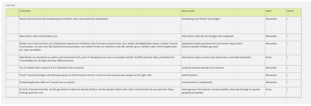
Please recall your experience and takeaways from your first testing session: What are things you would like to do differently this time?

Prepare all documents (script, consent form, …) you will need during the test session:

  • What documents do you need?

script, consent form, observation coding form, ueq short german version

  • This time, you will measure the effectiveness using the task completion rate. Please use the provided template (PDF, see below).
  • This time, you will also measure the satisfaction of users, by using a post-task or post-test questionnaire. Please choose independently what suits your project.
  • Which standardized questionnaire did you choose and why?

We decided to use the short version of the UEQ. We chose a post-test-questionaire, because we have only one functionality to test and our tasks are short. We like the short version better because the points to evaluate are better to differentiate then in the long version and the short version is enough for our small project. It is easier for us to compare the test results.

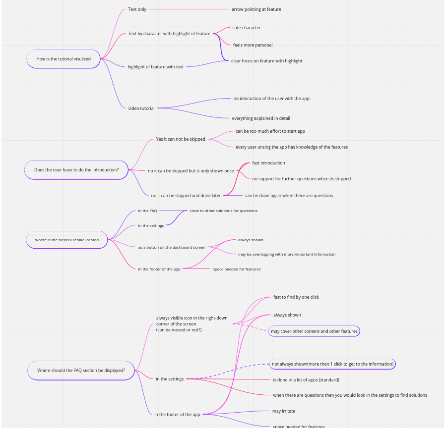
  • Document your preparation.

Skript Usability Testing

Herzlich Willkommen und vielen Dank, dass Sie sich die Zeit für diesen Test genommen haben. Wir sind … und möchten diesen Usability Test für unseren Unikurs Human-Computer Interaction durchführen. Im Kurs beschäftigen wir uns mit Digitalen Gesundheitsanwendungen, so genannten DIGAs. Die DiGA, die wir untersucht haben ist eine App zur Unterstützung der Rauchentwöhnung. Dazu haben wir einen Prototypen gebaut mit dem wir mit ihnen einen Usability Test durchführen möchten. Damit wir die Daten aus diesem Test auch verwenden dürfen, brauchen wir bitte die unterschriebene EInverständniserklärung. Bitte machen Sie sich keine Sorgen, dass Sie etwas falsch machen könnten. Wir testen nicht Sie sondern den Prototypen und ihr Verhalten hilft uns zu verstehen, wo dieser Prototyp noch verbessert werden kann. Wir werden Ihnen gleich Aufgaben stellen, die sie in unserem Prototypen ausführen sollen und wir möchten Sie darum bitten, dass Sie Ihre Gedanken während der Bearbeitung der Aufgaben laut auszusprechen.

AUFGABEN

Vielen Dank für Ihre Mitarbeit. Wir werden die Ergebnissein auswerten und in die Weiterentwickling unsers Projektes einbinden, um den Prototypen weiter zu verbessern.

Aufgaben

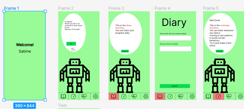
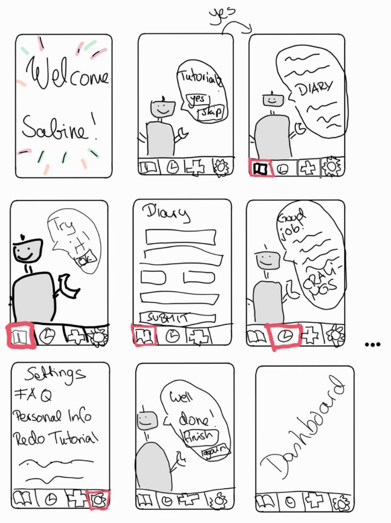
  1. main task flow: Bitte absolvieren Sie das Tutorial vollständig
  2. Bitte starten Sie das Tutorial neu
  3. Bitte fangen Sie das Tutorial an und brechen es an einer beliebigen Stelle ab
  4. Bitte überspringen Sie das Tutorial

[T3, A9] Prepare usability test

High Fidelity-Prototyp: https://www.figma.com/proto/vKlEYIkcpOjpLLNpAIOY6F/HCI-first-prototype?type=design&node-id=1-3&scaling=min-zoom&page-id=0%3A1&starting-point-node-id=1%3A3

Heuristic Evaluation Form: https://docs.google.com/forms/d/e/1FAIpQLSfYjptnWvuVZwWnj5XQnChkWsiv-P8ktnyN5SowfupHybUPiA/viewform

(1) Reflect on the results of the heuristic evaluation you conducted in class.

Bei der durchgeführten heuristischen Evaluation wurden verschiedene Bereiche identifiziert, in denen Verbesserungsbedarf besteht. Die Ergebnisse zeigen, dass das Design nicht auf allen Seiten konsistent ist. Das Design einiger Seiten weicht voneinander ab. Die Navigation auf der ersten Seite erfolgt durch Wischen anstelle von Klicken, was ebenfalls eine Inkonsistenz darstellt. In allen anderen Frames ist zum Navigieren bzw. Interagieren lediglich ein Klicken erforderlich. Die Kennzeichnung des der markierten Navigationselemente im Tutorial ist nicht auffällig genug und die Platzierung der Sprechblase des Roboters nicht auf allen Frames identisch. Die Position der „Weiter“-Buttons variiert auf den Sprechblasen der verschiedenen Screens und sollte einheitlicher gestaltet werden. Die „Weiter“-Buttons haben die gleiche Farbe wie andere Elemente, was ihre Sichtbarkeit verringert. Der „Zurück“-Button sollte eine relative Rücknavigation ermöglichen und nicht zu einem bestimmten Bildschirm führen. Des Weiteren wurden Kritikpunkte an der Gestaltung der Roboter-Grafik geäußert, da sie viel Platz auf dem Bildschirm einnimmt, jedoch keine zusätzlichen Informationen bietet. Bei Formularen ist der „Submit“-Button immer aktiv, obwohl keine Daten eingegeben wurden, was den Nutzer verwirren kann. Die Benutzerführung weist ebenfalls Schwächen auf. Bspw. wird der Nutzer beim Klicken auf „Skip Tutorial“ auf der ersten Seite nach keiner erneuten Bestätigung gefragt. Ebenfalls sollte eine Option zum Wiederholen des Tutorials vorhanden sein.

Zusammenfassend erfordern die Ergebnisse der heuristischen Evaluation Verbesserungen in verschiedenen Bereichen wie Designkonsistenz, Platzierung von UI-Elementen, Sichtbarkeit von Elementen und Benutzerführung. Diese Punkte sollten bei der weiteren Vorgehensweise berücksichtigt werden, um eine bessere Benutzererfahrung zu gewährleisten.

(2) Continue to improve your high-fidelity prototype.

Improvements / Areas we worked on:

CommentDone
First page is still in the old designx
Navigation on page 1 is different to all other pages (swipe instead of click)x
Marking of the footer icon is not eye catching enoughx
The speech bubble of the robot is too far left in comparisson with all other screensx
Robot graphics take up a large part of the screen without providing any additional information.x
Submit button in forms is active when there is no datax
Chosen point in diagram needs to be biggerx
Mission screen is not the same as in the original app. desing should not be touchedx
The „continue“ buttons are placed in different places each time, which can be a bit trickyx
The „continue“ buttons have the same color as most other elements. Not that visiblex
Back button should be a real back button (navigation = back and not to a specific screen)x
When you click „Skip Tutorial“ on the first screen, you are not asked again if you are sure you want to cancel the tutorial.x
Welcome text should have correct interpunctationx
No skip buttonx
The Continue button is somewhat lost here, since it is in a different place than on the other screens. It is also x
The Continue button has the same shade of green as the bar chart and is therefore not directly noticed.x
Cancel button x is not centered in headerx
Text in continue button should be bigger and better readablex
„Back“ button doesn’t feel like „Back“ buttonx
You can see pixels in robot icon. Need to be a bigger iconx
No question if we are sure we want to skip the tutorial in the beginningx
After finishing the tutorial, there is no possibility to repeat it.x
„Do you want to finish the tutorial?“ is separate page, doesn’t feel like warningx
Too sharp corners, rounded would look betterx
Oval as a Speech Bubble looks a bit primitivex

https://www.figma.com/proto/vKlEYIkcpOjpLLNpAIOY6F/HCI-first-prototype?type=design&node-id=1-3&scaling=min-zoom&page-id=0%3A1&starting-point-node-id=1%3A3

(3) Prepare another round of heuristic evaluation  (this time you test the interface of another group)

(4) Reflection

Wer hat welchen Beitrag geleistet?

Wir haben uns die einzelnen Punkte, die in unserem High-Fidelity-Prototyp verbessert werden müssen, untereinander aufgeteilt, sodass jeder ungefähr den gleichen Arbeitsaufwand hat.

Was habt ihr gelernt?

Wir haben gelernt was bei der Erstellung eines High-Fidelity-Prototyps wichtig ist und wie man ein Formular für eine Heuristische Evaluation entwirft.

Was lief gut?

Die Kommunikation im Team lief sehr gut. Wir haben und regelmäßig getroffen, um uns auszutauschen und an der Bearbeitung der Aufgaben weiterzuarbeiten.

Was möchtet ihr verbessern?

Wir möchten unser Zeitmanagement weiter verbessern, um zum einen die uns zur Verfügung stehende Zeit effizienter zu nutzen und zum anderen genügend Zeit für unerwartete Änderungen zu haben.

[A8, T3] refining the prototype

(1) List your various requirements elicited from the user research.

  • This step should be earlier in the process, as you know, but it is useful for focusing your work

  • it should be easy to understand how to follow tutorial
  • the most basic information should me explained/shown on each step
  • each feature in the down section of app has to be explained
  • by the end of tutorial user should be able to use the Smoke Free app on their own
  • Step-by-step instructions: The user wants simple and clear instructions to guide them through the registration process and tutorial. It should be clear that one has to swipe up to continue.
  • Skipping steps: There should be a button that allows the user to skip certain steps in the tutorial.
  • Show button functions: The users would like the ability to click on the highlighted button to view the functions while other buttons are disabled.
  • Additional information: In addition to health status, some users would like the ability to indicate other information such as cravings for certain foods.
  • Cancel tutorial: The user should be able to cancel the tutorial at any point.
  • Skip text inputs: It should be possible to skip certain input steps instead of having to enter something.
  • Go back to previous step: Users would like the ability to return to the previous step in the tutorial.
  • Clearer highlighting of buttons: The color of buttons should stand out more clearly to make them easier to see, especially for the colorblind.
  • Adaptations for people with visual impairments: Measures should be taken to ensure that colorblind people can easily recognize the buttons and markers.
  • Highlighting the save button: In the tutorial, the save button to save entered values should be highlighted more prominently, for example by making it larger.
  • Clarity and understandability: The tutorial should be easy to understand and comfortable for users.

(2) Decide based on your requirements and the insights from the low-fi prototype-testing what functionality to include in your high-fidelity prototype.

  • Consider your problem statement
  • What insights did you gain from the testing? What are your main takeaways?
  • Decide on an approach to select the most appropriate requirements (whatever appropriate means in your context)
  • asy to follow as you’re guided step-by-step through the process.

  • Skip step button.
  • Ability to click on the highlighted button to view its functions. Other buttons disabled.
  • Ability to cancel the tutorial at any point.
  • Option to skip input; not mandatory.
  • Option to go back to the previous step.
  • The color of the buttons is not prominent enough. Can be difficult for color-blind users to recognize see it.
  • Make the save button more noticeable (for example, larger), as this is a tutorial and it’s not clearly indicated that something needs to be entered.

(3) Define the major task flow you want to support.

  • Based on your scenario, describe at least two major task flows.
  • These descriptions will serve as task descriptions for the evaluators within heuristic evaluation next week.

Task Flow 1: Simplified Introduction

  1. User opens the SmokeFree app for the first time.
  2. After successful registration, the user is guided through the onboarding tutorial.
  3. The tutorial provides step-by-step instructions on using the app, including features like tracking smoking habits, setting goals, and accessing resources.
  4. The user completes each tutorial step, following the instructions and interacting with the app accordingly.
  5. Once the tutorial is finished, the user is directed to the app’s main dashboard, where they can access the full range of features and functionalities to aid in their smoking cessation journey.

minor task flow:

Task Flow 2: Revisiting Tutorial Steps

  1. User is actively using the SmokeFree app.
  2. While navigating through the app, the user realizes they have missed certain tutorial steps or information related to a specific page or feature.
  3. On the current page, the user looks for a dedicated option or button to revisit the tutorial steps.
  4. The user locates the „Tutorial Recap“ or similar option on the page and clicks on it.
  5. The app presents a recap of the tutorial steps associated with that specific page or feature.
  6. The user reviews the instructions, explanations, and interactive elements presented in the tutorial recap.
  7. If necessary, the user follows the instructions and interacts with the app to practice the steps covered in the tutorial.
  8. Once the tutorial recap is completed, the user can continue using the app with the refreshed knowledge and understanding of the missed information.
  9. If the user encounters another page or feature where they feel they have missed tutorial steps, they can repeat this process by finding the „Tutorial Recap“ option on that particular page.

(4) Start building your prototype. The UI should be clearly developed (consider all interaction, visual, and information design)

https://www.figma.com/proto/vKlEYIkcpOjpLLNpAIOY6F/HCI-first-prototype?type=design&node-id=1-3&scaling=min-zoom&page-id=0%3A1&starting-point-node-id=1%3A3

[A7 T3] prototyping


(1) Summarize the feedback you received on your storyboard.

During the last lab session, you collected feedback from your peers. Please summarize the feedback and document which feedback you will incorporate into your prototype.

The people giving feedback noted that the storyboard’s design and personalization were done well and detailed, offering a nice picture of the app guide. There was however a weak connection with the scenario, so there could be more description of Sabine’s thoughts and actions.

(2) Develop an interactive paper prototype.

You will develop a low-fidelity interactive prototype that represents multiple states or views. Think about your persona who wants to use your product: What are the minimum needs of your persona? What are the must-haves?

Please describe briefly:

  • Your prototyping process.
  • The use case this prototype addresses.
  • How the storyboard is reflected in your prototype.
  • A self-assessment of the potential strengths and weaknesses of this first step into your design space.

We started by deciding to use figma as a plattform to create our first prototype. We created accounts and a project. Then we all started creating the first flow in figma. After we had all the frames we continued to create components and started filling the frames with our desired content. We all worked on different aspects of the frames.

The use case of our prototype is a onboarding process of a user after the user registered and starts using the app. They will be greated by a tutorial but can decide to skip it.

Our Storyboard was already very detailed and very focused on the prototype. Therefore we just recreated the storyboard as the prototype.

The strengths of our prototype are clear user interactions and a straight forward user guidance. But it lacks a refined design.

https://www.figma.com/proto/vKlEYIkcpOjpLLNpAIOY6F/HCI-first-prototype?type=design&node-id=0-1&scaling=min-zoom&page-id=0%3A1&starting-point-node-id=1%3A3&show-proto-sidebar=1

[T3, A6] storyboards

1) Formulate a problem and hypothesis statement and document it.

Please use the template (shown in class) introduced in the lab session:

PROBLEM STATEMENT

Sabine needs a way to register easily in the app and to get a simple and understandable introduction because she decided to quit smoking, but due to her limited experience with smartphones, she could be overwhelmed by the many features of the app. We know that this is achieved when Sabine regularly uses the app and its functions.

HYPOTHESIS STATEMENT

We believe that by creating a good introduction for Sabine, we will achieve an easier onboarding for users so that more of them start using it regularly with understanding of basic app functionality.

(2) Create individual sketches.

  • Now it is time for solutions and first drawings!
  • Step 1: Look at your persona, your scenario and reflect on your problem/hypothesis statement, and focus!
  • Step 2: Each person in the team is drawing on paper (drawing on a tablet is also okay!) a solution he/she thinks would solve your problem.
  • Justify your first design rationales by documenting them using QOC.

Anna:

Henry:

Alexandra

(3) Share your sketches with your team.

  • Each person should present his/her first drawing to the other team members.
  • Select features and ideas you think should be part of your prototype.
  • You can use the dot-voting method again to make faster decisions.

(3) Condense your results from the previous step into a storyboard.

  • Check out the examples and hints on storyboards on the web…
  • You should not spend too much time with it, and your solution does not need to be perfect. We will continue working on that!
  • Synthesize your design rationales and document them using QOC.
  • This step aims to explain your idea/solution using the storyboard to your fellow students.

[A5, T3] creating a persona and a scenario

Derive a primary persona from your data-gathering insights

source of the profile picture: https://this-person-does-not-exist.com/en

Create a scenario that describes your vision of how your persona interacts with your

Sabine (42) erwachte am Morgen durch das penetrante Klingeln ihres Weckers und greift noch im Bett sofort nach ihrem Smartphone auf dem Nachttisch. Sie entsperrte es und öffnete die App SmokeFree, die sie von ihrem Hausarzt verschrieben bekommen hatte. Nachdem sie ihr morgendliches Verlangen nach einer Zigarette in der App notiert hatte, las sie die motivierende Nachricht des Tages und erinnerte sich daran, warum sie mit dem Rauchen aufgehört hat und nie wieder damit anfangen will.

Nachdem sie für sich und ihre Familie Frühstück gemacht hat spürte sie den typischen Drang, eine Zigarette zu rauchen. Aber anstatt nach der Zigarettenschachtel zu greifen, öffnete sie stattdessen wieder die App. Sie benutzte eine der Ablenkungstechniken, die die App anbot – ein einfaches Spiel, das sie ablenken solle. Nach ein paar Minuten hatte das Verlangen nachgelassen.

Anschließend bringt sie die Kinder zur Schule und zur Kita, fährt zur Arbeit in das Büro und fängt an zu arbeiten

Während der Arbeit bekam sie von ihrem Vorgesetzten die gewohnten Rauchpausen, aber statt mit den Kolleg:innen zur Raucherecke auf dem Firmenparkplatz zu gehen, nutzte sie diese Pausen nun, um einen kurzen Spaziergang zu machen und frische Luft zu schnappen. Sie nutzte auch eine der Atemübungen, die ihr die App vorschlug, um Stress abzubauen.

Am Ende des Arbeitstages überprüfte Sabine ihre Statistiken in der App. Sie hatte heute keine einzige Zigarette geraucht und die App zeigte ihr, wie viel Geld sie dadurch gespart und wie viele Minuten ihrer Lebenserwartung sie theoretisch „zurückgewonnen“ hatte. Dieses positive Feedback motivierte sie und gab ihr die Bestätigung, dass sie auf dem richtigen Weg war. Sie fährt nach Hause, wo ihre Familie bereits auf sie wartet und sie verbringen zusammen den Abend

Vor dem Schlafengehen öffnete Sabine noch einmal die App und las eine weitere motivierende Nachricht. Sie konnte sehen, dass sie Fortschritte machte und dass ihr Ziel, für rauchfrei zu sein, in greifbare Nähe rückte. Sie schloss die App und legte ihr Smartphone auf den Nachttisch, bereit, am nächsten Tag wieder der Versuchung zu widerstehen und ihren gesünderen Lebensstil fortzusetzen.

[A3, P3] Assignment 3

Define the goals of your data collection session.
What do you want to find out? These goals should be based on your project goals.

Enhance the user guidance and support features of the „Smoke free“ app by integrating the next features:
– a short guide of using the app
– daily tracking with motivation section, and advice

Therefore we want to find out more about our target group. For example what are their reasons for quiting, if they quit smoking before and why they went back to smoking. Furthermore we want to find out if they know about apps that support you or if they already tried them.

Based on your goal, derive the stakeholders you want to collect data from.
What are your stakeholders? Whom do you need to approach (i.e., who is indispensable for your achieving project goals)?

Our main target group are people who want to quit smoking, but it would also be interessting to talk to people who quit before (successfully or not) to see patterns that helped them or reasons why they were unsuccessfull.

Start with collecting information without approaching your stakeholders (so-called secondary data collection). Use existing websites, app information, and experience the app by yourself. Describe the app you are using in detail (who has developed the app, why, what functionality is available, how can people access the app, etc.)

Prepare an interview study with your primary stakeholders.
Name the stakeholders and explain, why they need to be interviewed. Explain, how you want to contact them.

Our main stakeholders are current smokers and smokers that want to quit. They need to be interviewed because we need to understand the reasoning for quitting and failed quitting attemps so we can fill the gap with the app. Furthermore we need to see if they see an app as a possible support of their quitting journe. Also we need to see if our stakeholder group is correct or if we need to talk to a other subgroup (e.g. longterm smokers or smokers in a certain age)

Justify the type of interview (structured, unstructured, semi-structured).

In our case, a semi-structured interview is the best choice as it allows us to get some general info about person’s smoking routine as well as to focus on each person’s case individually.

Prepare the introduction and the closing session as well as the consent form as well as the questions (the interview should be 20 to 30 min long)
Describe how you plan to conduct the interview (Who is taking notes? How do you take notes? Who is asking questions?)

Einleitung:

Guten Tag Herr/Frau XY,

herzlich Willkommen und vielen Dank, dass sie sich die Zeit für dieses Interview nehmen. Wir sind … und möchten dieses Interview für unseren Unikurs „Human-Computer Interaction“ an der Freien Universität Berlin führen. Im Kurs beschäftigen wir uns mit Digitalen Gesundheitsanwendungen, so genannten DIGAs. Die DiGA, die wir untersuchen möchten ist eine App zur Unterstützung der Rauchentwöhnung und daher möchten wir ihnen einige Fragen zu den Themen Rauchen und Rauchentwöhnung stellen. Damit wir die Daten aus diesem Interview auch verwenden dürfen, brauchen wir bitte die unterschriebene EInverständniserklärung. Außerdem möchten wir das Gespräch, das ca. 20 bis 30 Minuten in Anspruch nehmen wird, gerne aufzeichnen. Ist das für Sie in Ordnung?

Einverständniserklärung

Demographische Fragen:

  • Wie viel rauchen Sie pro Tag/pro Woche/pro Monat?
  • Welche Tabakprodukte konsumieren Sie?
  • Wann haben Sie mit dem Rauchen angefangen
  • Warum haben Sie mit dem rauchen angefangen?

Fragen zur Rauchentwöhnung:

  • Haben Sie schon einmal mit dem Rauchen aufgehört oder versucht mit dem Rauchen aufzuhören?
    • Wenn ja: Welche Hilfsmittel (Apps, Nikotinpflaster ect.) oder Unterstützungsangebote(Gruppensitzungen, Raucherberatungen) haben Sie bei der Rauchentwöhnung wahrgenommen?
    • Was waren Ihre größten Probleme bei der Rauchentwöhnung?
  • Welche Hilfsmittel und Hilfsangebote zur Rauchentwöhnung kennen Sie?
  • Kennen Sie Apps, die bei der Rauchentwöhnung unterstützen können?

Outro:

Vielen Dank das Sie sich für das Interview zeitgenommen haben. Wir werden Ihre Antworten in den kommenden Wochen auswerten und in unser Projekt einbinden. Dürfen wir sie bei weiteren Fragen zu einem zweiten Interview einladen?

Reflexion

Wer hat welchen Beitrag geleistet?

We decided all together on the questions for the interview. Henry created the consent form, Anna answered the starting questions for the blogpost and Alexandra did the research concerning smoking-statistics (in germany, in the EU and worldwide) and wrote the introduction and closing session for the interview as well as the blog post

Was habt ihr gelernt?

We learned how to set up a semi-structured interview and how to formulate the proper questions for it. Furthermore, we learned how to create a consent form for an interview. We also continued to work with the app and became familiar with its functions.

Was lief gut?

The communication in the team worked very well. We were able to distribute the tasks evenly so that everyone had the same amount of work. We were also able to set up questions for an interview using the methods we had learned in the lecture. Furthermore, we were able to successfully create a consent form in which all data protection-related questions are clarified.

Was möchtet ihr verbessern?

We need to improve our time management so that there is enough time to review the answers and correct mistakes.

[A2, P3] Assignment 2

Main insights


The article highlights the importance of designing products and services with a human-centered perspective that prioritizes the needs and experiences of the people who will use them. This approach requires a deep understanding of user behavior and preferences, as well as a focus on empathy, collaboration, and iteration. The points that are important for a humanity-centered design approach include solving the root issues, focusing on the entire ecosystem, taking a long-term approach, continually testing the designs, and working with the community.

In our project, it’s important not just to think about solving smoking habits itself but to understand the root issue – what’s putting back people who try to quit smoking. And as a result, to provide an app that supports users and knows which problems they are going to have on their journey.

Useful resources

Sicherheitslücke edupression: https://www.heise.de/news/DiGA-Hacker-offenbaren-Sicherheitsluecken-in-Depressions-App-8989065.html

FaQ Diga: https://www.bfarm.de/DE/Medizinprodukte/Aufgaben/DiGA-und-DiPA/DiGA/_node.html

Nebenwirkungen rauchen aufhören: https://www.barmer.de/gesundheit-verstehen/psyche/sucht/rauchen-aufhoeren-koerper-1055172

Rauchen aufhören: https://gesund.bund.de/rauchen#nach-dem-rauchstopp

ePA: https://www.bundesaerztekammer.de/themen/aerzte/digitalisierung/digitale-anwendungen/telematikinfrastruktur/epa

Research article about the relative effectiveness of a full versus reduced version of the ‚Smoke Free‘ app: https://www.researchgate.net/publication/327810529_Relative_effectiveness_of_a_full_versus_reduced_version_of_the_’Smoke_Free’_mobile_application_for_smoking_cessation_a_randomised_controlled_trial/fulltext/5ba5a410a6fdccd3cb69e679/Relative-effectiveness-of-a-full-versus-reduced-version-of-the-Smoke-Free-mobile-application-for-smoking-cessation-a-randomised-controlled-trial.pdf

Does the addition of a supportive chatbot promote user engagement with a smoking cessation app? An experimental study: https://www.ncbi.nlm.nih.gov/pmc/articles/PMC6775545/pdf/10.1177_2055207619880676.pdf

W-questions

What is the challenge you would like to tackle?
First, we would like to provide a user with a short instruction on how to use the app. The content library and dashboards should be improved to make it less overwhelming and intuitively understandable. We want a person to feel the guidance, support, and efficiency of using the app. That’s why our goal is to connect the daily tracking with the motivation section and some advice – all of which are now separated.

Why do you expect your engagement to be useful?
The suggested changings in the app will make it more intuitive and supportive. As a result, people will be more likely to use it longer and quit smoking.

Who are your intended stakeholders?
Direct: smokers
Indirect: health institutions, doctors and hospitals, insurance companies, social circle of smokers, environment specialists, researchers, the tobacco industry, sustainability experts, human rights organizations (no more child labor on tobacco fields), government (regulation of cigarettes (see new zealand), fewer taxes), tobacco farmers, biodiversity experts (fewer tobacco fields mean more possible other plants on the fields), city cleaning service (don’t need to clean the waste of cigarettes)

Where is your user group interacting with your software?
At home, in the hospital, or on the go.

When is the user group interacting with your software?
Any time during the day when the user wants to fix the result, write some thoughts, see the progress, or get some advice. Possibly while being in the hospital.

Reflexion

Wer hat welchen Beitrag geleistet?

Wir haben gemeinsam zum Thema Rauchentwöhnung recherchiert und einige relevante Studien gesammelt.
Alexandra hat sich mit den für unsere App relevanten Stakeholder und den 5 W-Fragen beschäftigt.
Anna hat die Reflexion geschrieben und sich um die Aufbereitung der Informationen für den Blogpost gekümmert. Henry hat hilfreiche Informationen zum Zulassungsverfahren von DiGAs gesammelt.

Was habt ihr gelernt?

Wir haben uns mit der DiGA „Smoke Free“ intensiv beschäftigt und sowohl gelernt, welche Funktionen diese bietet, als auch wie ihr Bezahlmodell funktioniert. Ebenfalls haben wir gelernt, welche Voraussetzungen eine App mit sich bringen muss, um als DiGA zugelassen werden zu können, als auch was die Unterschiede zwischen einer vorläufigen und dauerhaften Aufnahme sind.

Was lief gut?

Wir konnten uns schnell auf eine konkrete DiGA festlegen. Ebenfalls haben wir ein Miro-Board angelegt, um stets einen guten Überblick über unsere gesammelten Quellen als auch gewonnenen Erkenntnisse zu haben.

[A1, P3] basics to ePa and DiGA

Teilaufgabe 1: uns ist noch kein Teamname eingefallen 🙁

Teilaufgabe 3: The electronic patient record (ePA) and digital health applications (DiGA) are two digital health initiatives in Germany. The ePA is a digital health record that allows patients to store and share their medical data with their healthcare providers. Patients can use the ePA to manage their medication, access test results, and view their vaccination records. The DiGA is a digital health application that is designed to improve patient health outcomes and are eligible for reimbursement by German health insurance companies. DiGAs can be used to support the treatment of chronic diseases, mental health issues, and other conditions. They can also help patients manage their health and wellbeing through various digital tools, such as tracking their symptoms, providing educational content, and enabling telemedicine consultations. Overall, both ePA and DiGA aim to improve patient care and outcomes in Germany. While ePA focuses on the storage and sharing of medical records, DiGA offers a range of digital tools to support the treatment and management of various health conditions.

Teilaufgabe 4: We decided to do our prject on the DiGA: Smoke Free

What is the challenge you would like to tackle?
The Dashboard is overwhelming and overall the app seems to have a lot of functionality that is not explained. We would like to introduce an instruction/tutorial to guide new users through the functionality the app provides.

Why do you expect your engagement to be useful?
we want to make the user experience for the app better, so that people use it for a longer time and reach their goal to stop smoking.

Who are your intended stakeholders?
smokers, health institutions, maybe doctors,

Reflexion:

Wer hat welchen Beitrag geleistet? All of us did the research for Task 3 and searched for a fitting DiGA. Anna and Alexandra wrote the blog entry. Henry found the DiGA we want to use,

Was habt ihr gelernt? We improved our knowledge about ePA and DiGA. We learned how to write this blogentry 🙂

Was lief gut? We had a good process to decide on a DiGa for the project

Was möchtet ihr verbessern? We want to improve our communtcation skills, so we can work better together.