1. Summarize the feedback you received regarding your storyboard
From the feedback, that we received from our peers, we gathered some clues that we did not think about before.
- The political compass should be explained. The users may not know what political compass actually is and as they are introduced with this idea on our app, they should be informer or guided through it so they can get the most of the experience.
- In our storyboard we showed many features of our app and what user can do but we did not specify what is the landing page when the app is opened. As from this point the whole interaction with our app starts, we should emphasize it more in our prototype.
- The distribution of article count should be two dimensional. On our storyboard we showed general count of how many articles refers to the topic, but it would be more useful to visualize, i.e. which side of the political compass has more articles . We could use a heatmap for this. It gives overall view which side talks more about particular topic.
2. Develop an interactive paper prototype
- your prototyping process.
In our prototyping process we had a look on the feedback we received from our peers. We decided that we will base on what we did in the storyboard. With this as the fundamental part we could include clues from feedback and create a prototype basing on the use case from previous assignment. Instead of many features shown individually on the storyboard we condensed it to simple prototype with Figma web application.
- the use case and/or model (task analysis from last assignment) this prototype relates to.
In terms of use case we do not lead users what to do, but rather give them options to move around our platform. We do not want to make them read particular articular. After entering their article they get an overview of political compass through tab “Stats”. From there they can choose if they want to read an article and which.
- how the storyboard is reflected in your prototype.
While storyboard showed overall of our apps features, in prototype we condensed it to the case when the user wants to use the app by typing in the article URL and what can happen after that. The protype is strongly based on the storyboard and contains features implemented there.
- self-assessment of potential strengths and weaknesses of this first step into your design space.
We believe that the idea of our app is quite straight-forward: user types in an article, get an overview of the situation on political compass and reads other articles. As our goal is to achieve unbiased opinion by the user, the app can not be biased in any way to influence the user. With the prototype that we created so far, we are meeting this requirement.
On the other hand it is hard to determine how accurate political compass positioning can be. The question is how to evaluate articles truly unbiased. Also our drawing skills may not be perfect ones, so it is hard to express our idea fully in this type of prototype.
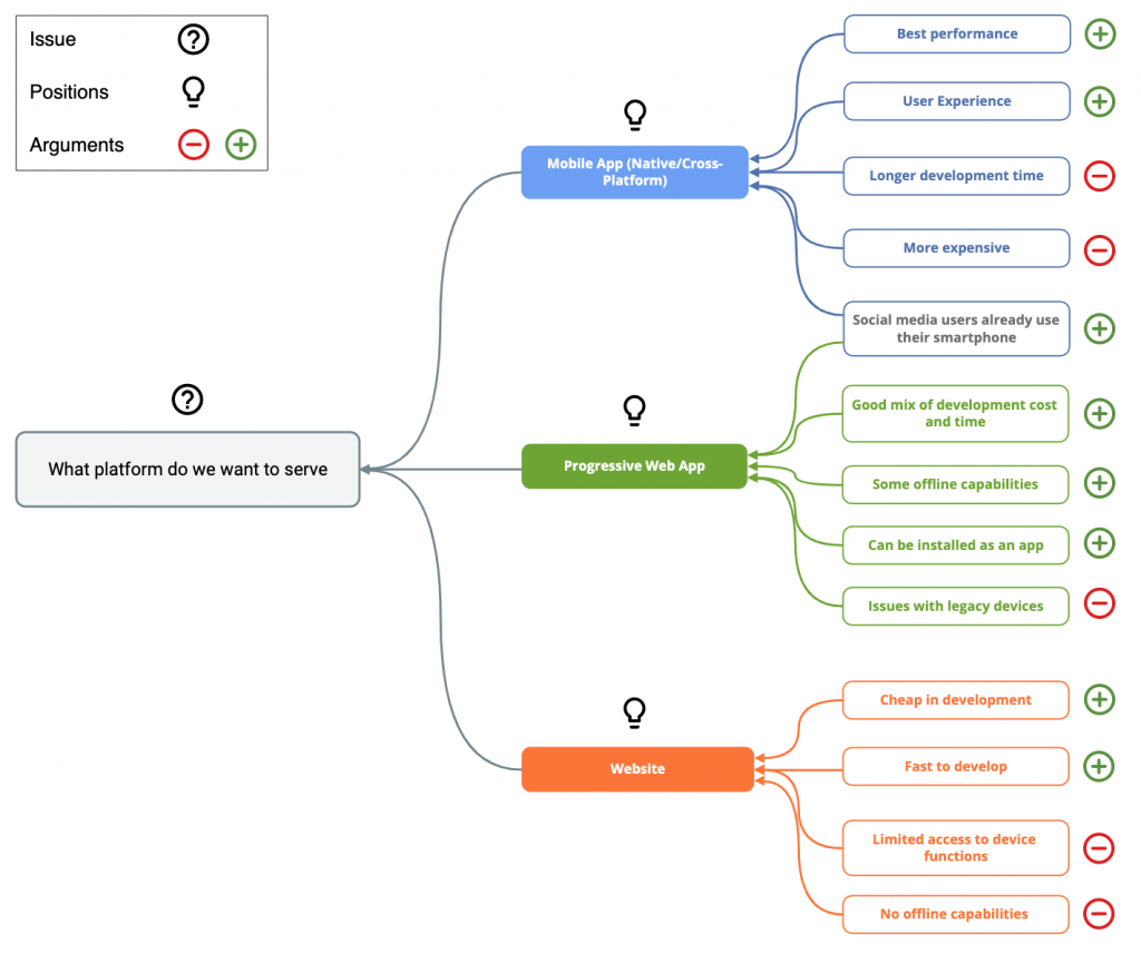
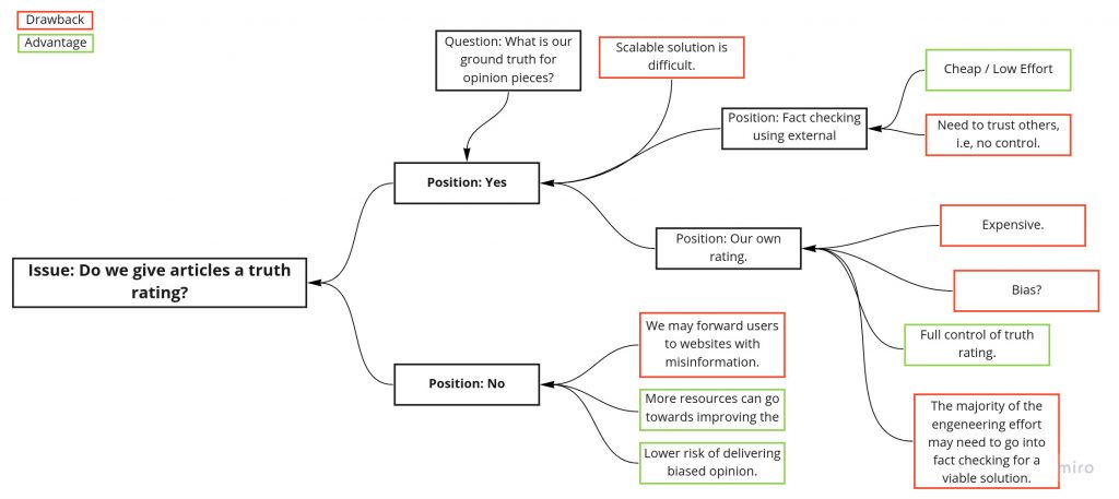
3. Design rationales
To design our rationales for our questions we used structure-oriented technique, QOS.
Reflexion
Who made what contribution?
We met on our weekly meeting straight after the tutorial on Tuesday. We went through assignments together and discussed about the tasks. We gathered all the ideas and prepared draft of the prototype and design rationales. As only Clemens attended the tutorial, he was responsible for gathering the feedback from other students. Daniel prepared the design of prototype, Clemens and Arne prepared visualization for design rationales and Mateusz gathered all together and prepared the blog post.
What did you learn?
Sometimes we have the feeling that we could already go to the next steps and some of the tasks are repetitive. However, we are learning how to be patient and we see advantages of low-fidelity prototyping. We could focus in trivial aspects of our domain and thanks to feedback from other students make changes to our project that did not required stepping back in the design process. At this level we can still form our design and it does not cost us in terms of time and effort already taken in the project.
What went well?
We are happy with how our idea is developing and our understanding of it through different assignments. Apps that are linked in the assignments are helpful and it is easier to visualize what we have in minds.
What would you like to improve?
There was a serious lack of communication last Tuesday and in result only Clemens was present on the tutorial. This definitely can not happen again. Through different aspects we divided our work not evenly on last two assignments and we did not have problem with at a time. However, for our own best and learning the skills from assignments, we need to distribute work better and every week each of us needs to have the same involvement in the project.