[A#10, P7] Veritas – Evaluation and Project Description

(1) Evaluate your test results.

What method(s) did you use to evaluate the results of your usability tests?

We first wrote down all our notes. As there weren’t many notes (14 in total), we skipped all more complex evaluation methods and simply discussed all notes in the group. We also used a post-test questionnaire (UMUX) to get feedback from users after the test. The questionnaire consisted of questions regarding their feelings after first contact with the app. 


How did you evaluate the results?

We found main points that we all agreed on were relevant in terms of the conducted tests. Those issues were the most problematic for users during the tests. We used them to make final touches on our prototype. We also retrieved positive points to evaluate what went correctly and was met with approval from our users. From all information gathered we extracted the main takeaways and applied them in the prototype.

What did you learn from the testing?

  • Overall, users found the app very easy to use (all users surveyed ‘strongly agreed’ to that statement in the post-test survey) and one mentioned it was intuitive.
  • All surveyed users disagreed with the statement: Veritas is a frustrating experience
  • the info-button was not clickable, but only the text. Two users clicked solely on the button, though, and assumed that it didn’t work
  • One user criticized that the onboarding screen (how to use the app) didn’t show the current site and that they had the urge to skip it and jump right into it. This reminds us of heuristic evaluation: showing the system state is part of Nielsen’s heuristic.

Just speaking from usability in the narrow sense, we are fairly confident that the app was easy to use and well designed.

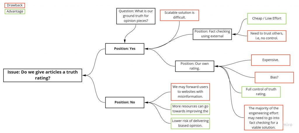
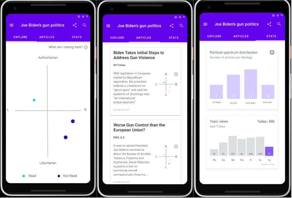
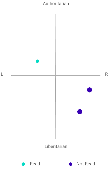
However, many users doubted the usefulness of the political compass. Many users wished for an explanation in regards to how articles are positioned. One user rejected the idea of the political compass altogether. Alternative solutions suggested were to show more “political dimensions” (in a radar chart). We feel that this would hinder the interpretability even more though. Still, one user explicitly and without us asking mentioned that they’d use the app. Another also said he would maybe use it. 

The testing itself was quite relaxed and the participants were well-informed in political topics and, as such, very interested in our app. This made for a good user group. The tasks didn’t quite fill their purpose. The users usually only worked for about 1 or two minutes per task. The thinking-aloud part was not done consistently. When asked about their opinion afterwards though, the users were eager to give additional feedback.

What are your main takeaways?

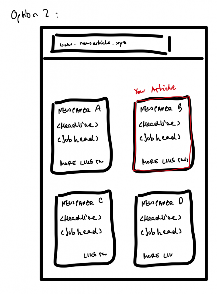
  • The political compass – our key feature in some sense – is controversial.
  • All participants questioned on which factors the articles get placed on the political compass. We should portray this information in our App.   
  • UX-wise we did a fairly good job 🙂

(2) Project description

Prototype:

Unique Part:

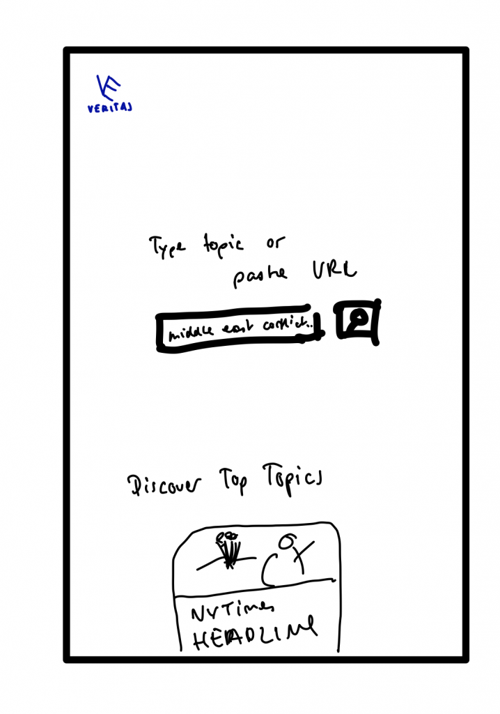
Name: Veritas – Escape your filter bubble today

Group Members: Arne, Clemens, Daniel, Mateusz

Project Description: Today’s news is often inherently biased and lacks nuanced journalism. Some more, such as breitbart news, and some less, such as reuters. With the recent surge of social media, a large share of unsuspecting readers fall into a so called filter bubble, i.e., they only see news of specific political backgrounds, which they are anticipated to like. Some think, this may lead to political extremism, further deepening preconceived opinions and ideas. 

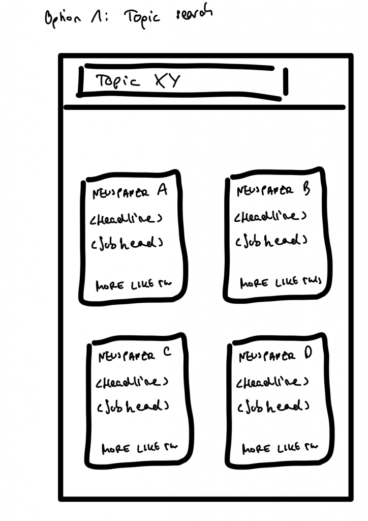
Veritas is a tool that makes it easy for users to explore opinions and articles in all corners of the political spectrum. You give Veritas a topic and it presents you a large collection of articles on the given topic that cover a diverse set of published viewpoints.

Final Prototype: https://www.figma.com/proto/xqMeWV6kxUEShVbQSxePjD/THE-INVINCIBLE?node-id=167%3A178&scaling=scale-down&page-id=0%3A1

(3) Reflection

Who did what?

Arne, Daniel, and Mateusz evaluated the test results. Clemens wrote the project description and reflection.

What did we learn?

We learned about the Smartspider which is a different type of political compass.

What went well?

We split up the tasks well and everything was on time.

What can be improved?

When we have time, we consider improving our prototype further because it still lacks some realism.

[A#9, P7] Preparation of a summative evaluation

(1) Improve your high-fidelity prototype

Group 3 mentioned that clicking on the same tab from different screens led to different results.

Feedback from group 3

Updated Prototype

Why is this the biggest problem for your users?

This is the biggest problem because it deviates from the expectations of the user, thus potentially confuses them.

How will you solve it?

We followed their recommendation and made the state constient by removing the forgotten link we still had active in figma.

How do you expect the user will behave, after the problem is solved?

Thanks to the added tutorial at the beginning of the interference with our app, the user is guided how to start using the app. The layout of our diagrams is consistent now and follow general guidelines on which we decided. 

Decide what usability issues you are going to fix in your prototype and what features you are going to implement next.

We implemented all of the three proposed fixes (add tour through the app at start, change one icon, fix one inconsistent screen), as they were small in scope and we saw their potential for improving the usability and understandability of our app.

(2) Preparation for a summative evaluation

What are things you would like to do differently this time?

The tasks were formulated too specific. For example, 2 b) was:

“Schaue dir die Statistik zu diesem Thema an”

We wanted the user to acknowledge the “stats” tab but now we just told them to click on it. Instead, we should have formulated it like “get an overview of the number of articles” or similarly, so that it’s an actual behavior which might be observed in real users. 

Additionally, there were too many tasks compared to the small scope of the prototype.

What documents do you need?

Consent form:

6.1 Pilot Study Forms 

Think-Aloud and Interview Pilot Study – Consent Form
Sheet #1 

I agree to participate in the study conducted by the Human-Centered Computing Lab of the Freie Universitat Berlin. Participation in this study is voluntary and I agree to immediately raise any concerns or areas of discomfort during the session with the study administrators. 

I understand that all data gathered in this test, including sound records, will be anonymized. I am aware that results from these tests might be published. Please sign below to indicate that you have read and you understand the information on this form. 

Date:  ____________________
Please print your name:  ____________________
Please sign your name:  ____________________

Thank you! 

The Task Observation Form

We updated our script:

(1) Hinweise für den User

Small-talk

Disclaimer: “Wir testen die App, nicht dich! Fragen bitte gerne stellen, ich kann aber nicht versprechen, alle Fragen direkt zu beantworten! Bitte laut denken (Think aloud).”

(2) Kontext der Anwendung

Veritas ist eine App, die für alle gesellschaftspolitisch interessierten Menschen entwickelt wurde. Veritas bietet Usern die Möglichkeit, URLs oder Themen einzugeben. Den Usern wird dann ein umfangreicher Überblick über das Thema gezeigt.

Wie interessiert bist du an gesellschaftspolitischen Themen?

(3) Szenario(s) und 

Du bist auf der Website der NYTimes. Du liest einen spannenden Kommentar über Joe Bidens Waffenpolitik. Du findest den Artikel nicht sehr ausgewogen und würdest gerne andere Perspektiven über dieses Thema einholen.

Benutze die veritas-App, um ähnliche Artikel zu finden. 

(4.1) Aufgaben

  1. Lies einen Artikel, der eine gegensätzliche Meinung zu dem NY-Times Artikel hat
  2. Verschaffe dir einen Überblick, wie die Medien über dieses Thema berichten

(4.2) Post test questionnaire

https://forms.gle/9NYpoejYoFVRM9Js7

(5) Abschließende Fragen

Hast du noch irgendwelche Fragen oder Anregungen?

(6) Abschluss

Danke für deine Zeit

Which standardized questionnaire did you choose and why?

We used the UMUX questionnaire and adopted it to our needs: Link

(3) REFLEXION

WHO MADE WHAT CONTRIBUTION?

We met all together and analyzed the evaluation that we received from group 3 and decided what we need to change in our prototype. Daniel played the biggest role in working on the Figma prototype On another meeting we conducted preparations for summative evaluation. On all of that we worked together during the meetings. 

WHAT DID YOU LEARN?

We could retrospect assignment #6. After gaining more experience and knowledge about our project, we changed our approach in testing and restructured the tasks for the next testing session.

WHAT WENT WELL?

As we were quite happy with our prototype already, with tips from group 3 and our own conclusions, we made our prototype even better. 

WHAT WOULD YOU LIKE TO IMPROVE?

We could have split up the work as some of the points we did during our meetings didn’t require all of us at the same time.

[A#8, P7] Heuristic Evaluation

1) Continue to improve your high-fidelity prototype.

Our prototype was already almost ready to test. We only fixed a few errors and then called it done.

2) Conduct the first and second phases of a heuristic evaluation

Phase 1: Prepare

Phase 2: Evaluate (Individual Inspection)

The results of our individual evaluation are available here.

We tested the prototype of group Scenic Route and found violations in most categories. Most of the violations we found were of severity 3. We used the tasks from their assignment submission for our evaluation.

The descriptions of our violations and the Screenshots can be found at the bottom of the survey above.

We used screenshots-Chrome AddOn for screenshots.

A summary of important issues can be found here.

Reflection

Who made what contribution?

We discussed the tasks and Phase 1 together and the split up to do Phase 2 individually. Clemens wrote this blogpost.

What did you learn?

We improved our skills with Google Forms again and now know how to create multiple pages. It was also interesting to use the Figma prototypes of others as that gave us a better understanding on how we should adjust our prototype.

What went well?

Communication with the team again went well. Again, we are also happy with the direction that we are going to with the prototype and look forward to the feedback of other groups.

What would you like to improve?

We would like to improve the prototype further as it does not look as good as it could be.

[A#7, P7] Starting High Fidelity Prototyping

  • What framework or tools are you going to use? Why?

We used Figma to prepare our Hi-Fi prototype. It is a framework that we were familiar with from our paper prototype and there was no issues with working with use of it before.  Figma allowed us to use components based on styled guidelines compatible with official specs.

List your functional and non-functional requirements (features) you are planning to include in your High-Fidelity Prototype.

Non-functional requirements:

  • Simple to use (mobile + busy environments)
  • Explain the political compass

Functional Requirements:

  • Search articles via an URL
  • Search articles via topic search
  • List view of articles
  • View for a single article
  • View for the Topic(s)
  • View of the political compass
  • Statistics view for a topic
  • Allow feedback for article placement (article is not e.g. “left-authoritarian”)
  • Allow feedback for topic clusters (articles aren’t about same topic)

  • Gantt chart
  • Start building your prototype

https://www.figma.com/proto/xqMeWV6kxUEShVbQSxePjD/THE-INVINCIBLE?node-id=16%3A14&scaling=scale-down&page-id=0%3A1

Please answer the following question: How did you handle the topics: menu, UI consoles, and Design patterns?

  • What menu type did you choose and why?

We decided on slide menu which is inline with material design. As our user group is going to use mainly the platform on their phones, this type of menu will fit the best to scroll through the list of trending topics and article list.

We applied also top navigation for possibility to go to different options after searching an article by URL. Instead of putting everything on one screen, the user can choose what steps to take next.

  • Which UI controls are appropriate for your application and why?

As for UI controls we used buttons so the user can explore our platform easily and navigate through it. An example would be search button, which then opens text input field. This is another control in our prototype. Another example of a button is menu button that navigates to submenu.

By using top navigation we implemented tabs for features choose. Links allow user to go to chosen article and read it either on our platform or go specific website.

Radio buttons were used for feedback option to rate the articles placement.

  • Which design patterns are suitable for your application and which ones have you implemented or used? Why?

While designing the prototype we were basing mainly on the guideline that we accessed from Figma. These are icons used for the buttons and general layouts. Political compass and all the diagrams were designed by ourselves.

Reflexion

Who made what contribution?

We worked together on the HiFi prototype. Firstly we planned what components needs to be designed and applied. Then we assigned the tasks, so parts of our prototype, and combined them again together. While everyone contributed to the prototype, Daniel and Arne focused more on working with Figma, Clemens did a Gantt chart and Mateusz summed up our work in the blog post.

What did you learn?

We definitely improved our skills in Figma and be able to use more advanced tools included there. There was more components that we need than we expected, but this allowed us to go into detail with our work.

What went well?

Communication with the team went well. We are happy with the direction that we are going to with the prototype. There is of course still field for improvements, but our target should and will be achieved.

What would you like to improve?

After two weeks’ time our prototype could be looking better so we could be further with the advancement of the prototype. It still looks quite basic, but as mentioned before, this will be improved.

[A#6, P7] Paper prototyping and usability testing

(1) Continue to develop (or start a new) paper prototype based on new insights or feedback from your peers.

As there was no testing during last tutorial, we couldn’t gather any feedback to develop our paper prototype.  However, we implemented a few changes compare to last week.

This means couple of more slides on our paper prototype, so the idea and process of working with the political compass by the users is more clear.

https://www.figma.com/proto/AylGS7g48gD2JSY9URiizG/Veritas?node-id=7%3A10&scaling=scale-down&page-id=0%3A1

(2) Conduct (at least) 3 formative usability tests.

SCRIPT:

(1) Hinweise für den User

Small-talk

Disclaimer: “Wir testen die App, nicht dich! Fragen bitte gerne stellen, ich kann aber nicht versprechen, alle Fragen direkt zu beantworten! Bitte laut denken (Think aloud).”

(2) Kontext der Anwendung

Veritas ist eine App, die für alle gesellschaftspolitisch interessierten Menschen entwickelt wurde. Veritas bietet Usern die Möglichkeit, URLs oder Themen einzugeben. Den Usern wird dann ein umfangreicher Überblick über das Thema gezeigt.

(3) evtl. kurzer Fragebogen (Fragen zur Person)

Wie alt bist du?

Was studierst du?

(4) Szenario(s) und 

Du bist auf der Website der NYTimes. Du liest einen spannenden Kommentar zu einem Thema, das dich interessiert. Du findest den Artikel nicht sehr ausgewogen und würdest gerne andere Perspektiven auf dieses Thema einholen.

Benutze die veritas-App, um ähnliche Artikel zu finden. 

(5) Aufgaben

  1. Suchen mittels der Artikel URL aus dem Zwischenspeicher weitere Artikel
  2. Beschaffe dir eine Übersicht zu einem Thema
    1. Sortiere die Artikel nach “Opposite first”
    2. Schaue dir die Statistik zu diesem Thema an
    3. Finde andere Artikel indem du den politischen Kompass verwendest
    4. Kehre zur Startseite zurück
  3. Entdecke weitere Themen

(6) Abschließende Fragen

Hast du noch irgendwelche Fragen oder Anregungen?

(7) Abschluss

Danke für deine Zeit

ROLES

In terms of roles of moderator and observer during the tests we were changing positions each test. The tests were conducted in single sessions, so there was no confusion about that for our participants. We decided that Daniel, Arne and Clemens will be moderators for each test, as they are German speakers. This way the participants would feel more comfortable as they were German speakers and there would be less problems with understanding.

RECORDING

As our prototype is in digital form, all three tests took place online, through Discord platform, where our participants could easily share their screen with the prototype that was provided to them through link during the session. All of us could see how they go through our prototype, while thinking aloud, so there was no issue with taking notes during the test.

WHO AND HOW LONG?

ParticipantYingshanCharlotteEla
Age232923
OccupationStudent of BiochemistryFinished her history master and is now looking for workStudent of Chemistry
Facilitator-roleClemensArneDaniel
ObserverArne, DanielMateusz, DanielMateusz, Clemens
Time15 min16 min14 min

(3) Document and evaluate the results of your testing.

What method did you use to evaluate the results of your usability tests? How did you evaluate the results?

After conducting the usability tests we met for analyse of the results. We went through the notes together and thoroughly talked about them. There were also comments from our side, what we saw during the tests and how do we feel about usage of our prototype. From all these data we gathered, we extracted the takeaways.

What did you learn from the testing? What are your main takeaways?

It occurred that there were some issues with understanding the context of political compass and political spectrum. Some users might be not familiar with those terms and their functionality. As this appears to be a problem, political compass should be designed in the clearest possible way, so there would be no misunderstanding  or confusion for the users. Providing this tool is crucial for functionality of the platform, in order for users to extract the most during building their unbiased view on the topic.

One of the good ideas from our participants was to gather feedback from the users on the articles. Users could rate the positioning and effectiveness of political spectrum. This would help us in developing the platform.

Another problem appeared with the home screen of the platform. Our participants stated that without context it is hard to determine what is it about. This should be improved, however we believe that our users now beforehand what this platform is about and they go for our tool with an idea what do they want to achieve. Our “paper” prototype might have not been clear enough due to our manual skills with creating it.

In our paper prototype we focused mainly on the use case, when the user searches an article by an URL to explore particular topic. Our participants of the usability test pointed that the list of topics to explore should be developed in the prototype. This showed us that users would be interested also in this use case and it is worth to focus on that.

Other takeaways that were discovered from the usability test:

– On what basis is the topic shown on the explore view?

– Clicking on the small political compass on articles should be maybe also implemented in the political compass view

– Articles in Article list take too much space if there were too many articles

– Political spectrum in articles overview seen as key differentiator

Reflexion

Who made what contribution?

The script was prepared during last tutorial and we improved it afterwards before conducting usability tests. On our weekly meeting after tutorial we discussed the prototype again and Daniel made necessary changes. We conducted usability tests in separate sessions, the roles were pointed before in the blog post. We discussed and summarized the data from the tests together and Mateusz wrote the blog post.

What did you learn?

The usability test gave us different perspective on our prototype. For us, everything was clear and understandable as it is our idea and we are working on it for quite some time. As for the person that have first contact with this topic it appeared that some aspects are not that obvious. It gave us a lesson that we need to focus more on presentation of our idea. We do not want the future users to be discouraged by first interaction with our platform.

What went well?

This week there were no delays and lack of communication, so we are definitely happy about that. We improved ourselves on this aspect.

What would you like to improve?

The results from usability tests showed us what we need to work on. As mentioned above, users need to get better idea of the context of the platform.

[A#5, P7] First interactive low-fidelity prototype

1. Summarize the feedback you received regarding your storyboard

From the feedback, that we received from our peers, we gathered some clues that we did not think about before.

  • The political compass should be explained. The users may not know what political compass actually is and as they are introduced with this idea on our app, they should be informer or guided through it so they can get the most of the experience.
  • In our storyboard we showed many features of our app and what user can do but we did not specify what is the landing page when the app is opened. As from this point the whole interaction with our app starts, we should emphasize it more in our prototype.
  • The distribution of article count  should be two dimensional. On our storyboard we showed general count of how many articles refers to the topic, but it would be more useful to visualize, i.e. which side of the political compass has more articles . We could use a heatmap for this. It gives overall view which side talks more about particular topic.

2. Develop an interactive paper prototype

https://www.figma.com/proto/AylGS7g48gD2JSY9URiizG/Veritas?node-id=7%3A0&scaling=scale-down&page-id=0%3A1

  • your prototyping process.

In our prototyping process we had a look on the feedback we received from our peers. We decided that we will base on what we did in the storyboard. With this as the fundamental part we could include clues from feedback and create a prototype basing on the use case from previous assignment. Instead of many features shown individually on the storyboard we condensed it to simple prototype with Figma web application.

  • the use case and/or model (task analysis from last assignment) this prototype relates to.

In terms of use case we do not lead users what to do, but rather give them options to move around our platform. We do not want to make them read particular articular. After entering their article they get an overview of political compass through tab “Stats”. From there they can choose if they want to read an article and which.

  • how the storyboard is reflected in your prototype.

While storyboard showed overall of our apps features, in prototype we condensed it to the case when the user wants to use the app by typing in the article URL and what can happen after that. The protype is strongly based on the storyboard and contains features implemented there.

  • self-assessment of potential strengths and weaknesses of this first step into your design space.

We believe that the idea of our app is quite straight-forward: user types in an article, get an overview of the situation on political compass and reads other articles. As our goal is to achieve unbiased opinion by the user, the app can not be biased in any way to influence the user. With the prototype that we created so far, we are meeting this requirement.

On the other hand it is hard to determine how accurate political compass positioning can be. The question is how to evaluate articles truly unbiased. Also our drawing skills may not be perfect ones, so it is hard to express our idea fully in this type of prototype.

3. Design rationales

To design our rationales for our questions we used structure-oriented technique, QOS.

Reflexion

Who made what contribution?

We met on our weekly meeting straight after the tutorial on Tuesday. We went through assignments together and discussed about the tasks. We gathered all the ideas and prepared draft of  the prototype and design rationales.  As only Clemens attended the tutorial, he was responsible for gathering the feedback from other students. Daniel prepared the design of prototype, Clemens and Arne prepared visualization for design rationales and  Mateusz gathered all together and prepared the blog post.

What did you learn?

Sometimes we have the feeling that we could already go to the next steps and some of the tasks are repetitive. However, we are learning how to be patient and we see advantages of low-fidelity prototyping. We could focus in trivial aspects of our domain and thanks to feedback from other students make changes to our project that did not required stepping back in the design process. At this level we can still form our design and it does not cost us in terms of time and effort already taken in the project.

What went well?

We are happy with how our idea is developing and our understanding of it through different assignments. Apps that are linked in the assignments are helpful and it is easier to visualize what we have in minds.

What would you like to improve?

There was a serious lack of communication last Tuesday and in result only Clemens was present on the tutorial. This definitely can not happen again. Through different aspects we divided our work not evenly on last two assignments and we did not have problem with at a time. However, for our own best and learning the skills from assignments, we need to distribute work better and every week each of us needs to have the same involvement in the project.

[A#4, P7] Veritas – Ideation and Storyboard

Formulate a problem and hypothesis statement and document it.

Problem Statement

Mark needs a way to get a balanced overview on a specific topic because he would like to form an unbiased opinion. 

We will know this to be true when we see: can explore different sources for his opinion forming.

Hypothesis Statement

We believe that by building an intuitive overview site showing a range of news articles for Mark, we will double the diverse sources that Mark is using.

Conceptual models for task analysis

To create a conceptual model for the task analysis we opted for Hierarchical Task Analysis (HTA) because the tasks the user has to fulfill fit well into this format and we were already accustomed to this method.

https://cdn.discordapp.com/attachments/834058821948276749/842007298012741632/Sitemap_-_Frame_1.jpg

Find inspirations, analogies, and create a moodboard.

Next, we each worked 30 mins individually to find inspirations and envision what theme our application is supposed to have. Additionally, we look at other solutions out there and thought about how we can differentiate us from existing projects. We opted for simplicity and usability as main focus since this is what is lacking most on similar websites.

https://cdn.discordapp.com/attachments/834058821948276749/842019005766434856/dubidu_-_Frame_1.jpg

Create individual sketches.

After discussing our individual moonboards we again split up and tried to think of how the application should look like.

https://cdn.discordapp.com/attachments/834058821948276749/842658660673257472/2021-05-14-Note-09-03.png
https://cdn.discordapp.com/attachments/834058821948276749/842666485988982805/IMG_20210513_225335.jpg
https://cdn.discordapp.com/attachments/834058821948276749/842666488016011305/20210514_093424.jpg

Condense your results from the previous step into a storyboard.

After presenting the design to each other we decided to integrate the best of everything into our solution. The descriptions below the individual pictures describe the idea in detail.

https://cdn.discordapp.com/attachments/834058821948276749/843476600602361866/20210516_151319.jpg

Reflection

Who did what?

We did task 1 and 2 together as a group. We split and did task three individually and then discussed our individual results again as a group. Next, we split up again to do the individual sketches and later decided as a group how we want out application to look like. Arne then merged our ideas and what we discussed into one big, nice sketch. Clemens wrote the blog post.

What did we learn?

We learned how one can merge the vision of multiple people into one core idea and how we can create one UI where the ideas of everyone are somehow represented.

What went well?

The discussion as a group usually works very well. Everyone gets to share their opinion and we are usually all happy with the result. Also, everyone does their work on-time and with good enough quality such that we can focus on further steps when we meet again.

Where is room to improve?

We are sometimes not a punctual to our meetings as we could be.

[A#3, P7] Veritas – Conceptual Model

In the previous week we interviewed three students in our target group and conducted a public survey to get an overview on how the general public forms their opinion on political topics.

In total we received 122 responses to our questionnaire, of which 61% are male and 56% are students. Most of the participants (78%) are younger than 36 years.

1. Affinity Diagramming

Our questionnaire consists of 15 questions, including 13 multiple-choice questions and two text-field questions. We used the responses to the question What are your usual steps when trying to form an opinion on a controversial topic? as input for our affinity diagram because it received the most qualitative answers.

We used miro.com to sort through and categorize the responses. The below image shows the initial state of the diagram.

https://cdn.discordapp.com/attachments/834058821948276749/839150273712226334/Screen_Shot_2021-05-04_at_16.18.31.png
Initial state of the affinity diagram.

We sorted the responses into 4 major categories (gray/white) and 4 subcategories (colored). Unsurprisingly, the majority of participants responded that they Look up information when trying to form an opinion. The blue area contains participants that attempt to look up information of both sides of the story. This is our target group because they are willing to understand multiple viewpoints, but possibly lack easy access to websites across the political spectrum.

https://cdn.discordapp.com/attachments/834058821948276749/839150441895297038/HCI_-_3-2.jpg
Final state of the affinity diagram.

2. Primary Persona

To form a primary persona we used the responses from our three interviews and the average response to our questionnaire. The majority of facts about the primary persona in the following picture is directly based on responses, e.g. favorite apps and age. The the remaining facts, such as curious or helpful, are simply invented and thought to be well fitting.

https://cdn.discordapp.com/attachments/834058821948276749/839932574091706388/Screenshot_2021-05-06_at_20.20.30.png
Primary persona.

3. Scenario

To create a scenario for our persona we used our entire dataset and came up with a story aligns with the primary persona and attempts to describe how application is supposed to be used. WHAT questions are printed in bold and WHERE/CONTEXT questions are printed in italic font.


Each work day when Mark commutes to university with public transportation, he quickly checks his Reddit feed for some minutes in between transfers. On his favorite subreddit, /de, he finds entertaining content. Many posts contain political content, often directly referencing news articles, and comments of other users. Mark wants to read about other perspectives off one post he deems opinionated. He uses the share button provided by Reddit to share the URL of the newsarticle with the app VERITAS. There, he gets an overview of other articles about the same topics. He can easily discern the political positions of the post on Reddit and other articles.
After a long day of studying, Mark is laying in his bed, about to sleep. He just wants to briefly check his Instagram before. He sees an interesting post about US politics liked by one of his friends. The post has some images with text describing a controversy about a US politician. He finds the information shocking and wants to read more about it. He uses VERITAS to loop up the topic he is concerned about and gets a collection of articles he can briefly skim over.


4. Two Use Cases

The following UML diagram depicts two use cases: (i) the administrator updating articles on the political spectrum and (ii) the potential user of VERITAS search, rating, and reading articles.

https://cdn.discordapp.com/attachments/834058821948276749/839935784185495603/Veritas_UML.jpg
Two use cases for our potential user and the administrator of VERITAS.

Reflection

Who did what?

First, we sat together to discuss the results of the interviews and questionnaires. After we selected the responses to put in the affinity diagram we categorized them. After that we split the tasks between us: Arne worked on the primary persona, Daniel wrote the scenario, Mateusz created the use cases, and Clemens put everything together in a polished blog post.

What did you learn?

We were excited to learn about affinity diagrams. Although initially skeptic about its scalability and usefulness, we soon found it to be useful and quickly got a nice overview of the responses.

[A#2, P7] Veritas – Data

  • Project 7
  • Week 2

  • Define the goals of your data gathering session.
    The goal of our study is to gather information on how people of age group 50+ form their opinions on political topics, i.e., how many and which sources are used. Additionally, we attempt to find out whether they consider their own opinion biased or balanced. We want to also know how they life in social media looks like and their daily usage of news.
  • Based on your goal, derive the kind of people you want to gather data from.
    We needed people of age 50+ for our interviews. Survey, however, was sent to wider range of people to get bigger picture on the problem. Through this survey we were also looking for participants over 50 years old.
  • Decide on your data gathering method.
    We use two methods. First, we conduct a questionnaire targeted at the general public, which we will post on forums and mailing lists. In parallel, partially based on preliminary results from the questionnaire we conduct in-depth interviews with multiple participants of our target group of age 50+.

    Our interviews are semi-structured. We decided, since we are going to talk about politics, we need to give our interviewed a space for longer responses and to share their opinion on the problem.
  • Decide how you handle the topics pilot study & data recording.
    For data recording we used: Audio recording and notes for personal interviews and video recording for a remote interview. Achieved transcription from the interviews will be used as a main source for us.

    We use Google Forms as questionnaire software. They will provide us with categorized and counted solutions in the form of Excel sheet. We will be working from there on the next assignments.

Reflection:

We took our time to rethink thouroughly the questions for participants of our survey and interview. There was a lot of brain storming to decide what data do we want to gather from the public. Working together on the file was very helpful and time saving.

What surprised us, was the response for our survey. We got more replies than we expected and we hope that this is going to make our work more clear in next assignments. Our topic is definitely a wide area and a controversive one. We hope for more questions to answer and more solutions to provide.

In terms of how the interviews went, we are happy how did it go and with data we were able to gather. Some information and ideas came up during them, that we didn’t predict before. The biggest struggle was avoiding leading questions, as the main topic is politics and media, where each person can have it’s own, original opinion.

Also thanks to the survey we conducted, we could get a feedback from our responses about the questions and the problem. Opened questions in the survery, allowed our responders to state their opinion and some of them we followed up by the discussion on our meeting.

[A#1, P7] Veritas

  • Project 7
  • Week 1
  1. Who is your user group?
    Anyone interested in politics and news.
  2. What is the exact problem?
    Today’s news is often inherently biased and lacks nuanced journalism. Some more, such as breitbart news, and some less, such as reuters. With the recent surge of social media, a large share of unsuspecting readers fall into a so called filter bubble, i.e., they only see news of specific political backgrounds, which they are anticipated to like. Some think, this may lead to political extremism [https://www.connectsafely.org/social-media-can-lead-to-political-extremism/], further deepening preconceived opinions and ideas. Anyone interested in politics and news.
  3. Where is your user group interacting with your software?
    When the general public are using, e.g., social media, and want to fact check an article or get a different view on the topic the article is about.
  4. When is the user group interacting with your software?
    The “check” might be both 5 minutes for the particular single news and also longer time, depending on how much the user wants to learn about different sources.
  5. Why do your users need this software?
    We believe that the majority of readers in filter bubbles are simply unaware of other political views, but when notified of their biased opinions, are willing to get an overview of the entire political spectrum. Usually, people seek to find out the truth, making this software particularly interesting.
  6. How do you want to solve the problem?
    We want to provide a web page where users can provide an url of an article which, then, gets placed onto a political compass. Other articles of the same topic will be shown on the compass too.

Reflection

On our first meeting we decided to give ourselves some time to come up with ideas and look for possible interviewee. We presented each idea and after thorough discussion agreed on the final one that we will work on during the semester. We considered all the pros and coins and general details that we need at this stage. Formulating the pitch was quite straightforward after that. As our users group is quite wide we need to definitely work on narrowing this group of interests before starting gathering the data.