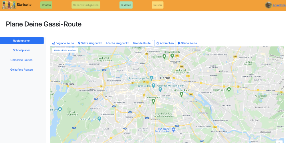
(1) Evaluate your test results.
What method(s) did you use to evaluate the results of your usability tests?
We used the method introduced in Assignment #6 for this evaluation too because we received very good feedback after presenting it to our other fellow students and we believe it fits to the other methods given in this assignment.
How did you evaluate the results?
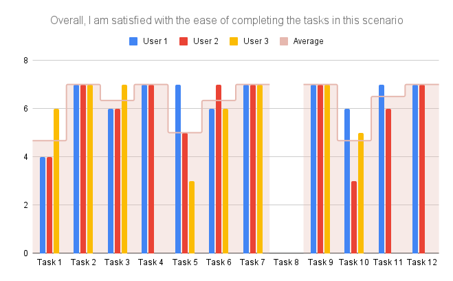
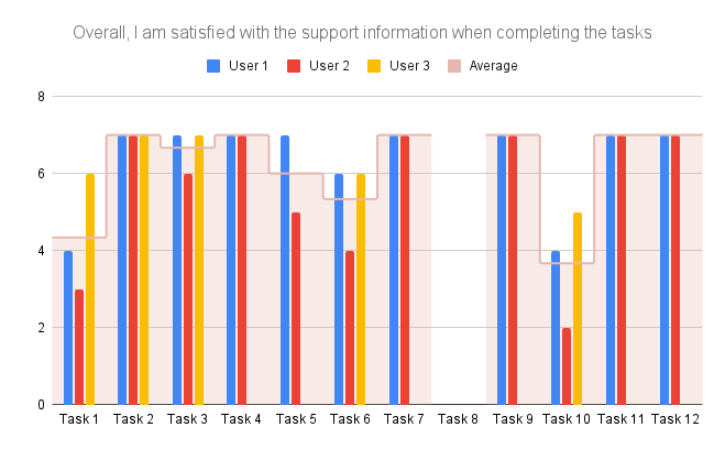
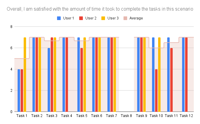
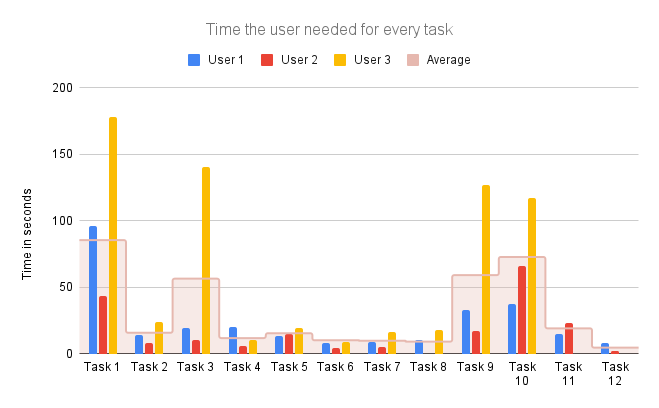
After filling in the formulas provided we expanded it with our difficulty estimation and with both we created the following table to summarize the results:
| Task | Notes | Take-Away |
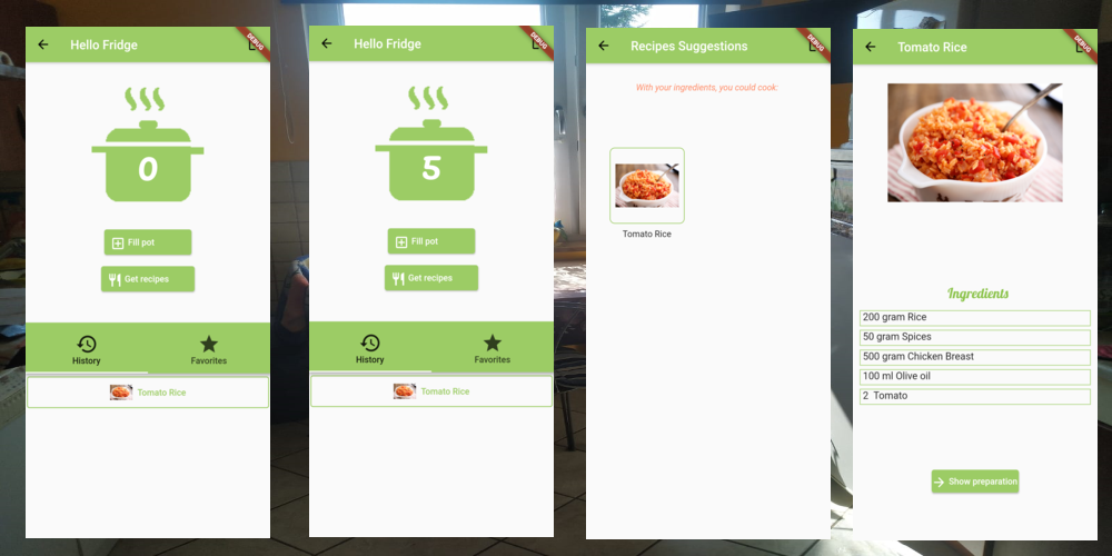
| Log-in | No option to log-in without google or social media. | Add more anonymous way or even without log-in. |
| Figure out what is the last recipe you cooked | – | – |
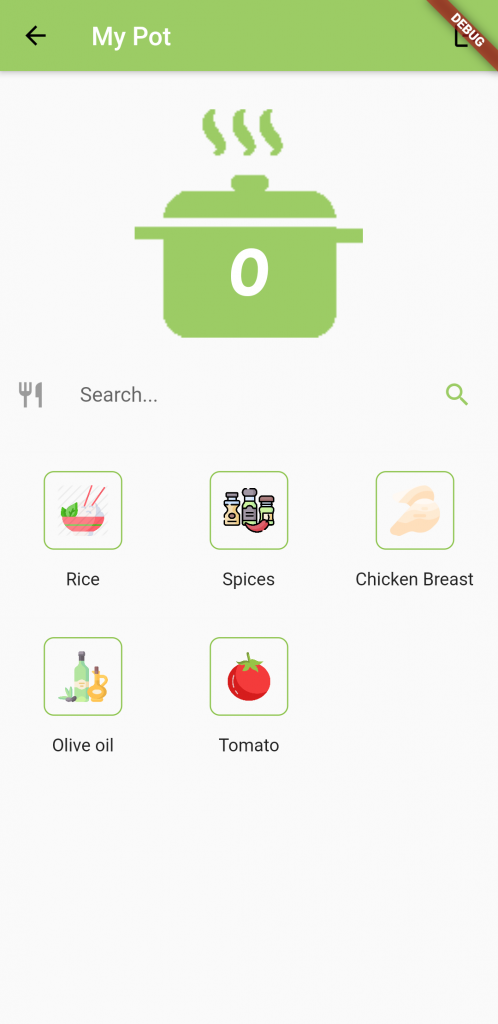
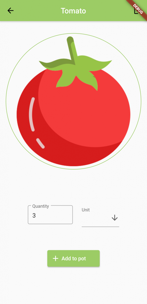
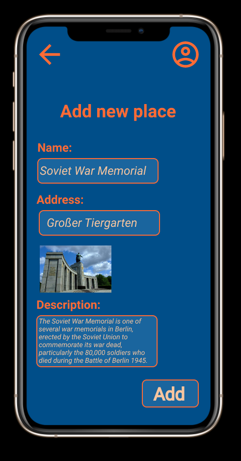
| Add ingredients | Ingredients doesn’t have unit. This confused the user since it is not consistent with other ingredients. Additional after adding the users are confused why the home-screen is the next one and not the fill-pot-screen. | No drop-down when no unit. Test person should stay in FillPotLayout when adding an ingredient. App bar name should be Fill Pot and not My Pot when searching for ingredients |
| Access pot | No indication that the pot is clickable. | Add tutorial. Not-clickable with grey color could work too. |
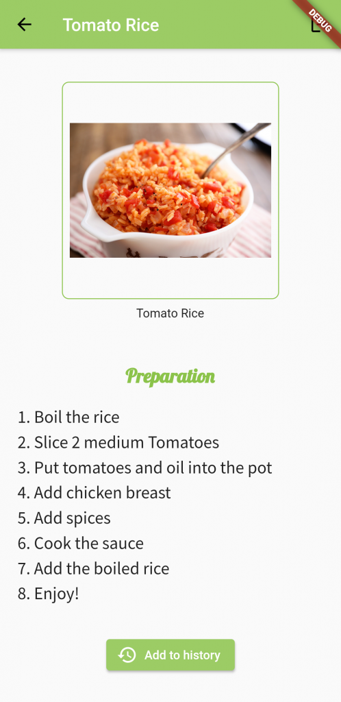
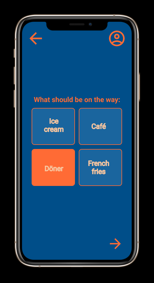
| Get recipe | – | Add more content |
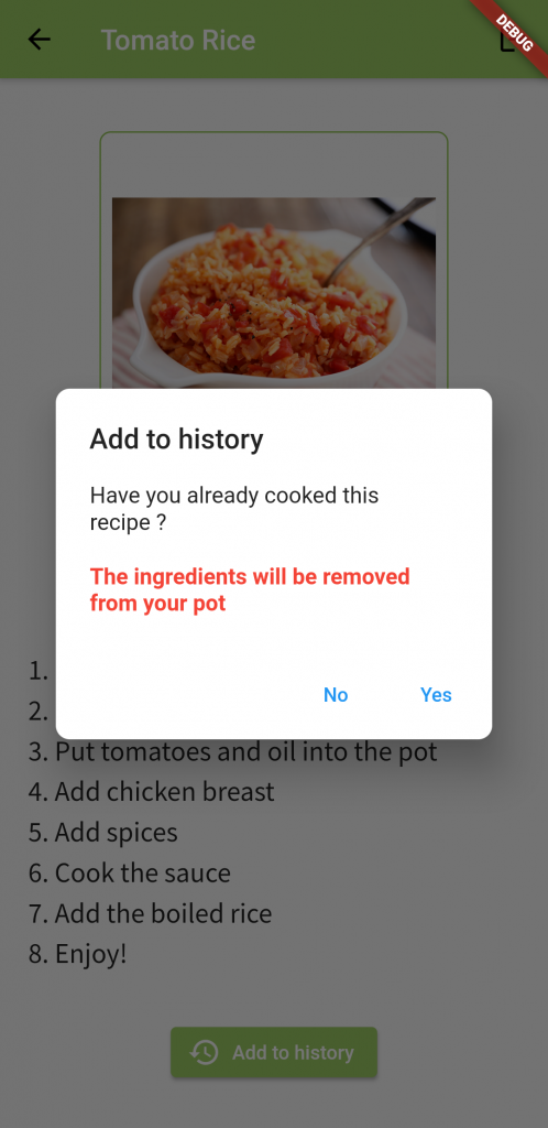
| Add recipe to history | Test person literally said that he would never click the „Add to history“ button after cooking.He want to use the smartphone for something different after cooking. | We will describe a better way to motivate the click on the „Add history“ button in the next block(see below). |
| Get recipe with too little ingredients | The provided explanation text is very helpful when no recipe suggestions available | – |
| Log-out | Make it more difficult to log-out, because we want to keep users as long as possible | Logout should be just on the home-screen not in every screen and also with a pop-up. |
What did you learn from the testing?
We want to improve a general issue which is the size of the fonts which might be a bit too small, especially for seniors. We will now mention one part of our design that was continuously discussed in every single task and we think it is important to go into detail about the ideas we can share after this semester regarding this.
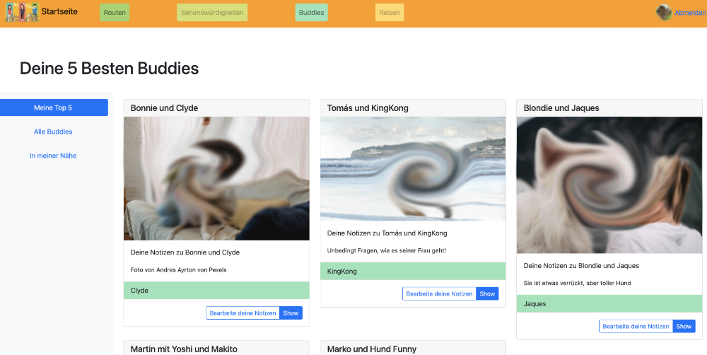
What are your main takeaways?
The main general takeaway from usability testing is the idea that the developer/designer perspective might be very different from the user’s expectation from the app. Concretely, we could improve our prototype through test evaluations. Besides, the tests drew our attention to a serious usability problem. Namely, the last step of the recipe preparation contains a button named „Add to History“ that has to be clicked for the application logic to work. What we noticed during tests is that all test participants tend to think that the goal is achieved when they reach the recipe preparation description which is not the case. The „Add to History“ button is crucial since it doesn’t only add the recipe to history if the user wants to access it later but it updates the ingredients pot by removing the used ingredients. The solution that we came out with is to always pop the confirmation alert dialog whenever the user tries to exit the application or go to the main screen. If the user isn’t cooperative and chooses to forcefully exit the application, notifications should be pushed to remind the user that he has to update his ingredients pot. We also want to mention in the pop-up that we will empty the pot and add to history every looked up recipe because we have „favorites“ as a list controlled just by the user.
(2) Project description
Mouadh Khlifi – Master student on Computer Science at the FU Berlin
Christian Zygmunt Jeschke – Master student on CS Education at the FU Berlin
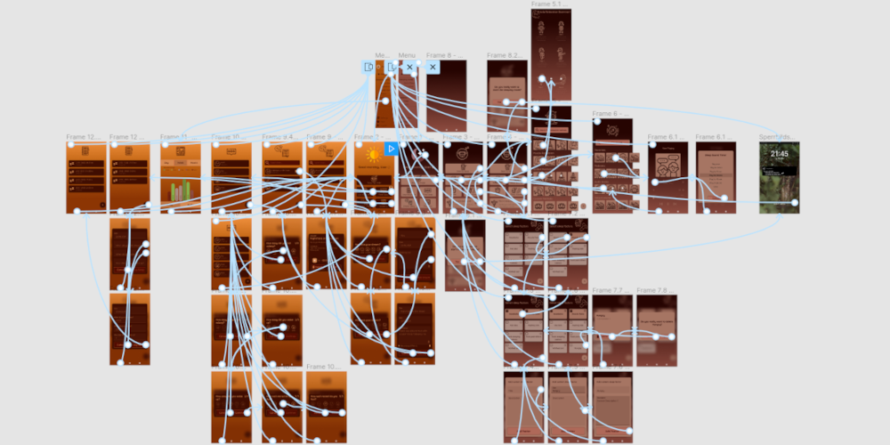
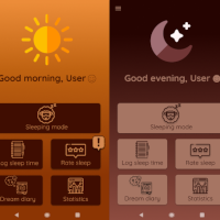
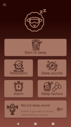
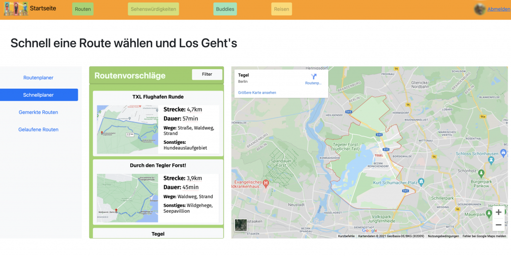
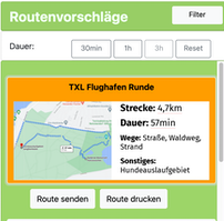
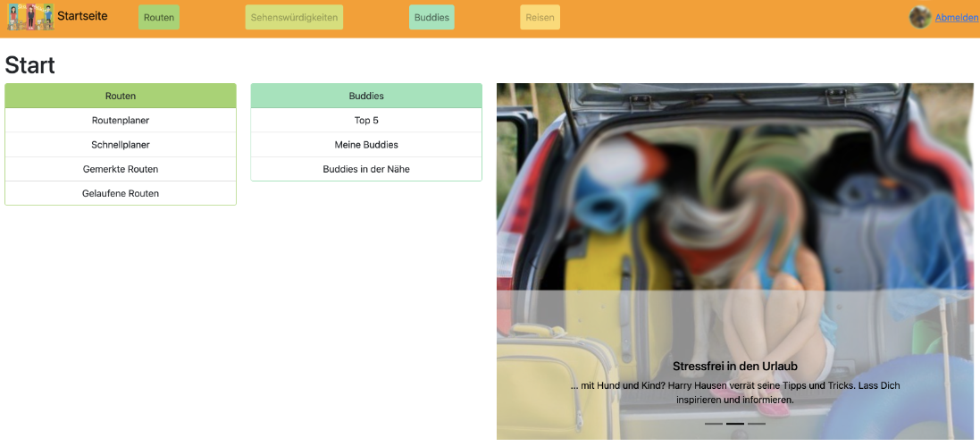
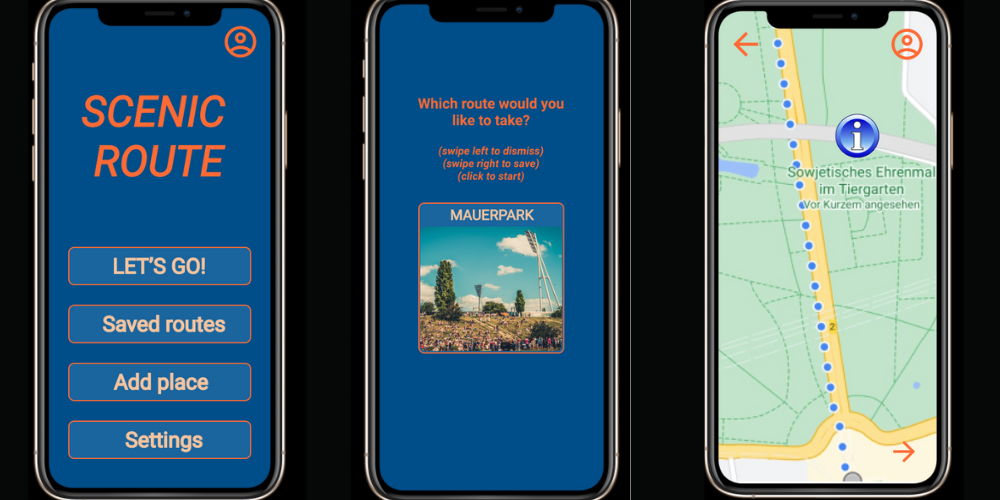
Take-away or food delivery is convenient, but ordered food mostly comes with too much plastic. Moreover, leftovers have to be thrown away. To protect the environment and save food we want to make it easier to find out which meal you can do with leftovers. From our own experience, we know: Even if we have ingredients, sometimes we decide not to cook because we are just too hungry and want to save time. We designed and implemented the app Hello Fridge to solve this issue. The app allows searching for recipes just by inserting ingredients. We expect that our users will more likely open their fridge (and check with our app if they can create something novel by themselves) before ordering food. We used proto.io for the first iterations and now the Flutter Framework from Google for the development. During the methodology-oriented design process, we made multiple types of user tests. On one hand to conceive a concrete idea of what the end product should look like. On the other hand, to detect and solve usability ambiguities that a user can encounter.
Test the app in you browser here (preferabily on your phone)
Please ask us for access to the source code
Who did what?
We had a strong pair work this week but we can mention that Mouadh was more focused on the administration of the web app while Christian did that for the evaluation.
What have we learned?
We identified that Meta Strategies like the consideration of multiple perspectives is a very important and difficult task. We need to keep this in mind during the whole process because once we forget it we are developing just for ourselves and have no chance to sell to the user.
What went well?
We managed better to find a good timing here.
What do we want to improve?
We need to find out how to work in the future.

