[A#10, P8] – Evaluation and Project Description

(1) Evaluate your test results.

  • What method(s) did you use to evaluate the results of your usability tests?
    How did you evaluate the results?

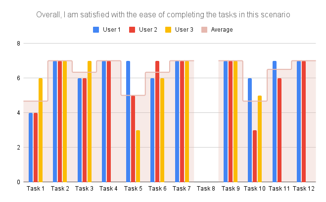
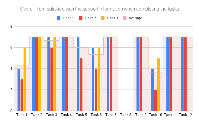
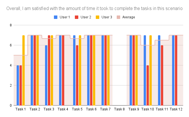
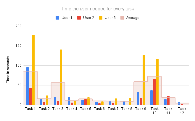
Wir haben die Verbesserungsvorschläge und Kritik am Prototypen der Testpersonen zusammengefasst und systematisch aufgeschrieben. Die Task Completion Rate weiter auszuwerten war nicht sinnvoll, weil alle Personen alle Tasks abgeschlossen hatten.

  • What did you learn from the testing?

Es macht einen großen Unterschied, ob man aus der Entwickler-Perspektive auf oder von außen auf den Prototypen schaut. Der Nutzer versteht eventuell Gedanken hinter Funktionen und Funktionsweisen nicht die für uns klar waren. Die Verbesserungsvorschläge von außen waren auch sehr hilfreich.

  • What are your main takeaways?

Testen ist gleichzeitig schwierig aber auch sehr wichtig. Auch sollte man relativ früh anfangen, damit Veränderungen noch leicht möglich sind. Die Aufgabenstellung für den Test ist relevant um möglichst aussagekräftige Ergebnisse zu produzieren.

(2) Project description

One image (1000×500 px, png), which shows your prototype:

One image (200×200 px, png), which shows some unique part(s) of your project or prototype in a very detailed way (e.g., some logo or part of a screen):

Name of your project + tagline/sub-line:

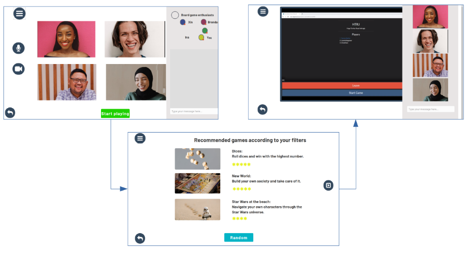
Social Gaming – no more messy remote board game nights

Project description text:

We are big fans of fun, relaxed board game nights with our friends. However, during the pandemic we experienced that remote version of the board game nights often turned out to be more frustrating than fun: switching between all the different websites, not knowing which games have an online version,…

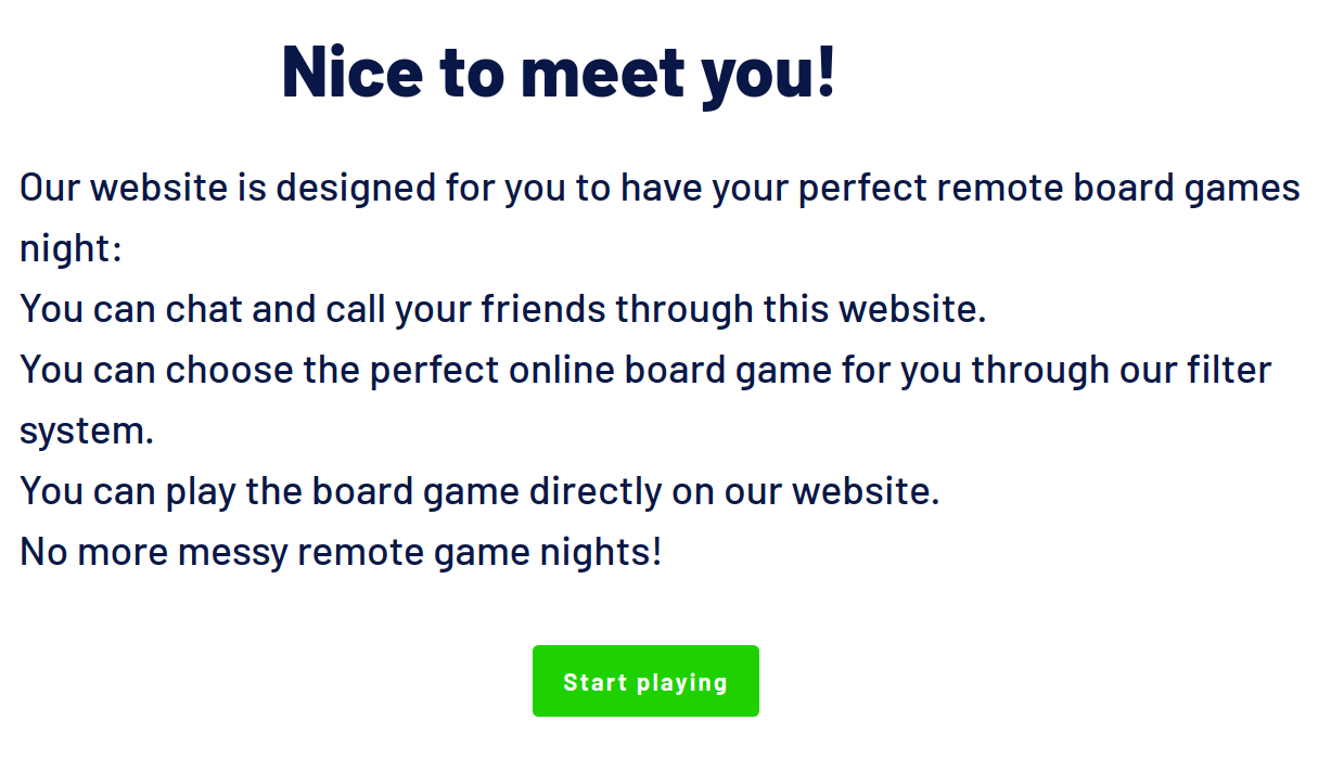
With Social Gaming, we want to transform remote board game nights into a great time with your friends instead of an exhausting evening. To achieve this goal, Social Gaming consists of three core elements:

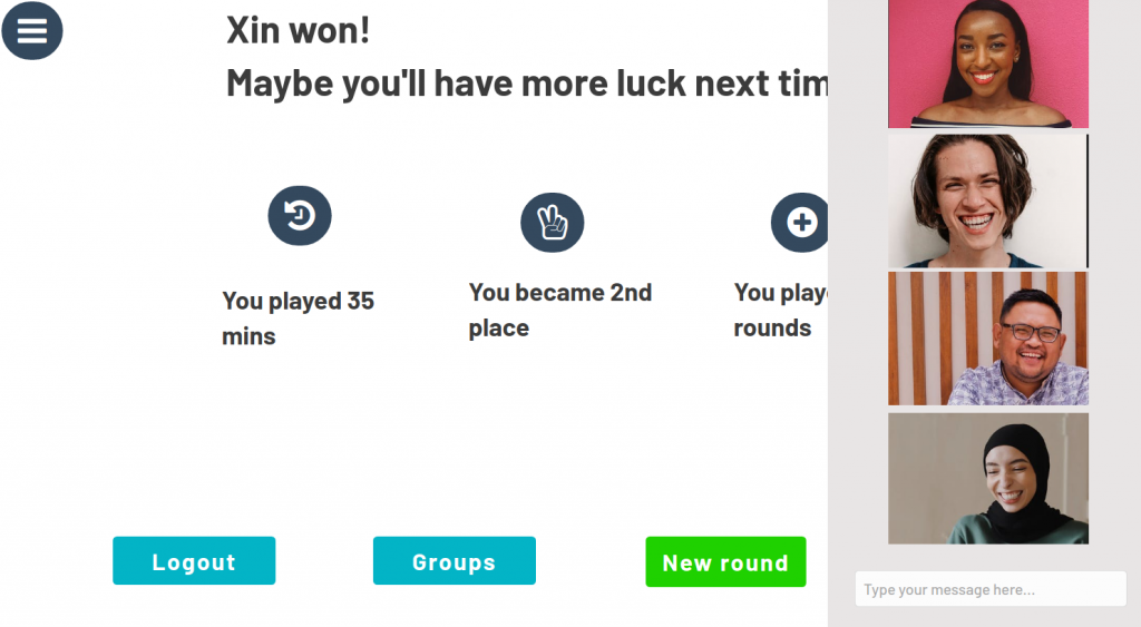
  • You are able to audio-, video chat and message your friends over our platform
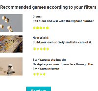
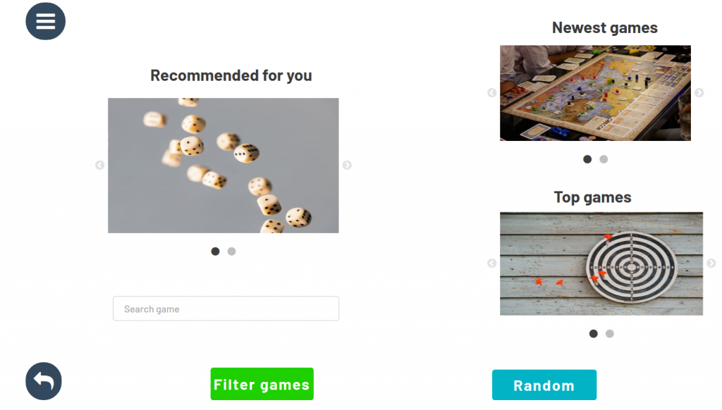
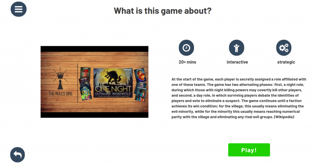
  • You can filter all the online versions of the board games from our many partners exactly according to your needs
  • You can play the board games embedded on our website.

To conclude: With Social Gaming your whole game experience will take place on one website, and one website only – no more messy remote board game nights!

3-5 additional images:

Link to your GitHub/GitLab repo:

https://socialgaming.bubbleapps.io/version-test/landingpage

[A#10, P5] Evaluation of the test results and final project description

Evaluate your test results

What method(s) did you use to evaluate the results of your usability tests?
How did you evaluate the results?

We created Diagrams with Google Docs and compared the different user ratings from the After Scenario Quest (ASQ) and the time they needed for the tasks. We calculated the average for the time and every post-task question and included them in the diagrams.

What did you learn from the testing?

  • Every user interacted really differently in the test.
  • To ask the 3 post-task questions took a lot of time.
  • It was hard to convince people to use a rating for the post-task questions.
    • We asked people during the interview and couldn’t always get numbers as answers, people seemed to find it easier to explain their thoughts.
    • It would have been probably more beneficial to give them a form where they can choose what number they want visually.

What are your main takeways

  • When using post-task questions, it seems better to only ask one instead of three.
  • Tasks shouldn’t be to short, otherwise measuring the time becomes a bit complicated and the evaluation results aren’t meaningful. (e.g. Task 8: Du bist aufgewacht und nimmst gleich dein Handy in die Hand um es zu entsperren.)
  • Task 1 took the most time in average, that is probably because the user didn’t know that they can find the factors in ‘sleeping mode’.
  • Overall the user were satisfied with the time the tasks took.

Project description

Prototype

Link to the final prototype: https://www.figma.com/proto/uyswzIlrEDZOnSqmzk08te/Sleepy-Heads-HiFi-Prototype?node-id=17%3A11&scaling=scale-down&page-id=0%3A1

Prototype made with Figma (1000×500 px, png)
Unique – Our Day & Night design

Unique in our prototype is that we have a design for the night and for the day.

Tagline

Sleepy Heads – Good night and sleep well. 🙂

Group members

Angelika Albert
Freie Universität Berlin
Bachelor Informatik

Ayse Yasemin Mutlugil
Freie Universität Berlin
Bachelor Informatik

Tanita Daniel
Freie Universität Berlin
Bachelor Informatik

Description

Many people suffer from sleeping problems and need help with falling asleep, having a well-rested sleep and waking up. Sleep is very important so that people can handle their everyday life. There are a lot of factors that can affect the sleep and many people aren’t really aware of this. For example: We all know that we should avoid screentime before going to bed, but we often do it nonetheless. That’s why we decided that our app should have a blue light filter and we chose to avoid the colour blue and its variations. This is the reason why our mobile application is only using warm colours.

Our goal is to increase the quality of sleep and improve understanding of the persons sleep schedule. Everything will be conveniently recordable in one app and there is no need for paperwork. By recording sleeping patterns, it provides the capabilities to improve the sleep quality and allow doctors to diagnose faster, easier and more accurately.

Additional Pictures

Dashboard
Notification
Dream
Sleep factors
Rate Sleep

[A#10, P4] Evaluation of the test results and final project description

1. Evaluate your test results

What method(s) did you use to evaluate the results of your usability test? How did you evaluate the results?

Wir haben darüber nachgedacht, die Ergebnisse systematisch über Affinity Diagramming oder wie bei der letzten Evaluation über eine graphische Verdeutlichung direkt am Prototypen auszuwerten. Allerdings waren die Ergebnisse nicht dafür geeignet. Dies liegt vor allem daran, dass die Testsessions überwiegend damit verbracht werden mussten, den Probanden zu erklären, was überhaupt ein Schema ist und warum Jurastudenten diese Schemata brauchen und wofür sie diese verwenden. Aufgrund des bereits klar strukturierten Feedbacks wurde sich also dafür entschieden, die qualitativen Ergebnisse durch eine einfache erneute Durchsicht der Mitschriften zu evaluieren. Die quantitativen Ergebnisse (Messung der Satisfaction und der Effectiveness) wurden zwar tabellarisch ausgewertet (siehe unten) allerdings nicht weiter beachtet, da diese Werte keine Aussagekraft für uns geliefert haben, da die Satisfaction und die Effectiveness stark davon abhängen, ob die getestete Person fachkundig oder Novize in Jura ist.

What did you learn from the testing? What are your main takeaways?

Am Ende haben sich in den qualitativen Ergebnissen (Notizen während des Testens) drei Anmerkungen von allen Probanden herausgestellt:

  1. Hierarchisierung während der geleiteten Schemaerstellung verdeutlichen,
  2. Quellenangaben bei Definitionen und Meinungenstreiten hinzufügen und
  3. Während der geleiteten Schemaerstellung Informationen zum gerade abgefragten Punkt bereitstellen (z.B. Definition) – beispielsweise über einen Tooltip.

Der letzte Punkt ist jedoch an dieser Stelle nicht repräsentativ, da es sich bei den Probanden nicht um Juristen oder Jurastudenten handelte und somit nicht klar ist, ob diese tatsächlich solche Hinweise benötigen oder wünschen.

Satisfaction:

ProbandEinschätzungKommentar
1keine AngabeNicht möglich zu sagen. Kommt auf das Wissen der Student*innen an. Bedienung an sich sehr leicht, aber dies kommt von Abstrahierung, welche es dann in der eigentlichen Benutzung sehr schwer machen kann.
2leicht (5)für mittelgute Studenten (für Novizen allerdings sehr schwer, für Experten sehr leicht)
3sehr leicht (7)
Quantitative Ergebnisse auf die Frage: Wie einfach oder schwer war die Aufgabe insgesamt zu bewältigen? – Skala vorgegeben

Effectiveness:

Test: geleitete Schemaerstellung
Completion: Alle Probanden konnten die Aufgabe komplett abschließen

ProbandBenötigte Zeit
112 min
214 min
38 min
Quantitative Ergebnisse durch mitstoppen der Zeit.

Durchschnittliche Zeit: ~11 min.
Anmerkungen: Es wurden während der Bearbeitung viele fachliche Fragen gestellt, welche die Bearbeitung teilweise immens verzögerten.

2. Project description

Image 1: 1000x500px – Overview of the main menu
Detail of „Aktenkoffer“ – JuurMates version of saved data. We hereby try to match the title and icon to what the User already knows in his/her daily use.

Name: JuurMate – Your Mate for Law-Studies

Name of all group members: Anil, Simon, Tobias

Project description Text: Studying law is very learning-intensive. Because of the massive amount of content it is very easy to lose track of things. When checking a legal issue (which is a very common task throughout university) you have to proceed in a structured way. To do so, there are standardized test schemes. Those test schemes are highly variable and nested. In certain cases some points are more important than others, some also may be irrelevant at all, some have to be expanded and so on. The problem with the present system (e.g. many different documents) is that those are not dynamic at all. This can lead to the usage of 10 or more different schemes to complete one assignment for university.
JuurMate is a desktop application that was specifically designed to dynamically create those schemes and thereby combine all necessary subschemes into one. This leads to a much more clearer overview about what has to be done to complete the given task for the student. JuurMate is a real live(time)-saver!

Additional Images:

Example of guided creation of Schemes
Example of Overview of the created scheme
Example of additional information that is shown next to the overview of the created scheme
Example of the „Aktenkoffer“
JuurMate – Text-based Logo

Link to prototype: Click here (may not be online after completion of studies)

[A#10, P7] Veritas – Evaluation and Project Description

(1) Evaluate your test results.

What method(s) did you use to evaluate the results of your usability tests?

We first wrote down all our notes. As there weren’t many notes (14 in total), we skipped all more complex evaluation methods and simply discussed all notes in the group. We also used a post-test questionnaire (UMUX) to get feedback from users after the test. The questionnaire consisted of questions regarding their feelings after first contact with the app. 


How did you evaluate the results?

We found main points that we all agreed on were relevant in terms of the conducted tests. Those issues were the most problematic for users during the tests. We used them to make final touches on our prototype. We also retrieved positive points to evaluate what went correctly and was met with approval from our users. From all information gathered we extracted the main takeaways and applied them in the prototype.

What did you learn from the testing?

  • Overall, users found the app very easy to use (all users surveyed ‘strongly agreed’ to that statement in the post-test survey) and one mentioned it was intuitive.
  • All surveyed users disagreed with the statement: Veritas is a frustrating experience
  • the info-button was not clickable, but only the text. Two users clicked solely on the button, though, and assumed that it didn’t work
  • One user criticized that the onboarding screen (how to use the app) didn’t show the current site and that they had the urge to skip it and jump right into it. This reminds us of heuristic evaluation: showing the system state is part of Nielsen’s heuristic.

Just speaking from usability in the narrow sense, we are fairly confident that the app was easy to use and well designed.

However, many users doubted the usefulness of the political compass. Many users wished for an explanation in regards to how articles are positioned. One user rejected the idea of the political compass altogether. Alternative solutions suggested were to show more “political dimensions” (in a radar chart). We feel that this would hinder the interpretability even more though. Still, one user explicitly and without us asking mentioned that they’d use the app. Another also said he would maybe use it. 

The testing itself was quite relaxed and the participants were well-informed in political topics and, as such, very interested in our app. This made for a good user group. The tasks didn’t quite fill their purpose. The users usually only worked for about 1 or two minutes per task. The thinking-aloud part was not done consistently. When asked about their opinion afterwards though, the users were eager to give additional feedback.

What are your main takeaways?

  • The political compass – our key feature in some sense – is controversial.
  • All participants questioned on which factors the articles get placed on the political compass. We should portray this information in our App.   
  • UX-wise we did a fairly good job 🙂

(2) Project description

Prototype:

Unique Part:

Name: Veritas – Escape your filter bubble today

Group Members: Arne, Clemens, Daniel, Mateusz

Project Description: Today’s news is often inherently biased and lacks nuanced journalism. Some more, such as breitbart news, and some less, such as reuters. With the recent surge of social media, a large share of unsuspecting readers fall into a so called filter bubble, i.e., they only see news of specific political backgrounds, which they are anticipated to like. Some think, this may lead to political extremism, further deepening preconceived opinions and ideas. 

Veritas is a tool that makes it easy for users to explore opinions and articles in all corners of the political spectrum. You give Veritas a topic and it presents you a large collection of articles on the given topic that cover a diverse set of published viewpoints.

Final Prototype: https://www.figma.com/proto/xqMeWV6kxUEShVbQSxePjD/THE-INVINCIBLE?node-id=167%3A178&scaling=scale-down&page-id=0%3A1

(3) Reflection

Who did what?

Arne, Daniel, and Mateusz evaluated the test results. Clemens wrote the project description and reflection.

What did we learn?

We learned about the Smartspider which is a different type of political compass.

What went well?

We split up the tasks well and everything was on time.

What can be improved?

When we have time, we consider improving our prototype further because it still lacks some realism.

[A#3, P10] Evaluation of the test results and final project description

Evaluation of test results

What method(s) did you use to evaluate the results of your usability tests?
How did you evaluate the results?


Zum einem haben wir alle Kritiken und Verbesserungsvorschläge herausgeschrieben, zusammengefasst und diskutiert, bei welchen es sinnvoll ist auf sie einzugehen und die Verbesserungsvorschläge umzusetzen.
Außerdem haben wir zur Bewertung der App die Tester/innen den “System Usability Scale” (SUS) ausfüllen lassen und ausgewertet. Unsere Ergebnisse waren 80, 85 und 90 Punkte, was alles in die Kategorie Excellent fällt. Dies freut uns natürlich sehr, allerdings sind wir auch der Meinung, dass unsere Testproband:innen nett waren und uns möglicherweise etwas zu freundlich bewertet haben.


What did you learn from the testing?

Es macht tatsächlich einen großen Unterschied, ob man als Entwickler:in Entwürfe oder Systeme noch einmal durchgeht und guckt, ob alle nötigen Funktionen eingebaut sind, diese verständlich sind, oder ob das jemand tut, der sich damit noch überhaupt nicht beschäftigt hat und ganz offen ohne Vorwissen die Sache angeht.
Es sind ein paar Probleme aufgetreten, bzw. Funktionsweisen nicht erkannt worden, mit denen wir nicht gerechnet hätten und es kamen auch einige sehr gute Anmerkungen und Verbesserungsvorschläge, auf die wir nicht gekommen wären, da wir zu sehr in der Thematik drin waren und so keinen offenen Blick mehr hatten, für was noch alles möglich/vielleicht sogar notwendig ist.

What are your main takeaways?

Testen ist unglaublich wichtig und sollte am Besten schon relativ früh erfolgen, damit es noch möglich ist, die vorgeschlagenen Veränderungen und Verbesserungen einzubauen, ohne dass dies einen enormen zusätzlichen Arbeitsaufwand nötig macht.
Außerdem sollten mehrere Tester/innen genutzt werden, da unterschiedliche Menschen einen unterschiedlichen Fokus haben und damit auch unterschiedliche Ideen und Verbesserungsvorschläge. Außerdem zeigt sich so auch, ob etwas, was beim ersten Tester/ der ersten Testerin nicht funktioniert hat, ein generelles Problem ist, oder dies nur ein Einzelfall bei dieser Testperson war und somit gar nicht behoben werden muss.

Project description

  1. One image (1000×500 px, png), which shows your prototype.

2. One image (200×200 px, png), which shows some unique part.

3. Name of your project +tagline:
Scenic Route – find your perfect walking route!

4. Name of all group members:

Milos Budimir, Freie Universität Berlin, Master Informatik
Marc Oprisiu, Freie Univerisät Berlin, Bachelor Informatik
Sebastian Wullrich, Freie Universität Berlin, Bachelor Informatik

5. Project description text:

Last year showed us the importance of staying healthy in times of pandemic. Walking with one’s closest friends turned out to be the most important form of socialization during the lockdown, but also has a positive effect on the psyche of each individual. Scenic Route was developed to emphasize awareness of one’s surroundings. Unlike conventional route planning, it does not calculate the fastest route, but the one with the most sights or the most unusual attractions. You get relevant information about interesting buildings and the surrounding area while walking around, so that you become an expert of your city! Choose whatever sort of gastronomy or attraction you would like to see on your route and enjoy the walk while being provided with interesting background knowledge based on experiences of a (soon to be) huge community. Functionally our prototype does still not provide real time route guidance. In the actual implementation open source map data such as OpenStreetMap could be used.

6. Additional images:

7. LINK TO OUR PROTOTYPE

Reflexion

WHO MADE WHAT CONTRIBUTION?

We worked together on this Assignment at a WebEx meeting.

WHAT DID YOU LEARN?

We have learnt how to evaluate testing results, and also where we made mistakes, where there has been place for improvement of our prototype, how it could be done better next time.

WHAT WENT WELL?

Whole process went really well. We were happy to work together on another assignment. 

WHAT WOULD YOU LIKE TO IMPROVE?

There is nothing we would like to improve, since we are pretty much satisfied with how it went, both content wise and atmosphere wise.

Assignment #10 Evaluation of the test results and final project description

?   Deadline: Tuesday, 13th July 12 PM (noon, two weeks)
 ?   Goals: Evaluate the results of your remote usability testing sessions and sum up your project.


(1) Evaluate your test results.

  • What method(s) did you use to evaluate the results of your usability tests?
    How did you evaluate the results?
  • What did you learn from the testing?
    What are your main takeaways?

(2) Project description

This part is mainly meant to be published on the HCC Group website under News. Please provide all information in English.

  • One image (1000x500 px, png), which shows your prototype. As example and for inspiration check the projects from the last semesters, for example, Idea Perspectives (2019), comRAT-C (2019), unreadable (2018), or projects from 2020.
  • One image (200x200 px, png), which shows some unique part(s) of your project or prototype in a very detailed way (e.g., some logo or part of a screen).
  • Name of your project +tagline/sub-line (e.g., “My Music Mate – Distributed music-making app for musicians in times of social distancing”)
  • Name of all group members (with info of university, study program – just if you want!)
  • Project description text (~ 150 words) consisting of your challenge, a motivation/background/context, your goal, and a description of the functionality of your project/UI.
  • 3-5 additional images
  • Link to your GitHub/GitLab repo, or link to your final prototype.