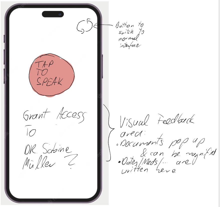
Martin (pensioner) needs a way to effectively use the ePA of the TK, while making use of his accessibility tools because he is unable to use the current interface with his fontsize and it is not yet possible to integrate text-to-speech or speech-to-text programs. We will know this to be true when we see Martin using the full functionality of the ePA. When prompted how his experience with the App is, he should say: “Da kann man nicht meckern.”
Hypothesis Statement
We believe that by improving the TK ePA app to work better with accessibility tools for Martin, we will achieve greater usability for this app, especially for the elderly and people that use the accessibility tools that are provided on their devices.
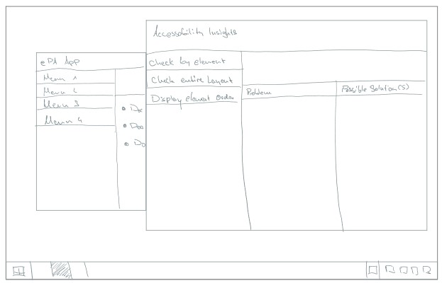
Marius braucht eine Möglichkeit, Software auf einfache Art und Weise auf ihre Barrierefreiheit untersuchen zu können, ohne großen Aufwand in Einarbeitung und Erlernen der Funktionalitäten stecken zu müssen.

Wir wissen, dass dies erfüllt ist, wenn jemand mit keinem ausgeprägten Know-How zu digitaler Barrierefreiheit die Oberfläche des geplanten Tools versteht und benutzen kann.
Hypothese
Wir glauben, dass wir durch die Gestaltung einer intuitiven und einfachen Benutzeroberfläche für die Barrierefreiheitssoftware für Marius einen simpleren Workflow für seine Arbeit und damit einen höheren Umfang von digitaler Barrierefreiheit in Software erreichen werden.
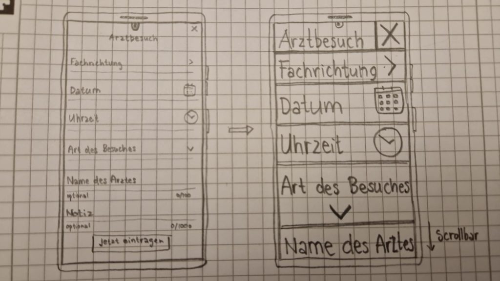
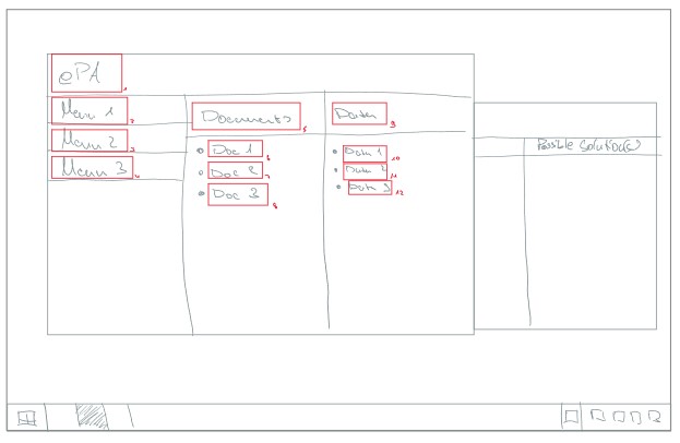
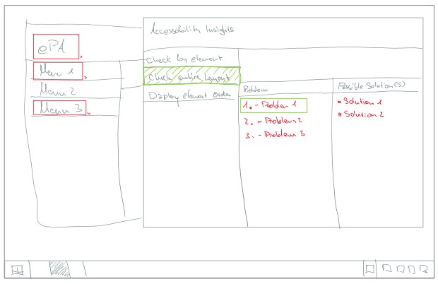
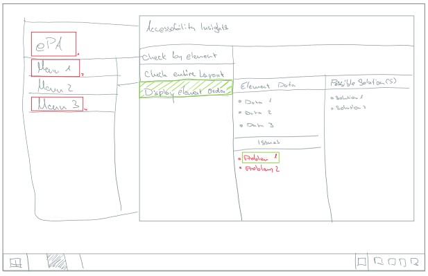
Sketches
Homescreen der Anwendung und zu untersuchende Anwendung im HintergrundZu untersuchende Anwendung im Vordergrund mit farblich markierten ProblemenNutzung der Funktion zum Überprüfen des gesamten Layouts der Anwendung mit aufgeführten Problemen und LösungsvorschlägenFunktion zur technischeren Ansicht der einzelnen Elemente einer Ansicht
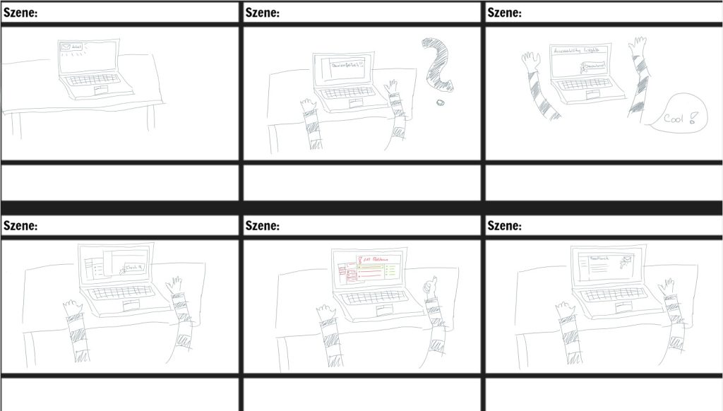
Storyboard
Storyboard
Alte Inhalte
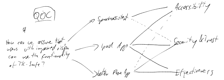
Eliana needs a way to seamlessly and efficiently interact with her digital devices and the (health) application on them despite her visual limitations.

We will know this to be true when we see a: clear and conclusive guideline on how to develop software in a manner that allows the use of and complete implementation of software assisted accessibility-functions.
Alter Sketch im Drive
Beschreibung zum Sketch: Resultierend aus den geführten Interviews sind den Beteiligten bei der Nutzung von Screenreadern, welches das meistgenutzte und gängigste Hilfsmittel ist, folgende Problematiken herausgestochen.
Bezeichnung der Elemente nicht eindeutig
Die Reihenfolge der vorgesehenen Elemente ist irreführend. Das Layout bzw. die Zugehörigkeit der einzelnen Elemente ist nicht nachvollziehbar
Das Layout ist überfüllt mit zu vielen Elementen, sodass die Navigation und das Vorlesen der einzelnen Elemente schwierig ist.
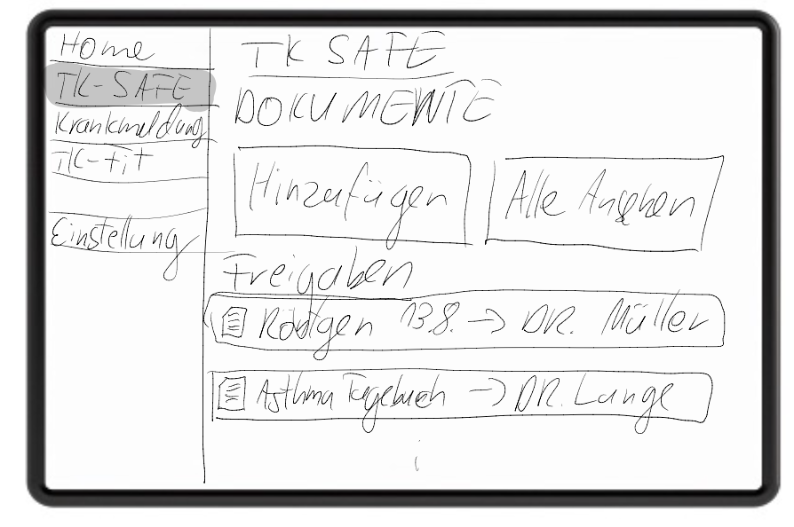
Wir haben uns bei unserem Sketch an dem Layout der Desktop-Anwendung unserer Krankenkasse orientiert. Das Layout besteht aus drei Hauptfragmenten, die gegebenenfalls in weitere Fragmente unterteilt sind.
Die Titelleiste am oberen Teil d. Layouts
Die Obermenü-Leiste am linken Rand
Die Detailansicht der einzelnen Menüpunkte auf der rechten Seite
Dieses ist wiederum in zwei weitere Fragmente unterteilt.
Unsere Idee ist, die Fragmentierung erstmals in Ebenen zu unterteilen, um die Navigation mit Screenreadern nicht unnötig lang zu machen. Es werden erstmals die Fragmente der ersten Ebene über ihre Titel beschrieben. Sobald mit einem Fragment interagiert, so wird in dieses navigiert und die unterliegenden Elemente bzw. bei weiterer Fragmentierung die Fragmente vorgelesen.
Maria Schmidt needs a way to learn more about her symptoms, having options (like courses or exercises) alleviating the symptoms, while also managing her medications, like vitamin D pills or Aspirin, in the same place, because she wants to have a compact solution instead of having several different apps for her different needs (medication plan, explanation of medication regarding her symptoms, information to her symptoms, exercises to help her with her symptoms,…). We will know this to be true when we see: Her app activity decreases or stops, because her health improves to a point, that she feels like she doesn’t need to use the app permanently. She is able to interact with her kids in a more active way again by doing activities without being exhausted.
HYPOTHESIS STATEMENT
We believe that by improving the “Medication” section towards a usable format for Maria Schmidt, we will achieve or at least get closer to her desire of having an „all-in-on“ app regarding her Long-Covid illness. This will lead to her taking her medication regularly and understanding why they help her and for which symptom. Then she will be able to interact with her kids in a more active way again by doing activities without being exhausted, or at least with being less exhausted.
Bug/Verbesserung
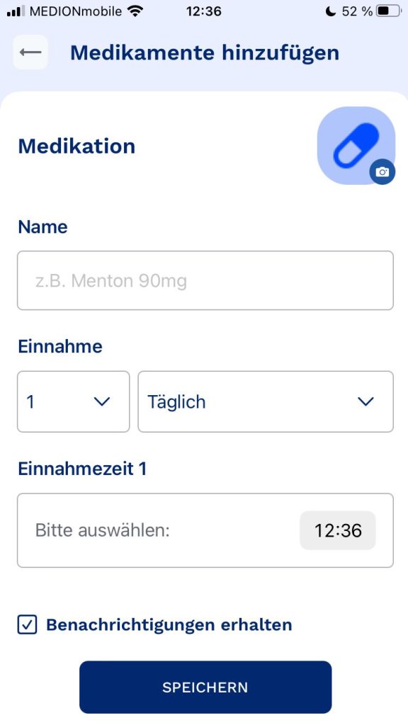
Kategorie „Medikamente“ unter „Profil“
Aktueller Stand:
Neues Medikament wird hinzugefügt
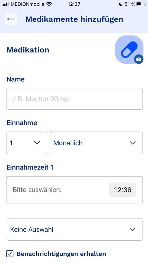
Einnahmeoptionen bezüglich der Zeiten werden eingetragen (täglich/wöchentlich/monatlich)&(Uhrzeit/ggf. Wochentag oder Tag im Monat)
Option der Benachrichtigung
Im Anschluss wird das Medikament unter „Als nächstes Einnehmen“ und auch „Alle Medikamente“ gelistet
Probleme:
Beim Eintragen des Medikaments:
Keine Beschreibung hinzufügbar
Keine Option, um zu erinnern, welche Symptome das lindern soll
Option des Einscannens via Barcode des Medikaments, wo dann automatisch gewisse Einträge ergänzt werden
Keine Option hinzuzufügen, ob bestimmte Einnahme-„Vorschriften“ wichtig sind (bspw. nüchterner Magen)
Keine Option für Notizen, ggf. auch zu den einzelnen Einnahmezeitpunkten individuell
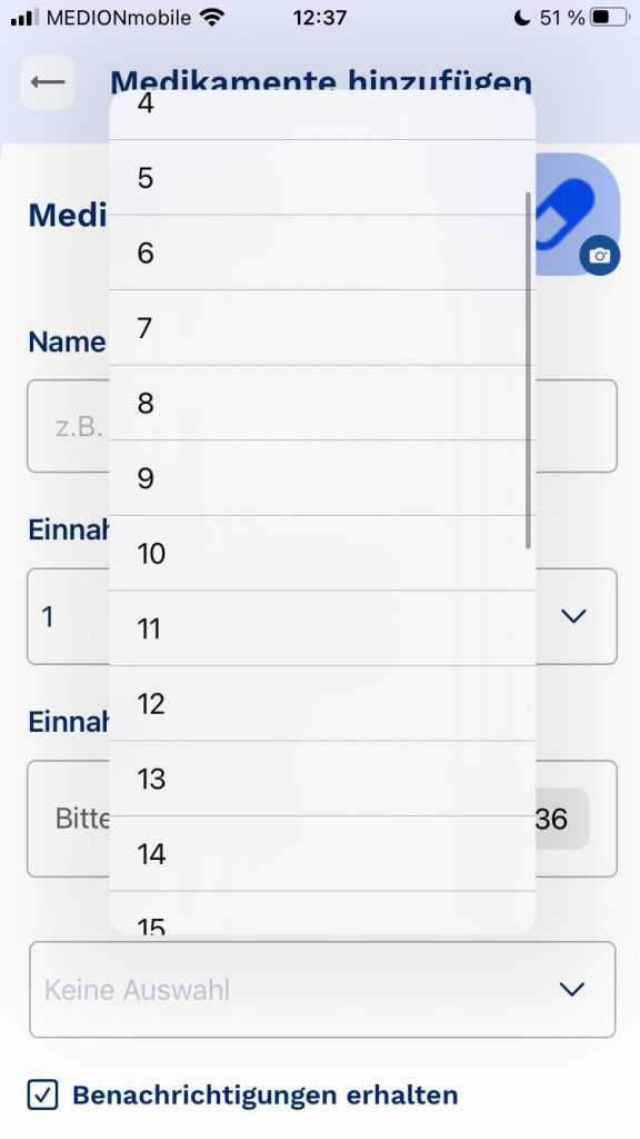
Bei wöchentlich und monatlich steht bei Auswahlfeld nur „keine Auswahl“, statt erstmal hinzuweisen, dass man dort den Wochentag oder den Tag im Monat wählen kann
Bei monatlich gibt es hierbei nur statisch die Auswahl von 1 bis 30. Man muss davon ausgehen, dass es sich generell um die Auswahl vom Tag im Monat handelt, hierbei aber wieder problematisch wie die Auswirkungen auf 31/28 Tage Monate sind. Überhaupt nicht intuitiv.
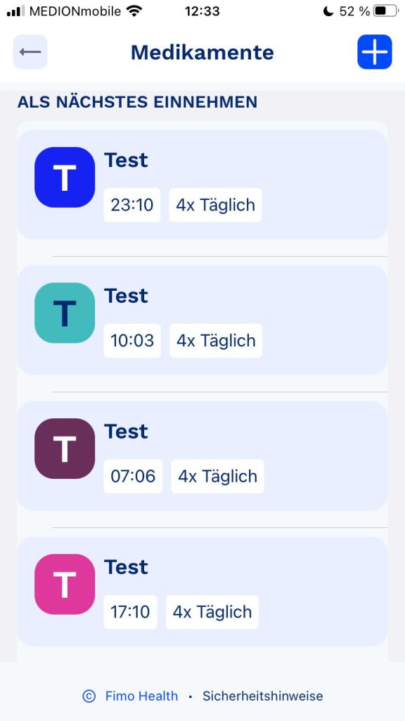
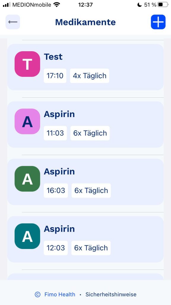
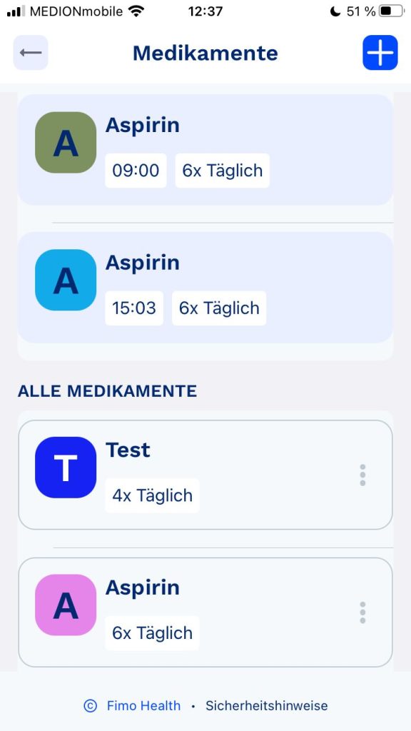
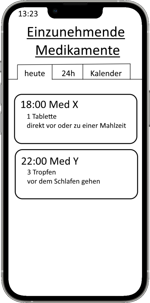
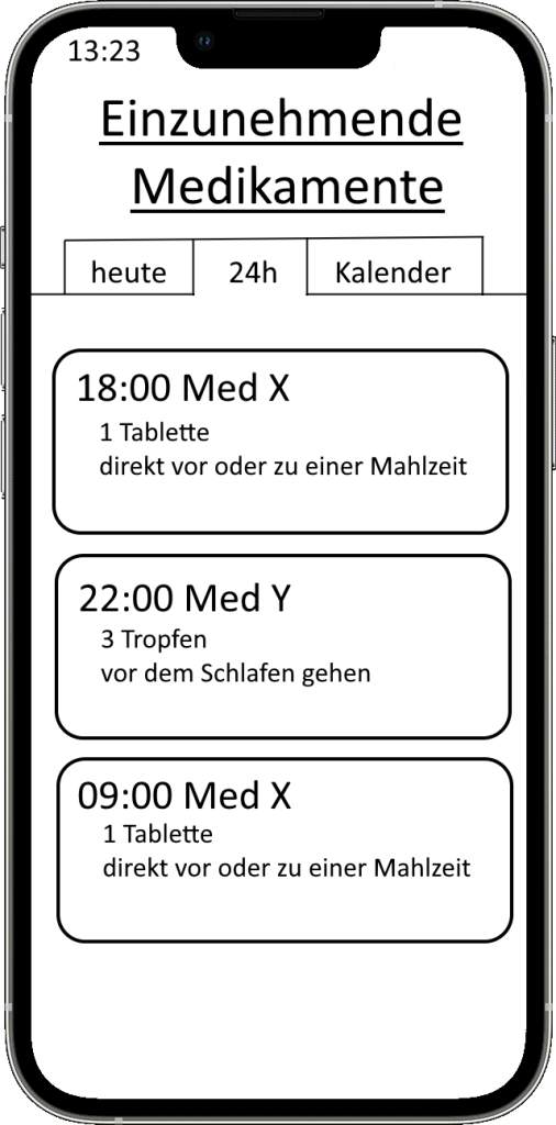
Bei der Medikamenten-Übersicht:
Fehlende Struktur
Komplett ungeordnet von den Zeiten
Selbst, wenn es bei der Erstellung in zeitlicher Reihenfolge erstellt wurde (8Uhr, 10Uhr, 14Uhr, 18Uhr) ist dann in der Übersicht eine falsche Reihenfolge (18Uhr, 10Uhr, 14Uhr, 8Uhr).
Im Reiter „Als nächstes Einnehmen“ wird nach Medikament sortiert und nicht nachdem, was als nächstes eingenommen werden muss. Selbst innerhalb des Medikaments stimmt die Reihenfolge nicht mit der eigentlichen Zeitfolge überein. => Man muss sich selber heraussuchen, welches Medikament gerade dran ist und dieses dann als erledigt markieren
Uhrzeiten sind generell zu klein/unauffällig dargestellt
Beim runterscrollen verschwindet der aktuelle Name der Übersicht (bspw. „Als nächstes Einnehmen“ oder „Alle Medikamente“. Wenn man viele Medikamente hat, kann man sich fragen, wo man gerade ist
Verbesserungen:
Reihenfolge muss unbedingt beachtet werden!
Keine Sortierung nach Medikamenten, oder falls schon, dann nur optional
größere Darstellung der Uhrzeit
Mehr Optionen bei der Erstellung der Medikation (wie oben beschrieben: Allgemeine Beschreibung, Individuelle Notiz zur Einnahmezeit,…)
Option des Einscannens des Bar-Codes des Medikaments, um feststehende Parameter zu dem Medikament automatisch eintragen zu lassen bei der Erstellung
Intuitiveres/Flexibleres Handling bei Monatlich und wöchentlicher Einnahme
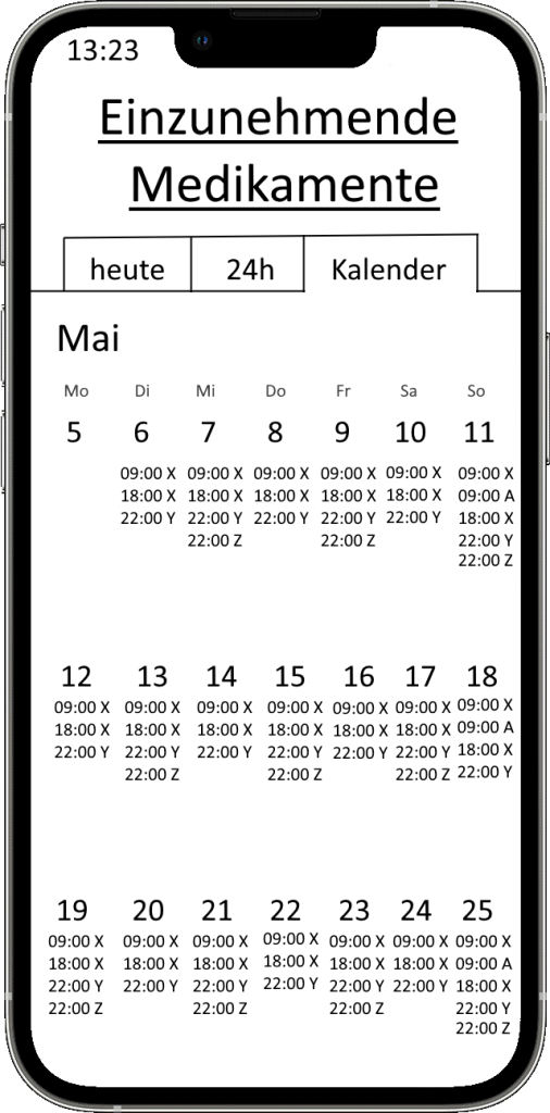
Option die Übersicht nicht als Liste, sondern in Kalender-Form darzustellen
Option das vielleicht sogar in den Apple/Google Kalender exportieren zu können? – Unter starker Warnung bezüglich Privatsphäre etc.
Optionales hinzufügen von Informationen, welche Symptome das Medikament lindern soll. Bsp.: Aspirin – Kopfschmerzen Damit man, vor allem auch bei vielen Medikamenten nicht die Übersicht verliert und man weiß, wofür man das Medikament nutzt.
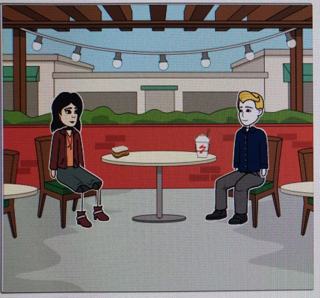
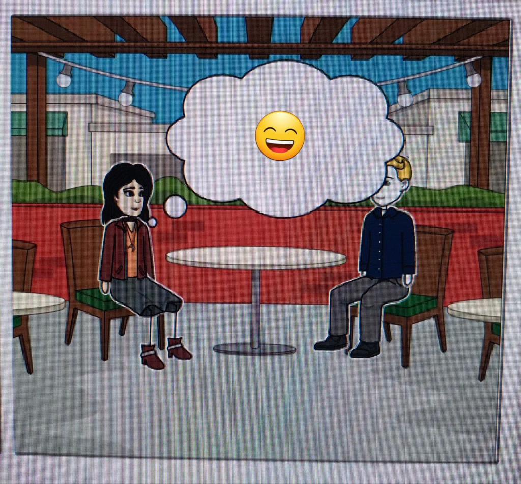
Storyboard und QOC
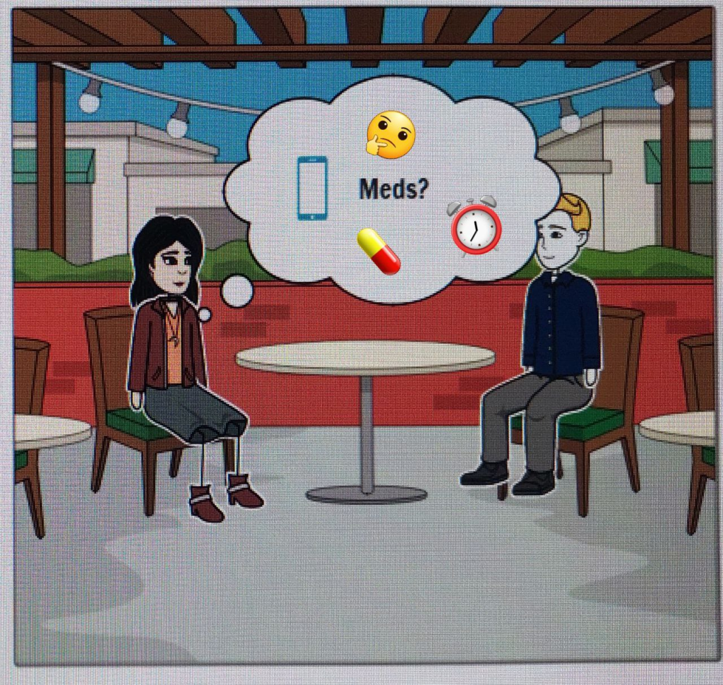
Maria Schmidt sitzt mit ihrem Bekannten Tom in einem Café und unterhält sich. Plötzlich fällt ihr ein, dass sie vermutlich noch Medikamente gegen ihre Long-Covid Symptome nehmen muss.
Maria ist erfreut, dass das alles so einfach und flexibel klappt und kann sich ungestört weiter mit Tom unterhalten.
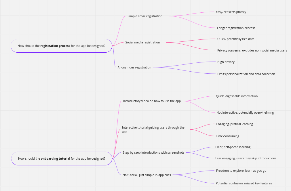
1) Formulate a problem and hypothesis statement and document it.
Please use the template (shown in class) introduced in the lab session:
PROBLEM STATEMENT
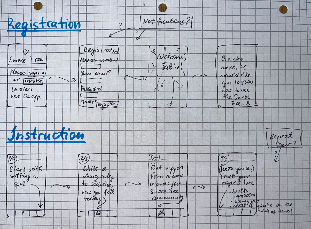
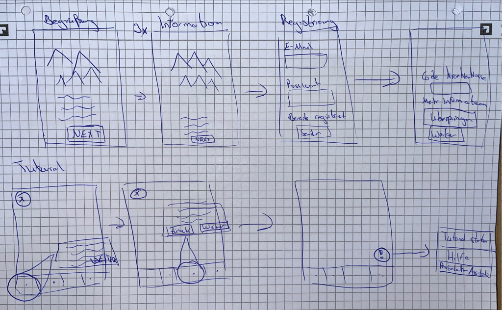
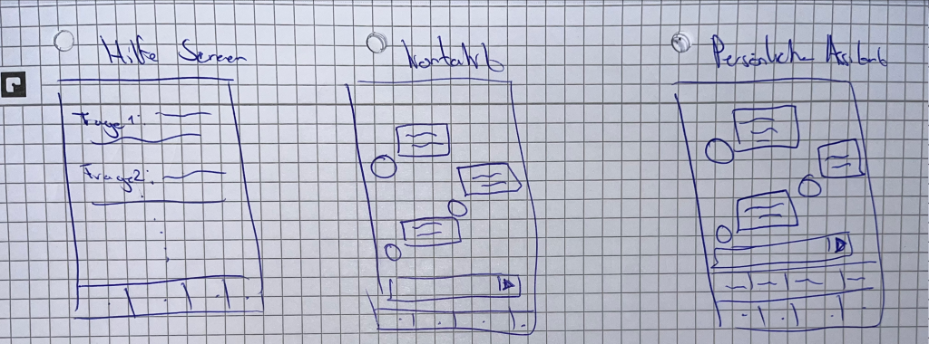
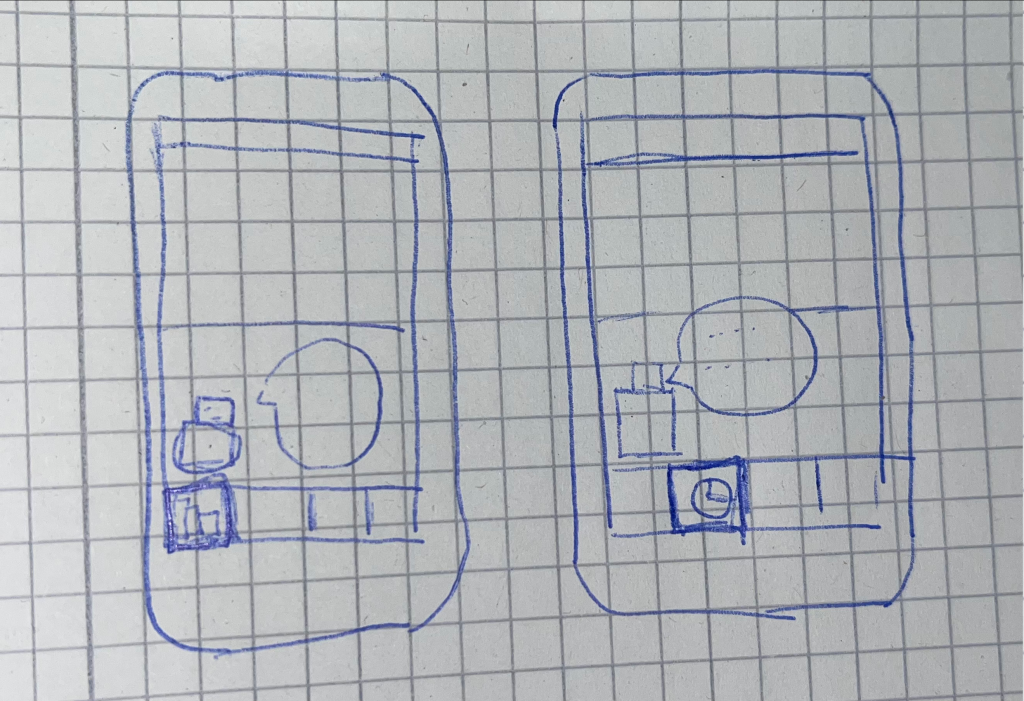
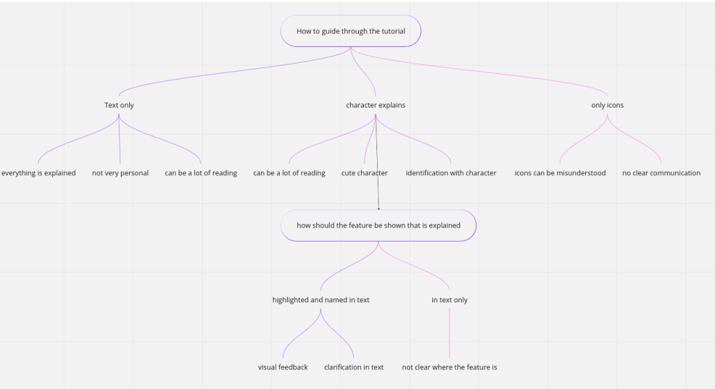
Sabine needs a way to register easily in the app and to get a simple and understandable introduction because she decided to quit smoking, but due to her limited experience with smartphones, she could be overwhelmed by the many features of the app. We know that this is achieved when Sabine regularly uses the app and its functions.
HYPOTHESIS STATEMENT
We believe that by creating a good introduction for Sabine, we will achieve an easier onboarding for users so that more of them start using it regularly with understanding of basic app functionality.
(2) Create individual sketches.
Now it is time for solutions and first drawings!
Step 1: Look at your persona, your scenario and reflect on your problem/hypothesis statement, and focus!
Step 2: Each person in the team is drawing on paper (drawing on a tablet is also okay!) a solution he/she thinks would solve your problem.
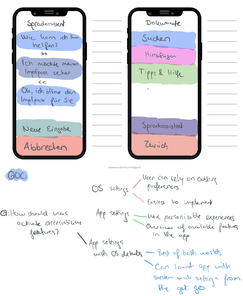
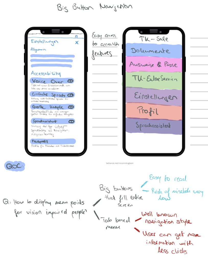
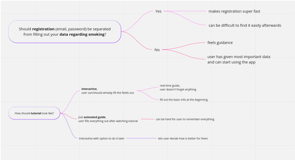
Justify your first design rationales by documenting them using QOC.
Anna:
Henry:
Alexandra
(3) Share your sketches with your team.
Each person should present his/her first drawing to the other team members.
Select features and ideas you think should be part of your prototype.
You can use the dot-voting method again to make faster decisions.
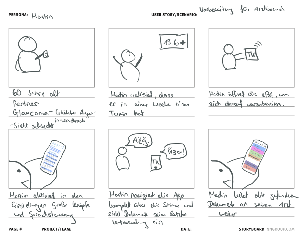
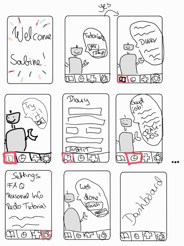
(3) Condense your results from the previous step into a storyboard.
Check out the examples and hints on storyboards on the web…
You should not spend too much time with it, and your solution does not need to be perfect. We will continue working on that!
Synthesize your design rationales and document them using QOC.
This step aims to explain your idea/solution using the storyboard to your fellow students.
(1) Formulate a problem and hypothesis statement and document it.
Please use the template (shown in class) introduced in the lab session:
PROBLEM STATEMENT
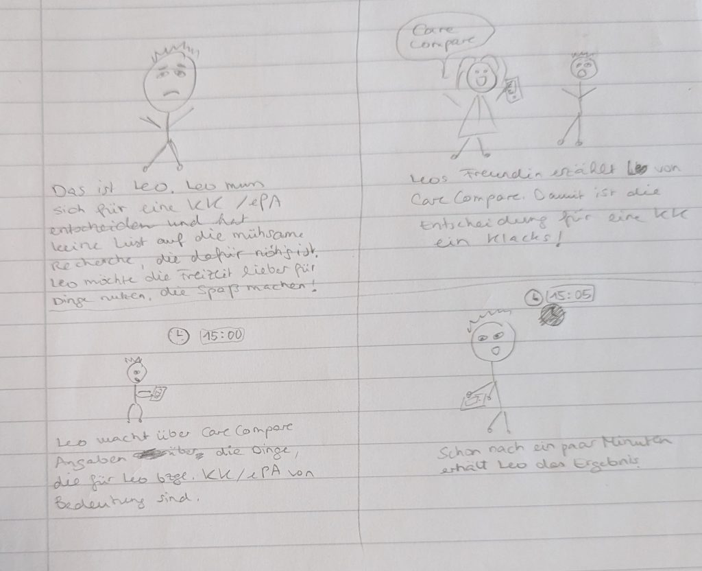
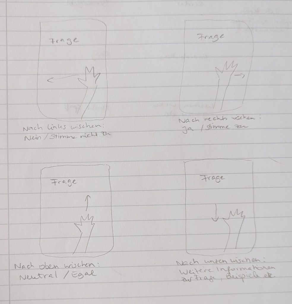
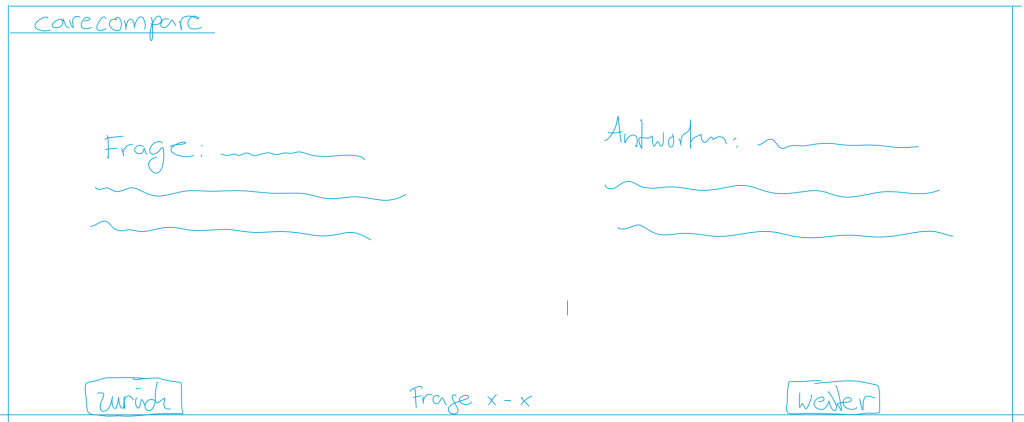
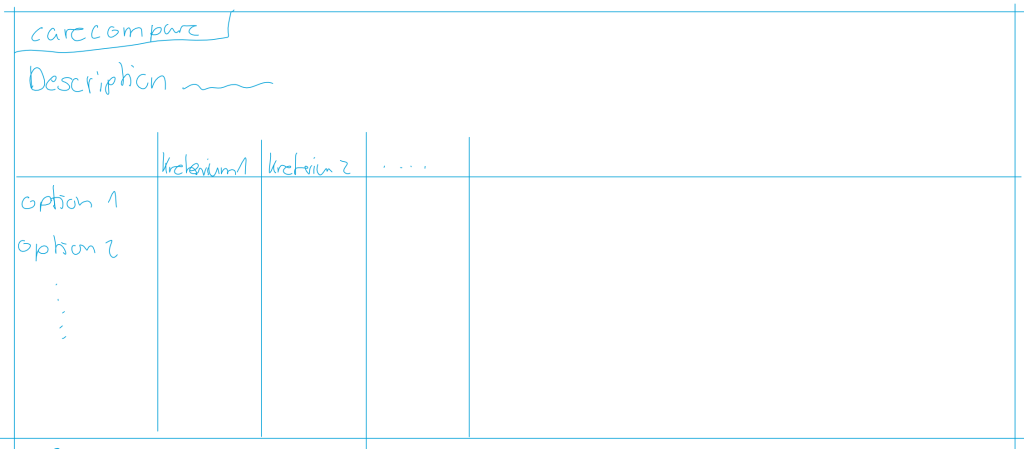
Problem: Es gibt bisher keine Möglichkeiten, verschiedene ePAs zu vergleichen.
Leo braucht eine Möglichkeit, ePAs schnell und einfach zu vergleichen, weil Leo dann weniger Zeit für Recherche verwenden muss.
Wir wissen, dass dieses Ziel erreicht ist, wenn wir sehen, dass Leo nicht mehr den ganzen Tag mit Recherche verbringt, und Leo das Gefühl hat, alle nötigen Informationen zu finden.
HYPOTHESIS STATEMENT
Wir glauben, dass durch das Anbieten des CareCompare für Leo, Leo weniger Zeit für die Recherche aufbringen muss und stattdessen mehr Zeit für Hobbies hat.
(2) Create individual sketches.
Now it is time for solutions and first drawings!
Step 1: Look at your persona, your scenario and reflect on your problem/hypothesis statement, and focus!
Step 2: Each person in the team is drawing on paper (drawing on a tablet is also okay!) a solution he/she thinks would solve your problem.
Justify your first design rationales by documenting them using QOC.
(3) Share your sketches with your team.
Each person should present his/her first drawing to the other team members.
Select features and ideas you think should be part of your prototype.
You can use the dot-voting method again to make faster decisions.
(3) Condense your results from the previous step into a storyboard.
Check out the examples and hints on storyboards on the web…
You should not spend too much time with it, and your solution does not need to be perfect. We will continue working on that!
Synthesize your design rationales and document them using QOC.
This step aims to explain your idea/solution using the storyboard to your fellow students.
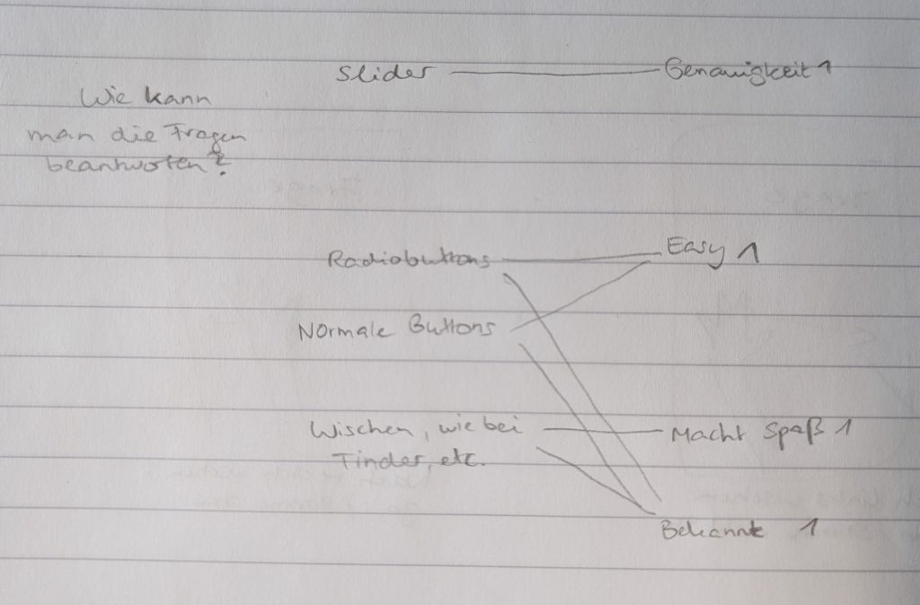
Die von Dating-Apps inserierte Lösung, sowie die klassischen Button Lösungen kommen jeweils auf 2 Punkte. Da unsere Zielgruppe vor allem junge Leute sind, haben wir uns für die Dating-App Lösung entschieden. Denn junge Leute sind Hauptzielgruppe von Dating-Apps
Deadline:Tuesday, 13 June 2023 2 PM Goals:Understanding your design space: create an interactive low-fi prototype
By now, you have developed a thorough understanding of your project in terms of users, context, and tasks. You have also developed a good understanding of the problem you are trying to solve and an idea of what your solution might look like. Now we put it all together and enter the design space! You will begin to build your first testable prototype.
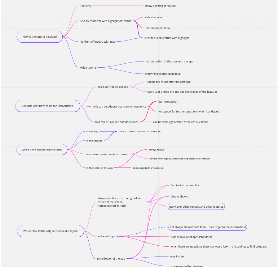
(1) Summarize the feedback you received on your storyboard.
During the last lab session, you collected feedback from your peers. Please summarize the feedback and document which feedback you will incorporate into your prototype.
(2) Develop an interactive paper prototype.
You will develop a low-fidelity interactive prototype that represents multiple states or views. Think about your persona who wants to use your product: What are the minimum needs of your persona? What are the must-haves?
Please describe briefly:
Your prototyping process.
The use case this prototype addresses.
How the storyboard is reflected in your prototype.
A self-assessment of the potential strengths and weaknesses of this first step into your design space.
Please make sure that your prototype is clickable and that other people can access your prototype for testing. Please don’t worry about what your prototype looks like! It is not about how nice things look, but about communicating a general idea and the main functionality.
TOOLS FOR INTERACTIVE PAPER PROTOTYPES
Suggested process: Do just one more round on paper or a pad. Make photos and link your screens using:
Marvel POP (Prototyping on Paper) App for iPhone or Android This would be just enough for now and has everything to make your photos/screens interactive.
Marvel Web application One free project with max. 6 team members.