Part I Tasks
(1) Feedback summarization
The feedback we received was the following:
- besides the filter option, there should be also an option to browse manually through the board games, a little bit like the discovery page of Netflix;
- there should be an option to show or hide the video chat and messenger;
- there should be a way to listen to the sound of the board game but also to be able to audio chat with friends ;
- don’t show the percentage of the match (board game matches …% the filters) but just show the board games with the highest rank first;
- describe the games in one sentence already on the result page;
- good idea to include webcam games for movement games.
We found all of the feedback helpful and good ideas (thanks for the feedback from fellow students). Some points we thought of already but didn’t feature it in our storyboard as it was more of a detail. For our first simple prototype we will also focus on the “less tricky”/low-fidelity feedback (point 4, 5) and include the other feedback in later, more high-fidelity prototypes .
(2) interactive paper protype development
Our prototype can be found here *.
Description of our prototype:
(i) our prototyping process
We first decided on which tool we want to use for our prototype. We liked the example from the lab session, so we decided on using Marvel. We first played around on the website a bit. Then we talked about what we want our prototype to have: We talked about the general ideas that we decided on the last couple of weeks and about how we could add the given feedback by the others from the last lab session. We decided on which sites we want our prototype to have. We found it really helpful to look at our storyboard for this. We then created one site after the other together. While we created the prototype we realized that even though it is a low-fidelity prototype, we wanted to add some very simple design features: We decided on making important buttons green and adding some emojis to the texts to make them more “alive”. These little design additions helped us to make the prototype feel more like our idea for our “end design”. In the end, we played the prototype and looked at whether everything worked well.
(ii) the use case and/or model (task analysis from last assignment) this prototype relates to.
The prototype very much relates to our task flow from last assignment. The task flow was our basis for our storyboard and this was the basis for our prototype – so the task flow is very much reflected by our prototype. Our use cases are also generally speaking reflected by our prototype. The low-fidelity prototype doesn’t 100% relate to the use cases that it doesn’t feature as much details as our use cases (e.g. our prototype has name and a passwort as information about the user, while the use case for the user account also features favourite game of the person, profile picture,… – these details will be featured in later prototypes).
(iii) how the storyboard is reflected in the prototype
As mentioned above, the storyboard was the foundation of our prototype. It is therefore very much reflected by our prototype. We wanted the prototype to create the same atmosphere as our storyboard and constantly reflected on how “Max”, our persona, would like the prototype.
(iv) self-assessment of potential strengths and weaknesses of this first step into your design space
Generally speaking, we are happy with the prototype and think that it is a step in the right direction. The site layouts are overall what we had in mind. We find a potential strength of the prototype that it is very clean and has only the absolutely necessary functions. This makes it easy to understand and the users can directly focus on playing board games rather than trying to understand the website.
A potential weakness is that the prototype idea works so well because it is not designed for answering details. So naturally, some details still haven’t been answered by it. For example: How exactly will the explanatory videos about the board games look like? What exactly will be our features? How exactly will the chat function look like? This could be a weakness moving forward since the devil is always in the details. We are curious to see whether this causes our future prototypes to later change drastically or not.
*The prototype is generated on 21. Mai 2021 through group collaboration using online collaboration tool Marvel.
(3) Design rationales
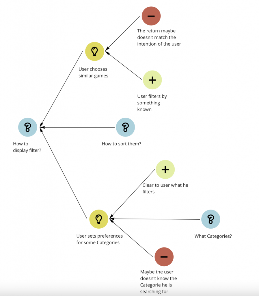
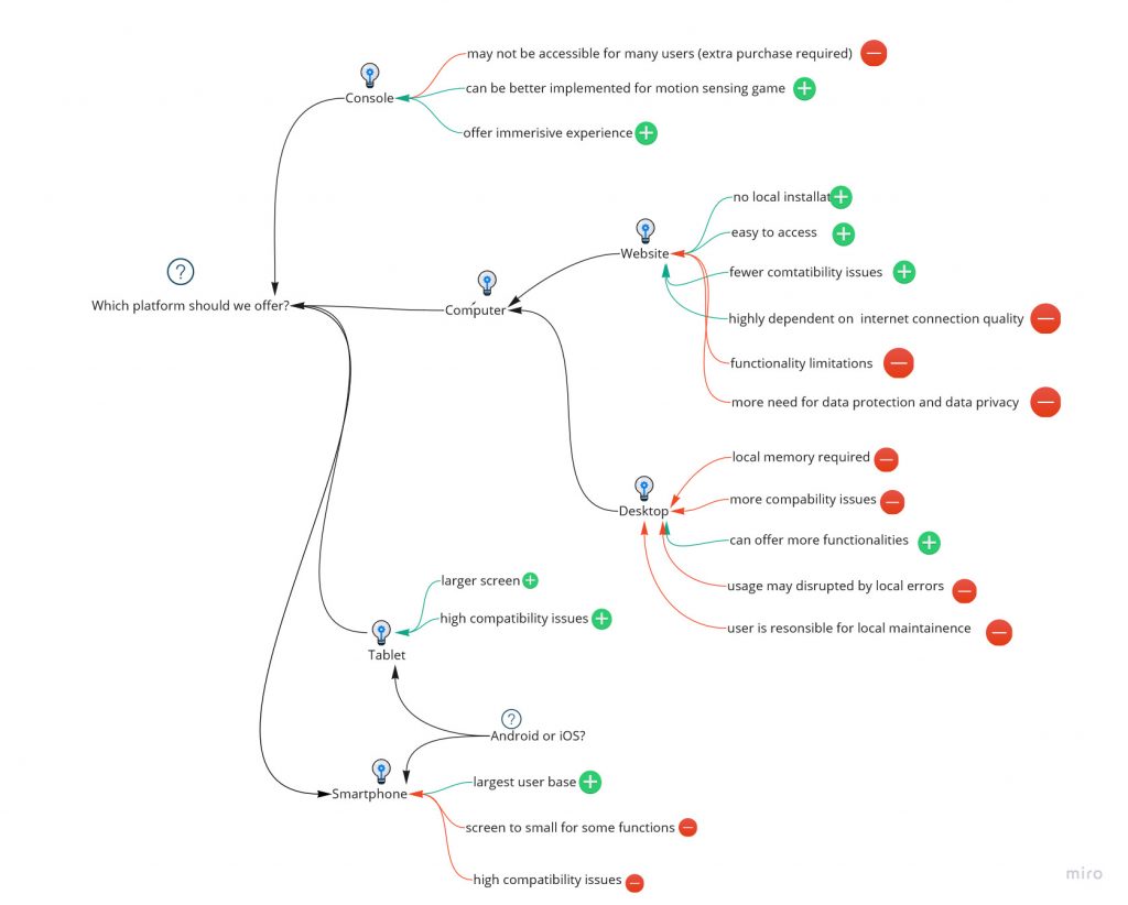
For capturing design rationales analysis, we choose process-oriented gIBIS. We consider gIBIS with its avantages of its clear presentation of inter-relationship and inter-dependencies of questions and subquestions, as well as a clear comparision between pros and cons for each position. It consists better with our design thinking process.
(i) Question: How to display filter?
(ii) Question: What platform should we offer?
Part II Reflexion
(1) Team member contribution.
We did the assignment as usual in a regular team meeting on Friday, 21. Mai 2021. Ina first reviewed the feedback and summarized it for other team members. We then considered and discussed how to incorprate the feedback into our prototype design.
For the second task, we first discussed how we would like to corporate and which tool we want to use for collaboration. We then discussed a general idea of prototype representation such as what layouts we want to design, for what use cases we want to design, and what interactions/functions need to be included in the low fidelity prototype. Then we separate the tasks to each team member, e.g. Ina is responsible for user/user accounted related pages, such as log-in, account registration etc, she is also responsible for homepage/welcome page; whereas Brendan is responsible for filter function related pages. Xin is responsible for the in-play and after-play pages. We also viewed each other’s pages and helped each other in process.
After viewing and agreeing on all the page designs, Brendan linked them together. Ina then finalized the final version with interaction and refinements.
The design retionales analysis is done by using gIBIS based on group consensus. Brendan and Xin are respectively responsible for a design question.
(2) Learnings from assignment.
We learned how to implement the theoretical knowledge into actual design processes by doing the assignments. We also learned by feedback that it is important to escape the „group think trap“ by design. Even though we analysed the user context in advance, it seems that we somehow still get caught up in „developer mind“. More important is „what users need“, but not „what developers want to offer“.
(3) possitive/successful experience
We appreciate our team work as always. Additionally, thanks to the advice for open design tools which helped us a lot in the beginning. Based on personal experience, an inadequate choice of design tools may trigger problems in later design process and waste time. But we found all the suggested tools went well with our tasks, in terms of both user friendliness as well as accessibility.
(4) Expected improvements
We are currently satisfied with the team work and team progress. But for further design phase, as mentioned in (2), we need to keep users in mind throughout the design process.