Feedback summary
- Night mode: No notifications or messages, mute certain calls -> No distractions on the mobile phone (not in the prototype)
- Dream diary with voice recording (not in the prototype)
- Notifications to remind you about entering data, even if you haven’t tracked anything for a week (not in the prototype)
- Perceived dialogue where the user is guided through the app
- Entering factors is a good function, as these factors strongly influence the quality of sleep.
Development of an interactive paper prototype
the first version of our interactive prototype:
The prototyping process
For our prototype we worked with Figma. As we had already agreed on the functions we wanted to provide, we didn’t have to discuss them during the prototyping process and could simply concentrate on creating the pages.
Relation to our use cases
The use case our prototype relates to is the process of when the user wants to go sleep.
Storyboard reflection
For our prototype we followed the first part of our storyboard where the user is preparing to go to sleep.
Self-assessment
- We were happy with the fact that we used the system-internal back-button, so that we didn’t have to build an extra back button into the design.
- Our colour selection was spontaneous, we believe this could be improved in the future.
- We weren’t absolutely sure if the icons for the buttons and functions are unique – some might not fit so well or be difficult to understand.
Design rationales
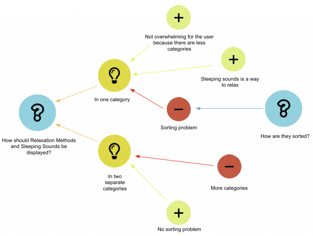
Design Rationale 1: Categorisation of relaxation methods and sleeping sounds

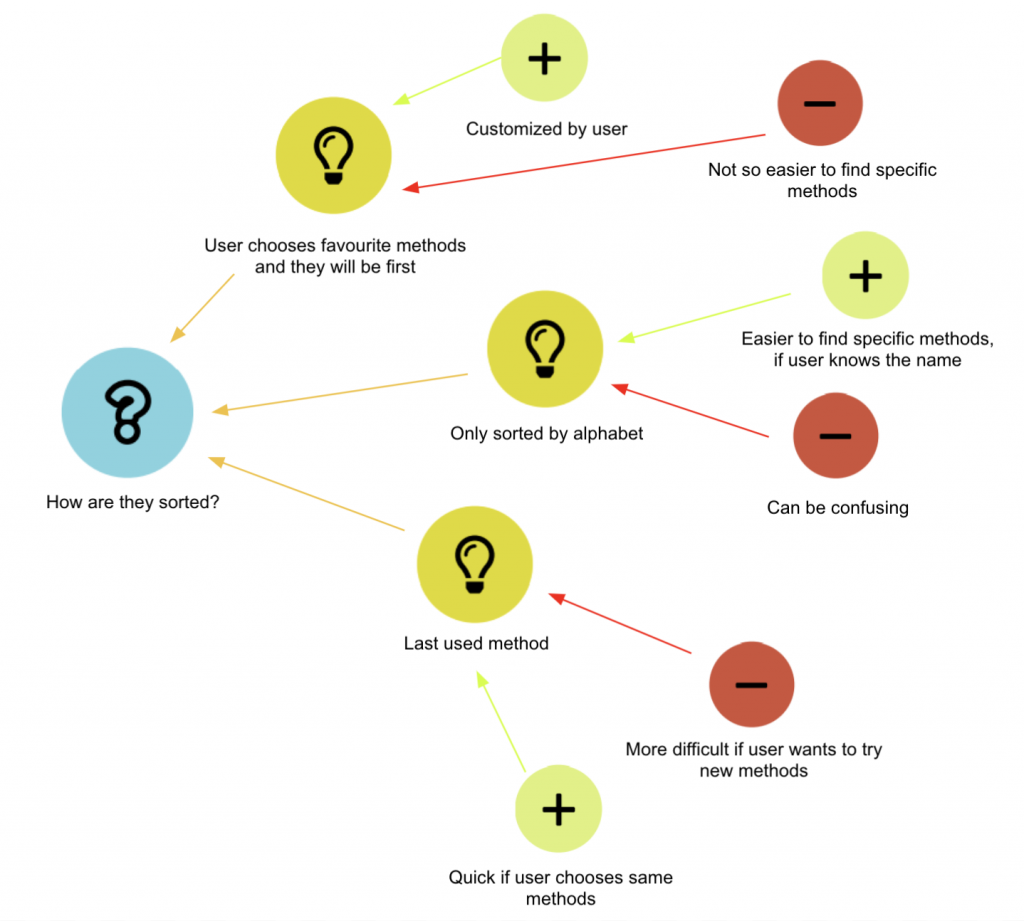
Design Rationale 2: Sorting the two functions when combined in one category

Our design rationales were created using the process-oriented gIBIS technique.