[A#8, P5] Heuristic Evaluation

(1) Improving our high-fidelity prototype

We continued working on our prototype and mostly fine-tuned it so that we were as happy as possible with the latest version we gave to the evaluators in our partnering group. This was important for us in order to get the most out of the evaluation and really be able to make use of the incoming feedback.

Here is the latest version of our high-fidelity prototype:

https://www.figma.com/proto/uyswzIlrEDZOnSqmzk08te/Sleepy-Heads-HiFi-Prototype?node-id=17%3A11&scaling=scale-down&page-id=0%3A1

(2) Conducting the first and second phases of a heuristic evaluation

Phase 1: Preparation

Tasks For the Evaluators

  1. You are looking for help in the app, where would you find it?
  2. Pick a relaxation method.
  3. Pick a sleeping sound.
  4. You have a headache and muscle soreness, choose these factors in the app.
  5. Add your own custom factor.
  6. Activate the option to record your sound during sleep.
  7. Start the sleeping mode.

Our evaluation form

We used the evaluation form template in order to make our own for the evaluation process.

https://docs.google.com/forms/d/e/1FAIpQLSe_-bejHJuFllO1uwi9hQ1E8uUpEFpXDQEg1q9P8z5QNIGDKw/viewform?usp=sf_link

Screenshots

We each used Google Drive to collect our screenshots individually and share their URLs in the evaluation form.

Phase 2: Evaluation

While conducting our individual inspections, we all benefitted from the following sources in order to better understand the Nielsen’s Heuristics:

Summary of our evaluation processes

We all found the tasks that were given to us very well written and had no problems understanding what was wanted from us. Each of us carried out the tasks and noted the problems we came across while doing so. We then used the sources stated above to link the issues we had found with the corresponding heuristics. Once we knew which heuristic the issue belonged to, we filled out the evaluation form and supported our explanation with a linked screenshot. Once we had all finished our individual inspections, we met up to briefly exchange our experiences during the heuristic evaluation process.

Our heuristic evaluation report for Group 1:

https://docs.google.com/presentation/d/15QT9JuhXICgxco4mfTA4s6zQVY1cxVwdC5XPKEWonXc/edit?usp=sharing
The Process of Heuristic Evaluation

The heuristic evaluation process consists of 4 phases:

  • The preparation phase
  • The evaluation phase
  • The discussion phase
  • The documentation phase

At the very beginning of the heuristic evaluation process the preparation phase takes place where a meeting is conducted to plan the process ahead. This meeting does not have to take place with all participants but the evaluation has to be prepared so that the most important heuristics that are going to be used are decided on. It is also important to know which application scenarios there are and which tasks there are to be carried out within these scenarios. The individual tasks must be formulated and defined.

After the preparation phase comes the evaluation phase. The evaluation is carried out by individual experts using the documents made available. The evaluators can be groups of the design or development team but also individuals.

If there is more than one evaluator, all the evaluators meet for the discussion phase after of the evaluation phase. The aim here is to compare the findings and problems that have been found, and to merge these into a list. The severity of the problems are then assessed and, in some cases, even initial solutions can be proposed in this phase.

At the very end, the documentation phase takes place in which the results are summarised in a corresponding results document.

Source: “09-1 HCI Evaluation Inspections and Quantifications” 33:39 – 35:48, Vbrick Rev, uploaded by Claudia Müller-Birn, 16 June 2020, https://fu-berlin.eu.vbrickrev.com/#/videos/db88c409-3b9b-46a0-a0d2-2c514542afda.

Types of UI Guidelines

There are many different guidelines that can be used that state what needs to be considered in a software project, especially in its interface design.

Style guidelines define how a software is visually expressed. When software is designed by a company or organisation the corporate identity must then be reflected in the software products. Here we can ask the question „What should a logo look like, which colours should be used, which symbols and which typography?“ and the answers must be matched with the corporate identity of the respective company or organisation for which the software is being created.

Layout guidelines define the overall structure of a user interface, i.e. „How should the individual windows, structures and areas be listed in the application?” These are mainly about the grid and list layout questions that need to be answered here and, of course, also when working in the area with different interfaces (desktop/web/mobile), the question „How can it be ensured that the interface always works as intended and how should it then be divided accordingly?”

UI component guidelines include questions such as „Which UI components are used? (How should window dialogues, control panels, menus be designed?)“ All this must be bindingly defined.

Text guidelines ensure that the same text is used everywhere. „What size, font and colour should the text be?“

The type of interaction should also be clearly defined when designing a software interface. Here we ask ourselves the question „When should we work with a click interface, when should it be more of a gesture interface or a corresponding voice interface?” and „What information should be displayed when and what is the behaviour in the respective situations?“.

Accessibility guidelines should be considered early in the designing process, as if they are considered at the beginning, it is much easier to take them into account in the corresponding interface design. Here we ask ourselves „How can the software application be designed to be as accessible as possible?”

Reusable design patterns can also be considered when designing the interface. Here we ask ourselves the question „Are there already user interface guidelines that help to make an informed decision? Are there patterns that help to determine the behaviour of certain controls?”

These UI guidelines and all the many more ensure that the final outcome is of highest possible quality for everyone involved in the software product.

Source: “07-3 HCI User Interface Guidelines” 03:44 – 07:25, Vbrick Rev, uploaded by Claudia Müller-Birn, 3 June 2020, https://fu-berlin.eu.vbrickrev.com/#/videos/5e6f1a27-0cfb-42c6-9366-e806f6b839ae.

[A#5, P5] Sleepy Heads – First interactive low-fidelity prototype

Feedback summary

  • Night mode: No notifications or messages, mute certain calls -> No distractions on the mobile phone (not in the prototype)
  • Dream diary with voice recording (not in the prototype)
  • Notifications to remind you about entering data, even if you haven’t tracked anything for a week (not in the prototype)
  • Perceived dialogue where the user is guided through the app
  • Entering factors is a good function, as these factors strongly influence the quality of sleep.

Development of an interactive paper prototype

the first version of our interactive prototype:

https://www.figma.com/proto/2ajRymIg7sGKAu2kDzQI7L/Prototype?node-id=6%3A52&scaling=scale-down&page-id=0%3A1

The prototyping process

For our prototype we worked with Figma. As we had already agreed on the functions we wanted to provide, we didn’t have to discuss them during the prototyping process and could simply concentrate on creating the pages.

Relation to our use cases

The use case our prototype relates to is the process of when the user wants to go sleep.

Storyboard reflection

For our prototype we followed the first part of our storyboard where the user is preparing to go to sleep.

Self-assessment

  • We were happy with the fact that we used the system-internal back-button, so that we didn’t have to build an extra back button into the design.
  • Our colour selection was spontaneous, we believe this could be improved in the future.
  • We weren’t absolutely sure if the icons for the buttons and functions are unique – some might not fit so well or be difficult to understand.

Design rationales

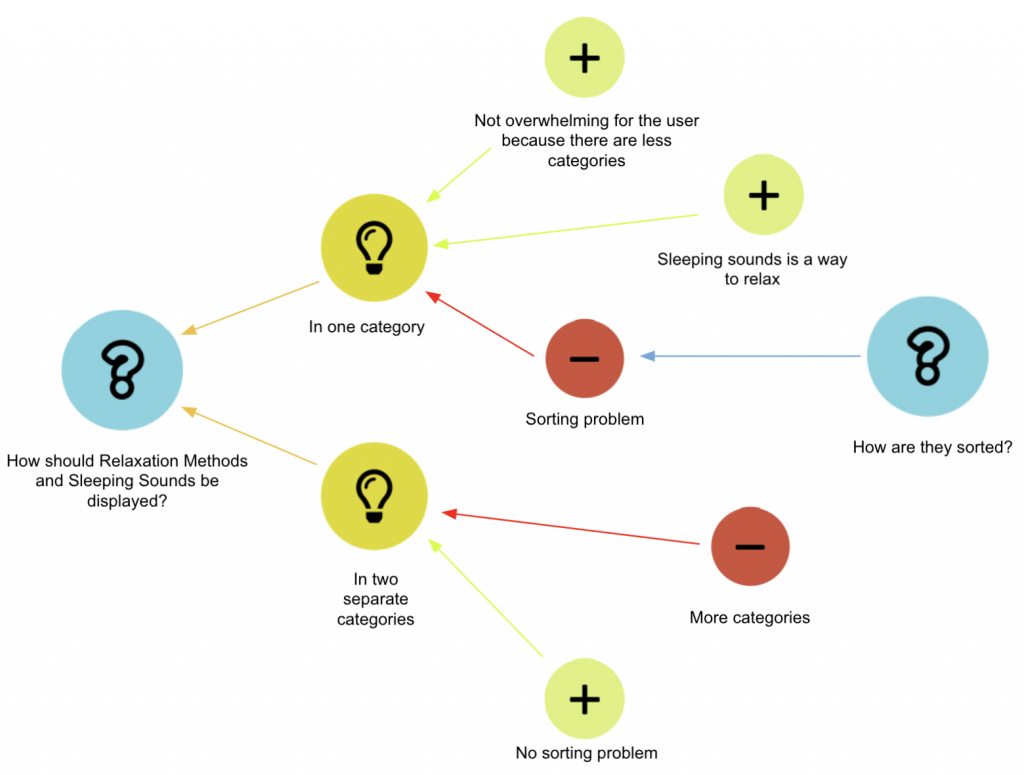
Design Rationale 1: Categorisation of relaxation methods and sleeping sounds

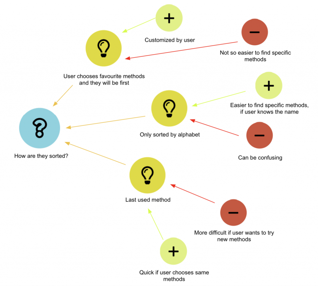
Design Rationale 2: Sorting the two functions when combined in one category

Our design rationales were created using the process-oriented gIBIS technique.

[A#2, P5] Sleepy Heads – Data Gathering

Our Plan

1. What are the goals of our data gathering session? What do we want to find out?

Our goal is to find out the requirements of the target group for such an application and what possible functions there are that we haven’t taken into consideration yet. We would also like to find out about the process at sleep labs and how the data collection is done.

2. What kind of people do we want to gather data from? Who are our participants?

Our participant is a person from our target group, who has been struggling with sleeping problems for many years and has also previously had experience with sleeping labs. Our participant is 27 years old and is not currently studying or working.

3. What is our data gathering method?

Which method will we be using and why?
We will be gathering data by conducting an in-depth interview with a person from our target group. As an additional data gathering method, we will be analysing existing sleep-tracking apps.

What type of interview?
Semi-structured

What kind of data do we want to gather?
Qualitative detailed data

4. How we decided to handle the topics pilot study & data recording?

We will conduct a pilot study with someone from a closer circle (as in a friend or family member) in order to make sure all questions are clear and understandable.

The data recording will be done via 1 interviewer and 2 recording clerks. If possible, the interview will also be recorded.

Preparation and conduction of our in-depth interview

1. Where to find our interview script?

You can find our interview script on page 2 of this blog post.

2. How we decided to conduct the interview?

Who took notes?
Angelika and Yasemin took notes. (We had decided to have 2 recording clerks instead of 1 to make sure we don’t miss out on any information if the interview is not recorded.)

Who asked the questions?
Tanita, as she knows the interviewee, we decided this would be best in order to make the interviewee feel as comfortable as possible during the interview.

3. Where to find the collected data?

You can find a summary of the collected data on page 2 of this blog post.

Conduction of one other data gathering method

1. What method did we choose and what type of data did we decide to gather?

We decided to conduct a market analysis to collect further data on our topic.
The questions that most interested us during this analysis where what our competition is doing and what we could do to outshine them.

2. Where to find the collected data?

You can find a summary of the collected data on page 2 of this blog post.