Fitts‘ Law

Fitts‘ Gesetz ist eine Möglichkeit vorherzusagen wie lange Personen brauchen um etwas zu zeigen. Das Gesetz wurde in vielen verschiedenen Bereichen gezeigt, so gilt es bei Personen unter Drogeneinfluss als auch bei Menschen die mit der Technik nicht vertraut sind.

Fitts Gesetz aus https://de.wikipedia.org/wiki/Fitts%E2%80%99_Gesetz

Dies ist die Originale Schwierigkeitsformel mit D als Abstand zum Ziel und W als Breite. Dies bedeutet in der Anwendung das z.B. oft zusammen benutze Icons nahe aneinander zu positionieren, da damit D und somit auch ID kleiner wird. Die gleiche Idee wird auch verwendet wenn man Menüs am Mauszeiger oder an einem angeklickten Icon öffnet. So kann man in Windows durch diese Methode schnell einen neuen Ordner erschaffen ohne das man lange nach einem sich öffnenden Fenster suchen müsste.

Quellen

(Janis Krzok)

Keystroke Level Model

Beim Keystroke Level Model handelt es sich um ein quantitatives Verfahren aus dem Forschungsbereich des Human Computer Interaction, welches eine Vorhersage darüber treffen soll, wie lange ein erfahrender Benutzer für die fehlerfreie Bearbeitung einer Aufgabe auf einem genannten System braucht.
Um eine Analyse durchzuführen, sollte im besten Fall schon ein High Fidelity Prototype vorhanden sein. Das KLM gehört zu den weitverbreitetsten Techniken und wird oft bei Textverarbeitungsaufgaben verwendet. Für eine Berechnung können verschiedne Operatoren genutzt werden.

K = Ein Tastenanschlag oder Mausklick
P = Mit der Maus auf etwas zeigen
H = Wechsel der Hand zwischen den Eingabegeräten
D = Zeichnen auf einem Bildschirm
M = Mentale Vorbereitungszeit auf eine physische Aktion
R = Antwortzeit vom System

Beispielaufgabe: Ziehen einer Datei in einen Papierkorb

Sources:
Vorlesungsvideo – HCI 09-3 Quantifications
Wikipedia – Keystroke-Level-Model

Nielsens Heuristiken

Von Nielsen et al. wurden 10 Heuristiken für die Bewertung eines User Interfaces zusammengestellt.

  1. Sichtbarkeit des Systemzustands: User Systemzustand jederzeit bewusst machen
  2. Abgleich von System und der realen Welt: Bekannte Objekte nutzen, Metaphern herstellen
  3. User Kontrolle und Freiheit: Notausgang aus unerwünschten Situationen immer ermöglichen
  4. Konsistenz und Standards: Plattformkomform arbeiten, Nutzer soll sich nicht neu orientieren müssen
  5. Fehlerprävention: Fehler durch erneute Abfragen verhindern, „Submit“ oder „Abbruch“ erkennbar
  6. Erkennen statt Erinnern: Aktionen auf Objekten sichtbar machen, dass Nutzer kein Langzeitgedächtnis braucht
  7. Flexibilität und Effizienz: Um erfahrenen Usern eine schnellere Nutzung zu ermöglichen
  8. Ästhetik und Minimalistisches Design: was wird wirklich benötigt, der Rest zerstört Ordnung
  9. Erkennen, Diagnostizieren und Erholen von Fehlern: sollte in menschenfreundlicher Sprache erfolgen
  10. Hilfen und Dokumentationen: schnell auffindbar und gut verständlich

[LU#9, 09-1_HCI_Evaluation_Inspections_and_Quantifications.pdf, Slides: 6-11, 13-15, 17-18]
{Video: 09-1 HCI Evaluation Inspections and Quantifications, Start: 5:28, End: 28:38}

The Process of Heuristic Evaluation

The heuristic evaluation process consists of 4 phases:

  • The preparation phase
  • The evaluation phase
  • The discussion phase
  • The documentation phase

At the very beginning of the heuristic evaluation process the preparation phase takes place where a meeting is conducted to plan the process ahead. This meeting does not have to take place with all participants but the evaluation has to be prepared so that the most important heuristics that are going to be used are decided on. It is also important to know which application scenarios there are and which tasks there are to be carried out within these scenarios. The individual tasks must be formulated and defined.

After the preparation phase comes the evaluation phase. The evaluation is carried out by individual experts using the documents made available. The evaluators can be groups of the design or development team but also individuals.

If there is more than one evaluator, all the evaluators meet for the discussion phase after of the evaluation phase. The aim here is to compare the findings and problems that have been found, and to merge these into a list. The severity of the problems are then assessed and, in some cases, even initial solutions can be proposed in this phase.

At the very end, the documentation phase takes place in which the results are summarised in a corresponding results document.

Source: “09-1 HCI Evaluation Inspections and Quantifications” 33:39 – 35:48, Vbrick Rev, uploaded by Claudia Müller-Birn, 16 June 2020, https://fu-berlin.eu.vbrickrev.com/#/videos/db88c409-3b9b-46a0-a0d2-2c514542afda.

Evaluation Settings

Die Evaluation Settings können in zwei Bereiche aufgeteilt werde. Die Settings ohne Nutzerbeteiligung und die Setting mit Nutzerbeteiligung.

Die Settings ohne Nutzerbeteiligung besteht aus zwei Unterbereichen. Den Inspection methods und der Quantifications.

Inspection Methods: Bei dieser Variante muss das Verhalten des Nutzers prognostiziert werden um Usability-Probleme zu erkennen. Hier wird auf das Wissen über das Nutzerverhalten und über gute Nutzbarkeit gesetzt. Zu diesen Methoden zählen die Heuristic Evaluation und das Walkthrough.

Quantifications: Diese Variante ist eine Quantitative Analyse der Benutzeroberfläche mittels vordefinierter Modelle. Hierzu zählt das GOMS Keystroke Level Model.

Die Settings mit Nutzerbeteiligung können ebenfalls in zwei Unterbereiche eingeteilt werden. Hierbei handelt es sich um die Controlled Settings und die Natural Settings.

Controlled Settings: Diese Einstellung erlaubt es alle Faktoren vollständig zu kontrollieren. Die Umgebung kann manipuliert werden, um das Experiment so präzise wie möglich zu gestalten. Zu dieser Variante gehört das Usability Testing und Experiments.

Natural Settings: Bei dieser Variante gilt es nur zu beobachten wie die Probanden handeln. Es sollte nicht in das Handeln eingegriffen werden. Hierzu gehören Classical field testing, Synchronous remote usability testing und Asynchronous remote usability testing

Sources:

HCI 09-1 Evaluation: Inspections and Quantifications, Prof. Dr. Claudia Müller-Birn (https://git.imp.fu-berlin.de/hcc/hci1-sose-2020/-/wikis/lecture/09-1_HCI_Evaluation_Inspections_and_Quantifications.pdf)

HCI 09-2 Inspections: Cognitive Walkthrough, Prof. Dr. Claudia Müller-Birn (https://git.imp.fu-berlin.de/hcc/hci1-sose-2020/-/wikis/lecture/09-2_HCI_Cognitive_Walkthrough.pdf)

Fitts‘ Law

Die Geschwindigkeit und Genauigkeit von Bewegungen ist von zentraler Bedeutung bei der Gestaltung von interaktiven Systemen.
Insbesondere wie viel Zeit benötigt wird, um von einem Punkt A auf dem Bildschirm zu einem anderen Punkt B zu gelangen und bei Punkt B das entsprechende Ziel zu treffen.
Hierbei ist „distance“ die Entfernung zwischen Punkt A und B und „size“ die Größe des Ziels.
a und b werden empirisch ermittelt.

Quelle: 09-3 HCI Quantifications, https://fu-berlin.eu.vbrickrev.com/#/videos/9a68edc0-eb68-4ca3-985b-d05abdbbb0f1 (Minute: 12:50-14:55), abgerufen 06.07.2021 um 13:00 Uhr oder https://git.imp.fu-berlin.de/hcc/hci1-sose-2020/-/wikis/lecture/09-3_HCI_Quantifications.pdf (Folie 8)

Cognitive Walkthrough

Geht darum herauszufinden was Personen denken, während sie bestimmte Aktivitäten mit dem User-Interface ausführen.
Dabei geht es insbesondere um einen Erstkontakt des Nutzers/der Nutzerin mit dem Interface und somit um die Erlernbarkeit des selbigen.

Was wird für einen Cognitive Walkthrough benötigt?
1. Beschreibung des Interface-Prototyps. Diese muss nicht unbedingt vollständig, aber trotzdem recht ausführlich sein. Somit benötigt der Prototyp auch einen gewissen Reifegrad.
2. Eine repräsentative Aufgabe, die von den Nutzer:innen erfüllt werden soll.
3. Eine vollständige Liste von Aktionen, die durchgeführt werden müssen, um die Aufgabe zu erfüllen.
4. Sich vorher gut überlegen, welche Erfahrungen und Hintergründe die Nutzer:innen haben sollten.

Die Essenz des Walkthroughs ist darauf zu achten, an welcher Stelle die Nutzer:innen vom in 3. idealisierten Pfad abweichen.

Quelle: 09-2 HCI Cognitive Walkthrough, https://fu-berlin.eu.vbrickrev.com/#/videos/19768a87-e963-4acc-afb6-0c3a1d75d36a (Minute 1:40-5:25), abgerufen 06.07.2021 um 13:10 Uhr oder https://git.imp.fu-berlin.de/hcc/hci1-sose-2020/-/wikis/lecture/09-2_HCI_Cognitive_Walkthrough.pdf (Folie 3+4)

Cognitive Walkthrough

Cognitive Walkthrough is an evaluation method, more precisely a Usability Inspection, in which no user participates.
This method focuses on the learnability of an application and what actions a new user would take for a given task and document it.
Therefore a usability expert emphasizes with a potential user and carry-out the given tasks.
For the procedure you need:

  • a description of the prototype of the interface
  • a task description
  • a list of the actions a user need to complete the task
  • an idea of who the users will be and what experience they have

Also an Evaluator should have these 4 questions in mind:

  • Will user know what sub-goal they want to achieve?
  • Will user find the action in the interface?
  • Will user recognize that it accomplishes the sub-goal?
  • Will user understand the feedback of the action?

Quellen :
Video: Müller-Birn, C., Lecture 9-2, LU #8 – Evaluating Techniques I – Human-Computer Interaction I (fu-berlin.de), Start: 1:40 End: 8:26, retrieved 10.06.2021, 13:00
Slides: 09-2_HCI_Cognitive_Walkthrough (fu-berlin.de), p.3-5

Types of UI Guidelines

There are many different guidelines that can be used that state what needs to be considered in a software project, especially in its interface design.

Style guidelines define how a software is visually expressed. When software is designed by a company or organisation the corporate identity must then be reflected in the software products. Here we can ask the question „What should a logo look like, which colours should be used, which symbols and which typography?“ and the answers must be matched with the corporate identity of the respective company or organisation for which the software is being created.

Layout guidelines define the overall structure of a user interface, i.e. „How should the individual windows, structures and areas be listed in the application?” These are mainly about the grid and list layout questions that need to be answered here and, of course, also when working in the area with different interfaces (desktop/web/mobile), the question „How can it be ensured that the interface always works as intended and how should it then be divided accordingly?”

UI component guidelines include questions such as „Which UI components are used? (How should window dialogues, control panels, menus be designed?)“ All this must be bindingly defined.

Text guidelines ensure that the same text is used everywhere. „What size, font and colour should the text be?“

The type of interaction should also be clearly defined when designing a software interface. Here we ask ourselves the question „When should we work with a click interface, when should it be more of a gesture interface or a corresponding voice interface?” and „What information should be displayed when and what is the behaviour in the respective situations?“.

Accessibility guidelines should be considered early in the designing process, as if they are considered at the beginning, it is much easier to take them into account in the corresponding interface design. Here we ask ourselves „How can the software application be designed to be as accessible as possible?”

Reusable design patterns can also be considered when designing the interface. Here we ask ourselves the question „Are there already user interface guidelines that help to make an informed decision? Are there patterns that help to determine the behaviour of certain controls?”

These UI guidelines and all the many more ensure that the final outcome is of highest possible quality for everyone involved in the software product.

Source: “07-3 HCI User Interface Guidelines” 03:44 – 07:25, Vbrick Rev, uploaded by Claudia Müller-Birn, 3 June 2020, https://fu-berlin.eu.vbrickrev.com/#/videos/5e6f1a27-0cfb-42c6-9366-e806f6b839ae.

Dialog Box

A Dialog box is a type of pop-up menus and is inserted to get a certain information from the user. It is a small window and structured like a form.
We distingiush between a modal and modeless dialog box.

A modal dialog box blocks the whole application and sometimes prevents you from interacting with other applications. You can only get back if you enter the needed information or close the dialog box. It is used when the application needs certain information from the user in order to proceed the process.

I made the picture myself

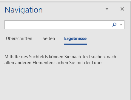
A modeless dialog box doesn’t restrict the workflow of the user like the model dialog box, so it coexists with the parent application.

Navigation side bar in MS Word
I made the picture myself

Quelle:
Video: Müller-Birn, C., Lecture 7-2, LU #7 – Designing the Interaction between Human and Computer – Human-Computer Interaction I (fu-berlin.de), Start: 9:30 End: 12:13, retrieved 03.06.2021, 12:00
Slides: 07-02_Interaction_Styles (fu-berlin.de), p.7