Keyboard layouts

The QWERTY keyboard layout developed by Christopher Latham Sholes in 1874 for the typewriter was designed to be the most efficient layout possible for the English language. The idea was that the person typing move their fingers between the rows to type the most common letters. It is also told that the arrangement of the keys was designed to reduce the possibility of typebars hitting each other by placing often used combinations of letters further away from each other. The QWERTY layout now has become the de facto standard for English language keyboards.

The French-speaking countries often use the AZERTY layout which switches the Q for an A and W for Z. The M key has moved to the right of the L key and some special characters are accessible with the shift key.

The QWERTZ layout used in central Europe (Germany, Austria, Switzerland, and Czech Republic) swapped the Y and Z key, as well as special characters such as brackets, are replaced with characters such as Ä, Ö, Ü, ß.

The Dvorak layout was developed by August Dvorak in 1936 with the intention to be more efficient than the QWERTY layout and it is also better suited to right-handed people. Distance measurements showed that the Dvorak layout reduces your hand movement to almost half of that of the QWERTY layout. After getting used to the key arrangement users saw an increase in typing speed up to 10-15%.

Dvorak Layout.
Source: Wikimedia Commons

Sources:

The Great Keyboard Debate: QWERTY versus Dvorak

Typewriter (https://en.wikipedia.org/wiki/Typewriter)

Keyboard Layout (https://en.wikipedia.org/wiki/Keyboard_layout)

6 Non-QWERTY Keyboard Layouts

[A#6, P1] Paper prototyping and usability testing

In our usability tests, the average time was 20 minutes. We did it in alternation so that each of us can experience the available roles at least once. The roles: The observer is taking notes while the facilitator guides the interview. All participants are affected by the solution that HelloFridge offers. Since the target group is living in our area we decided to provide the script in German:

1-Hinweis für den User

Wir testen die App, nicht dich! Fragen bitte gerne stellen, ich kann aber nicht versprechen, alle Fragen direkt zu beantworten! Bitte laut denken

2- Erklärung des Kontexts

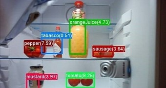
Essen bestellen und Fast Food ist bequem und schnell, aber es schadet der Umwelt. Um diese zu schützen erlaubt unsere App HelloFridge mit einer Zutatenliste passende Rezepte zu finden. So können für die Essensreste Zuhause neue Gerichte gefunden werden.

3-Fragebogen

Alter ?
Erfahrung mit dem Umgang von Smartphones ?
regelmäßiges Nutzen von Mobile Apps ?
Schon mal ein Food-App benutzt ? Welches ? Worum ging es ?

4-Szenario
Stell dir vor du bist zu hause und überlegst ob du etwas kochen sollst oder etwas
bestellen. Du öffnest dein Handy um eine Lieferdienst App zu nutzen, aber plötzlich siehst du das HelloFridge Logo und entscheidest dich der tollen App eine Chance zu geben.

5-Aufgaben

Sollten zu einem Zeitpunkt Verständnisfragen zu den Aufgaben auftreten, bitten wir dich, diese uns gegenüber zu äußern.
Wir stehen dir auch gerne zur Seite falls mal etwas schiefgelaufen ist.
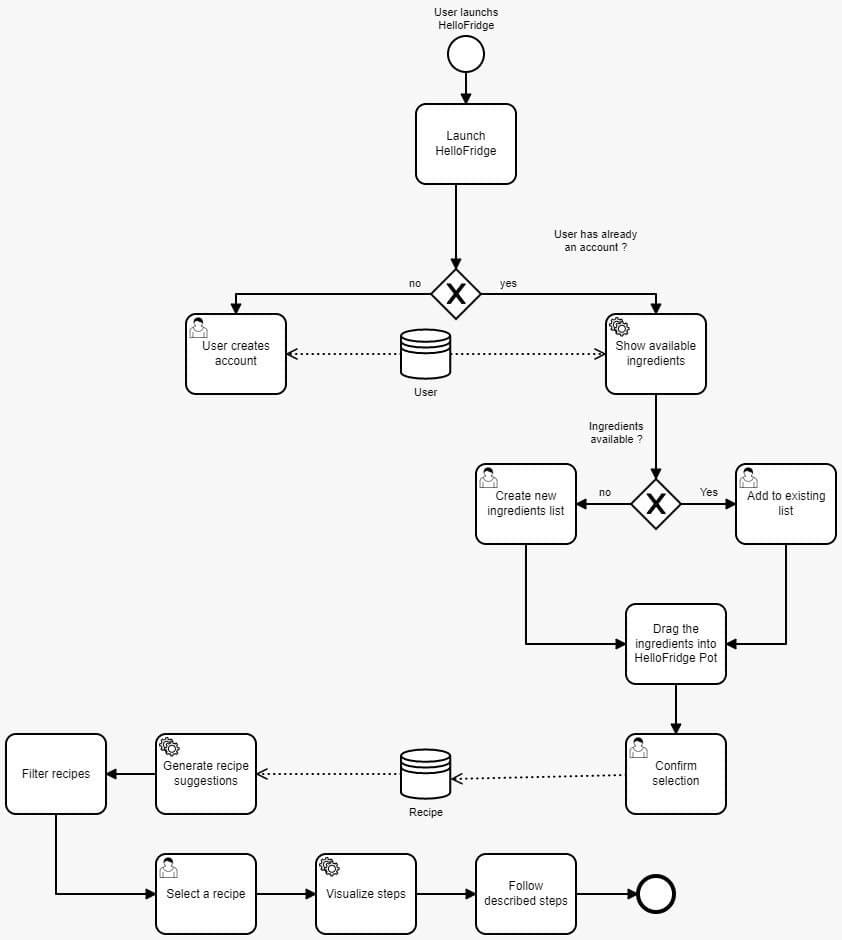
Log dich ein.
Beschreibe was du siehst und deinen ersten Eindruck
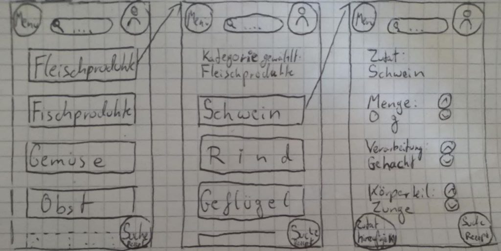
Finde heraus welche Zutaten du schon hast.
Du hast bereit Hänchenbrust, Reis, Olivenöl und Gewürze. Du öffnest die App. Unter der Annahme dass diese Zutaten bereit hinzugefügt wurden, wie wurdest du einen Rezeptvorschlag bekommen ?
Was ist die letzte Rezept die du gekocht hast ?
Welche zutaten hast du übrig nachdem du gekocht hast ?
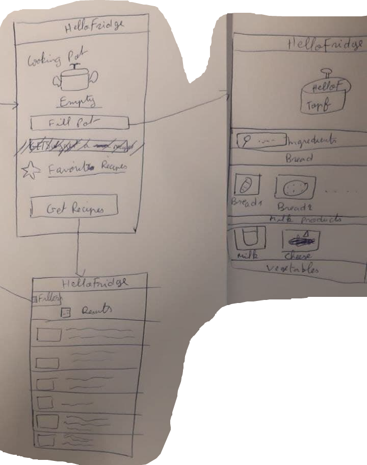
Versuch den Topf mit Zutaten zu füllen

6- Abschließende Fragen

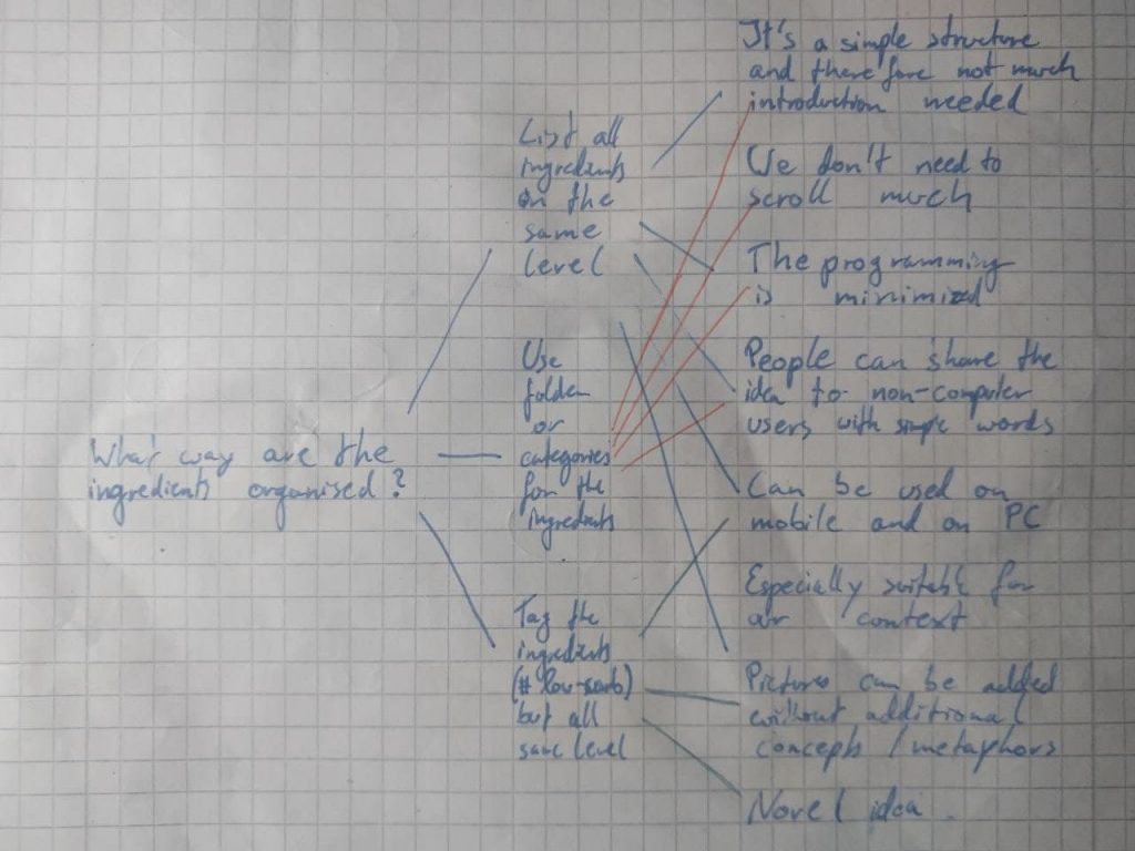
Welche Vor- und Nachteile siehst du grundsätzliche bei der Rezeptesuchen-Funktion der Hello Fridge App ?
Was war für dich nicht intuitiv bzw schwierig zu interpretieren?

7- Abschluss

Hast du weitere Fragen oder Anmerkungen ?

What method did you use to evaluate the results of your usability tests? How did you evaluate the results?

We tried to be as passive as possible during the usability tests to not influence the test persons interaction with the user interface.

While writing the script we tried to have small tasks which can be rated separately. The difficulty of each task will be rated by us according to the performance of the user in order to identify the ambiguous and not intuitive tasks.

Since we provided as little help as necessary to our test user we received rich feedbacks and interesting questions. Those led to greater discussions because we felt that only with additional prompts the thoughts will be verbalized by the users.

What did you learn from the testing? What are your main takeaways?

We noticed that our interpretation of the user interface does not always align with the users interpretation. On various occasions, the user said that „I think the app expects me to …“ which is a clear sign of multiple uncertainties on the users side.

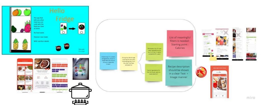
For the reasons stated above we decided to make some changes on our prototype:

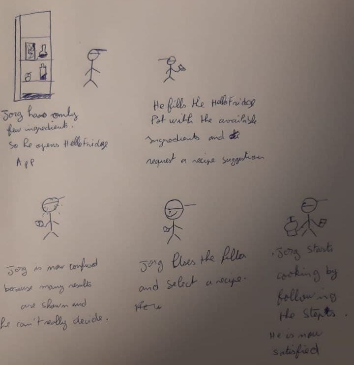
It is not possible to design all the possible use cases that`s why we started with an already filled pot (5 ingredients). The user had some confusion with the first step of our app because it was not clear that the empty pot use case is not tested here.
When the pot is empty the Get Recipe button should be disabled. The favourite button was not clear for all our users „He seems to be out of place“. After some discussions, we decided to change the approach and we will create a tabulation for the Favorites next to Already Cooked ones, which we will also change to a tabulation.

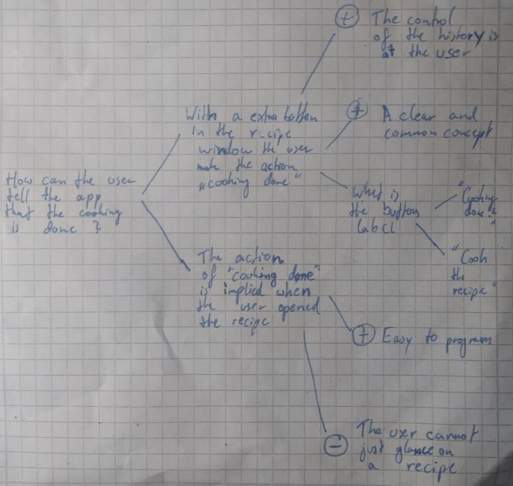
One situation that led to a greater discussion was How the user can mark a recipe as Already Cooked? In our prototype when the user is in the recipe preparation screen we have an Already Cooked? button but clicking this button was mentioned as not intuitive since the common approach is to click on the Back button (<-) . The functionality of the Already Cooked button is very important, especially for refreshing the ingredients list in the pot. This functionality was not communicated clearly to the user through the app. Again after some discussions, we decided to adopt a swiping system where the user can swipe through the recipes preparation steps. The last step asks the user to manually confirm Already Cooked? either by a simple button click or by taking a photo of the cooked meal. But the last-mentioned functionality is nice to have.

Some additional points we discovered:

we want to include drag and drop menues when choosing the ingredients

settings for multiple languages

the touch buttons have to be as big as the pictures

in the recipe preparation screen we want to see the name just once

the recipes at Already Cooked? need a star when they are also in the favourites

An open question is how long our UX prototype has to be alive.

Who did what?

The usability test script was written collectively. During the usability test, we alternated between the Moderator and Observer roles.

What did we learn?

The Usability test brought more inputs than we expected. Moreover, we understood the real value of a usability Test. We have learnt that the product looks different from the user perspective. A big usability flaw wasn’t noticed by us as we designed the prototype so it confused our test persons.

What went well?

The usability tests went well.The discussion was rich and fun.We could draw many conclusions and take some important design decisions.
We are happy that we are reserving a whole day for the collaboration.It is a system that we implemented since the beginning but wz started to see the benefits now since it became a habit for us.

What do we want to improve?

We have noticed nothing this week. The tests went well and the assignment itself was rewarding since we have learned and applied new ideas.

Chorded Keyboard

Das Chorded Keyboard, oder auch Akkordtastatur ist eine andere Art von Eingebegerät. Dieses wurde auch, genauso wie die Maus, 1968 von Douglas Engelbart auf „the Mother of All Demos“ vorgestellt. Sein Model hatte 5 Tasten mit denen, ähnlich wie bei einem Klavier Akkorde gespielt werden können und daraus Buchstaben entstehen. Buchstaben wurden der Reihe nach kodiert also war das „c“ z.B. eine 3. Die verschiedenen Tasten seiner 5 Tasten Tastatur waren: 1,2,4,8 und 16 um als ein c zu schreiben musste man taste 1 und 2 drücken und sobald man sie losgelassen hat Erschien ein c. Neuartigere Akkordtastaturen haben meist zusätzliche Tasten da man oft zusätzliche Features, wie Zeichensetzung Absätze Umschalttaste etc. braucht so hat das Decatxt beispielsweise 10 Tasten. Auch gibt es Chorded keyboards programmierbaren Macrotasten.

Source:

NaN-15 a 15-key chorded keyboard: https://deskthority.net/viewtopic.php?t=15195

Inputs of INterest: the Infogrip Bat Chording keyboard: https://hackaday.com/2020/08/18/inputs-of-interest-the-infogrip-bat-chording-keyboard/

Chorded Keyboard: https://en.wikipedia.org/wiki/Chorded_keyboard

Anti-Aliasing

Das Anti-Aliasing, oder auch Kantenglättung genannt, ist ein Verfahren in der Computergrafik, um bei erstellten 2D- und 3D-Objekten ein höheres Maß an Realismus zu erreichen. Dies geschieht durch die Verringerung des Treppeneffekts. Der Treppeneffekt in gerasterten Figuren ist der endlichen Anzahl an Pixeln des Ausgabegerätes geschuldet.

Das Grundprinzip des Anti-Aliasings ist das Auswerten nicht nur eines einzelnen Pixels, sondern auch der umliegenden Pixel. Durch Verwendung eines Rekonstruktionsfilters können daraufhin die Farben der abgetasteten Pixel angepasst werden, wodurch das Objekt einen glatteren Eindruck macht.

Je nach verwendetem Rekonstruktionsfilter kann das Objekt, auf dem Anti-Aliasing angewendet wurde unscharf erscheinen. Beim Echtzeitrendern fällt die zusätzlich benötigte Rechenleistung des Anti-Aliasing ebenso zur Last, was einen großen Nachteil dieses Verfahrens darstellt.

Sources:

A Comparison of Antialiasing Techniques (https://www.computer.org/csdl/magazine/cg/1981/01/mcg1981010040/13rRUwgyOf4)

Antialiasing (Computergrafik) (https://de.wikipedia.org/wiki/Antialiasing_(Computergrafik))

Assignment #6: Paper prototyping and usability testing

  ?   Deadline: Tuesday, 1st June 12 PM (noon)
 ?   Goals: Conduct formative usability tests.


(1) Continue to develop (or start a new) paper prototype based on new insights or feedback from your peers.

Please document:

  • What and why you have changed your prototype?
  • How you expect this will improve the prototype?

(2) Conduct (at least) 3 formative usability tests.

  1. Develop a script for your usability test.
  2. Document who is taking what role.
  3. Decide if you want to record your test session and how you take notes during the test sessions.
  4. Document who you are inviting for a test session and how long the session lasted.

(3) Document and evaluate the results of your testing.

  • What method did you use to evaluate the results of your usability tests? How did you evaluate the results?
  • What did you learn from the testing? What are your main takeaways?

[A#5, P1]

Summarize the feedback you received regarding your storyboard.

During our last virtual classroom session, we received a lot of software and especially programming tips from various other students and because of this we have a good idea of our coding challenges in the future of our project.
One of the hints was that the account is most likely the most difficult part since it needs access to our own database in every interaction and besides that, we must take care of all the necessary security that comes with an account.
The general feedback was good, and we heard that the artefacts created had a good quality and that the content suites the initial presentation/pitch.
An improvement can be done with a combination of the sketches with the storyboard.
While all teams accepted our Moodboard as a potential solution for the assignment, we found that it was difficult to explain our project through our Moodboard. That’s why we are interested in more theory behind this presentation method.
One sentence where all feedbacking students gave positive feedback was „Even if HTA provides a better understanding which subtask are included, in our current project state we mostly need a better overall understanding of the system. From the choices given BPMN is the best to achieve this because it delivers a clear visualization of the whole lifecycle.“ and it seems all of them came to a similar conclusion.
We want to include the pot as a metaphor while picking the ingredients.

Develop an interactive paper prototype.

https://share.proto.io/X7US1C/

After a group discussion it was clear that the most efficient way of a Paper Prototype is making it completely in proto.io. We are going for that since we are skilled here and the argument for using pen and paper was just the lower time and effort it takes. Therefore, we do have the opposite opinion: a computer made prototype is more efficient for us. Additionally, an interactivity is required which is also an argument for proto.io because this tool makes this very easy.

The prototyping process was straightforward and productive with some good thoughts regarding how intuitive it is.

The use case and/or model (task analysis from last assignment) this prototype relates to is mostly the BPNM.

With the storyboard created last week we can make a good software that solves the showed situation.

We have a pretty good feeling in the group since all our discussions are constructive. The technology knowledge is on a good level for the challenges.

At this point, we think it is good to mention that we had some confusion regarding the definition of a Paper Prototype since we understood with the lectures definition that the interactivity is just played (while this additional means it is not possible to distinguish it`s to a „Wizard of Oz“ prototype) but we remember from the last session that we need interaction without a playing computer.

https://www.designevo.com/apps/logo/?name=green-chef-cap-and-white-tableware (icon source)

Design rationales

process-oriented gIBIS
structure-oriented general QOS

Who did what?

Mouadh has strong knowledge of the prototype tool so he took the lead. The learning opportunity was used by Christian and since learning is more focused when you write while doing it this was a Win-Win situation. We are again happy afterwards that we did it this way.

What did we learn?

While Christian achieved a basic understanding in the disciplines required Mouadh was concentrated on the requirements implementation. The proto.io tool is very cool, process and structure is an interesting perspective.

What went well?

As mentioned in the second question of this assignment we are happy that we can do a lot of collaboration and this is always oriented for the good of our product. Therefore we have a lot of respect for the other person`s opinion.

What do we want to improve?

We had some struggles this week with the platforms but everything is clear at the end of the tasks. This was mostly because of an initial wrong thought regarding where we can find the correct answer.

Assignment #5: First interactive low-fidelity prototype

  ?   Deadline: Tuesday, 25th May 12 PM (noon) (Postponed due to Pentecost!)
 ?   Goals: Create your first interactive low-fidelity prototype.


By now, you have developed a thorough understanding of your project regarding the user, context, and tasks. You also developed a good understanding of the problem you are going to solve and developed a first idea of how your solution could look. Now we will put everything together and enter the design space! You will start to make your first testable prototype.

(1) Summarize the feedback you received regarding your storyboard.

During the last lab session, you gathered feedback from your fellow students. Please summarize the feedback and document which feedback you are going to include in your prototype.

(2) Develop an interactive paper prototype.

You will develop an interactive low-fidelity prototype that represents multiple states or views. Think of your persona, who wants to use your product: What does your persona need at least? What are the must-haves?

Please briefly describe:

  • your prototyping process.
  • the use case and/or model (task analysis from last assignment) this prototype relates to.
  • how the storyboard is reflected in your prototype.
  • self-assessment of potential strengths and weaknesses of this first step into your design space.

Please make sure that your prototype is clickable and other people can access your prototype for testing. Please don’t worry about how your prototype looks like! It is not about how nice things look but about communicating a general idea and the main functionality.

(3) Design rationales

Choose a technique (process-oriented gIBIS or structure-oriented QOC) and apply it with two questions.


Tools for Interactive Paper Prototypes

Suggested process: Do just one more round on paper or pad. Make photos and link your screens using:

  • Marvel POP (Prototyping on Paper)
    App for iPhone or Android
    This would be just enough for now and has everything to make your photos/screens interactive.
  • Marvel
    Web application
    One free project with max. 6 team members.
  • Figma
    Web application
    One free team project!
  • Invision (Prototype)
    Web application
    One free project with collaborators,

Other tools to consider: Sketch (Mac only!), AdobeXD, Axure (30 day trial), Balsamiq (only a 30 day trial).

Examples

Example from summer term 2020 using figma.

Human Processor Model

The Human Processor Model is a framework for system designers. It is a cognitive modeling method, which is also a possible way to evaluate the usability of a product, by estimating how long a person will take to perform certain tasks. The estimates are given by the framework, which eliminates the need to perform experiments with the users. Another aspect of the framework is that the designer can guess what the expected chance is that a person remembers an item that was presented to them in the process.  This can be used as an indication of whether or not a user is likely to recall crucial elements that they encountered during the procedure.

Source: Human Processor Model

[A#4, P7] Veritas – Ideation and Storyboard

Formulate a problem and hypothesis statement and document it.

Problem Statement

Mark needs a way to get a balanced overview on a specific topic because he would like to form an unbiased opinion. 

We will know this to be true when we see: can explore different sources for his opinion forming.

Hypothesis Statement

We believe that by building an intuitive overview site showing a range of news articles for Mark, we will double the diverse sources that Mark is using.

Conceptual models for task analysis

To create a conceptual model for the task analysis we opted for Hierarchical Task Analysis (HTA) because the tasks the user has to fulfill fit well into this format and we were already accustomed to this method.

https://cdn.discordapp.com/attachments/834058821948276749/842007298012741632/Sitemap_-_Frame_1.jpg

Find inspirations, analogies, and create a moodboard.

Next, we each worked 30 mins individually to find inspirations and envision what theme our application is supposed to have. Additionally, we look at other solutions out there and thought about how we can differentiate us from existing projects. We opted for simplicity and usability as main focus since this is what is lacking most on similar websites.

https://cdn.discordapp.com/attachments/834058821948276749/842019005766434856/dubidu_-_Frame_1.jpg

Create individual sketches.

After discussing our individual moonboards we again split up and tried to think of how the application should look like.

https://cdn.discordapp.com/attachments/834058821948276749/842658660673257472/2021-05-14-Note-09-03.png
https://cdn.discordapp.com/attachments/834058821948276749/842666485988982805/IMG_20210513_225335.jpg
https://cdn.discordapp.com/attachments/834058821948276749/842666488016011305/20210514_093424.jpg

Condense your results from the previous step into a storyboard.

After presenting the design to each other we decided to integrate the best of everything into our solution. The descriptions below the individual pictures describe the idea in detail.

https://cdn.discordapp.com/attachments/834058821948276749/843476600602361866/20210516_151319.jpg

Reflection

Who did what?

We did task 1 and 2 together as a group. We split and did task three individually and then discussed our individual results again as a group. Next, we split up again to do the individual sketches and later decided as a group how we want out application to look like. Arne then merged our ideas and what we discussed into one big, nice sketch. Clemens wrote the blog post.

What did we learn?

We learned how one can merge the vision of multiple people into one core idea and how we can create one UI where the ideas of everyone are somehow represented.

What went well?

The discussion as a group usually works very well. Everyone gets to share their opinion and we are usually all happy with the result. Also, everyone does their work on-time and with good enough quality such that we can focus on further steps when we meet again.

Where is room to improve?

We are sometimes not a punctual to our meetings as we could be.

[A#4, P1] Ideation and Storyboard

Formulate a problem and hypothesis statement and document it.

Jorg needs a way to easily generate recipes from a set of ingredients because he always has leftovers.

We will know this to be true when we see: that Jorg always get a list of recipe suggestions from his ingredients selection.

We believe that by creating a user friendly interface for ingredients selection and clear visualization of the resulting recipe list for Jorg, we will achieve having less leftovers and ordering 50% less food.

Conceptual models for task analysis

We hesitated between BPMN and HTA, but we decided to go for the task flow with BPNM because we estimate that this choice will help us the most analysing our user`s tasks. Even if HTA provides a better understanding which subtask are included, in our current project state we mostly need a better overall understanding of the system. From the choices given BPMN is the best to achieve this because it delivers a clear visualization of the whole lifecycle.

Find inspirations, analogies, and create a moodboard.

Picture sources from left to right: 3 screenshots, pot, fridgepix, no-fast-food sign, tender, supercook.com

Create individual sketches and share your sketches with your team.

With the made BPNM and the moodboard we are able to get a better insight for the processes. Following this insights we created sketches how our app will look like.

Condense your results from the previous step into a storyboard.

Who did what?

We decided this week that the assignments need a very strong interaction, discussion and collaboration. Therefore, we have not spent time on separation and had a long teamworktime. We are happy afterwards that we did it this way.

What did we learn?

All the methods used besides BPNM are new for us. This means we had a lot of hands-on training this time. We have also discovered that the old tool like Miro can be used in a new way and have functionalities previously unknown for us.

What went well?

The teamwork was taff but we think that our time was really productive and efficient: We have a good communication basis and we have a strong common vocabulary in the domain. It was also easy to establish the meeting appointment.

What do we want to improve?

It is very difficult to have a routine during weeks where you are in distance learning because you need to schedule learn time and additional even plan time. We discovered this habit in this week because we still have no fixed day and that´s not the best but still okay.