What framework or tools are you going to use? Why?
We decided to use Flutter because it offers an intuitive approach to building user interfaces. It provides higher productivity than implementing the application natively and thus saves us time. Moreover, its artefact is cross-platform what means that our codebase will be the same for multiple platforms(Android, ios…). We hesitated between Flutter and React Native. Since Mouadh had some experience with the latter, we decided to use the Hello Fridge project as an opportunity to learn new promising technologies.
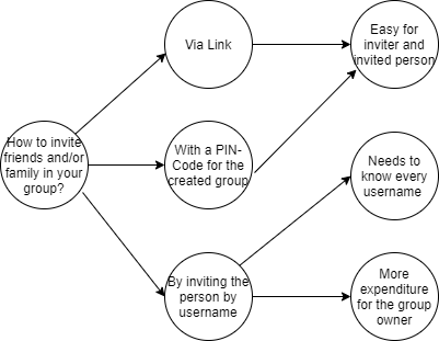
List your functional and non-functional requirements (features) you are planning to include in your High-Fidelity Prototype.
Sorted by priority in descending order.
Functional:
User should be able to add ingredients with limited possible ingredients at this stage
User should at least get one recipe suggestion from his ingredients
Already cooked meals should be automatically saved in the history menu
User should be able to manually add meals to favourites
User should be able to sign in with social media
Non functional: Database access should be done in reasonable time
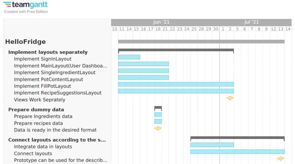
We now have 6 weeks left for our projects. Produce a detailed timeline (e.g., a Gantt-chart or similar) of jobs that need to be done and milestones that need to be reached starting from today.
What menu type did you choose and why?
Our menu type is not explicitly in the visible area since we decided that in our design we want to focus the route on the functionality and not the other way around.
Which UI controls are appropriate for your application and why?
In general we are using buttons which describes the functionality in the button’s label. One special case is the pot in the home screen. We used this analogy for our ingredients stack. Even if practically the pot is also just a button we have designed this element as a support for the understanding of our functional requirements. An animation that looks like the pot is opened or closed will help in this mindset.
Which design patterns are suitable for your application and which ones have you implemented or used? Why?
Since it’s important for our app to break down single goals into smaller one we want to use the wizard design pattern. „The task of inputting data into the system is parted into multiple steps. Each step is presented to the user one at a time. The user should be presented with information about the steps that exist, progress through the process and which steps are completed.“ http://ui-patterns.com/patterns/Wizard We will use it especially when the recipe is presented where we have some options like adding this recipe to the favorites or at the ende when the user can click on „Already coocked“. With the design pattern wizard we have a previous and a next Logic and we have that during this preparations steps. It`s also very good to show a step by step process.
Who did what?
In this week we have clarified our approach before the start of the first week and had in both following weeks a very separate to-do list.
What did we learn?
We learned Flutter and CI basics but we talked a lot about our priorities too.
What went well?
Everything.
What do we want to improve?
Despite having a clear idea of what the product should look like, we experienced some uncertainties since we are new to the technology and we are still in the explorative prototyping phase.
Wir testen die Anwendung, nicht dich! Fragen bitte gerne stellen, ich kann aber nicht versprechen, alle Fragen direkt zu beantworten! Bitte laut denken.
(2) Kontext der Anwendung
JuurMate ist eine Desktop Anwendung und für Jura Studierende. JuurMate wurde entwickelt, um die Rechtsprüfung einer Rechtsfrage zu unterstützen. JuurMate bietet dazu eine dynamische Erstellung von Schemata zur Prüfung solcher Rechtsfragen an. Im Rahmen dieses Nutzertests möchten wir eine Funktion testen und Feedback einholen. Das Feature soll das anlegen eines neuen Schemas sein.
(3) Fragebogen
Um unsere Ergebnisse besser einordnen zu können, würden wir gerne noch ein paar persönliche Informationen von dir haben. Ist das okay?
Wie alt bist du?
Wenn du möchtest, kannst du uns dein Geschlecht verraten?
Was ist dein Beruf (wenn Student: Welcher Studiengang + Semester)?
(4) Szenario
Du musst als Hausaufgabe einen Rechtsfall prüfen. Aktuell bist du auf dem Weg nach Hause und möchtest schon mal damit beginnen. Also öffnest du die JuurMate Anwendung auf deinem Notebook. Nach dem öffnen erscheint ein Auswahlbildschirm, bei dem du dich entscheiden kannst, ob du die geleitete Variante der Anwendung oder die ungeleitete Variante benutzen möchtest. Mit der geleiteten Variante kannst du nun ganz einfach in der Bahn auf dem Nachhauseweg ein einziges Schema dynamisch generieren lassen, dass dir dabei hilft deine Hausaufgabe zu Hause schneller zu beenden.
(5) Aufgaben
Mache dich mit der Anwendung vertraut: – Beschreibe was du siehst und deinen ersten Eindruck der Anwendung. – Was fällt dir als erstes auf? – Wohin hast du als erstes geschaut? – Hast du nach etwas bestimmten dabei gesucht? – Worauf würdest du am liebsten zuerst klicken?
Fertige mithilfe der Anwendung ein Prüfungsschema zum Prüfen einer Rechtsfrage zu Mord an und denke bitte daran, alle Überlegungen laut zu formulieren.
Öffne ein altes Schema, das im Vorhinein abgespeichert wurde. Denke auch hier bitte weiterhin daran, alle deine Gedanken hierzu auszusprechen.
(6) Abschließende Fragen
Welche Vor- und Nachteile siehst du grundsätzliche bei der Schema-Gestalten-Funktion der Anwendung?
Stell dir vor du könntest ein Feature bezogen auf die Schema-Gestalten-Funktion verbessern, was wäre das und wie würdest du es verbessern? Warum?
(7) Abschluss
Hast du weitere Fragen oder Anmerkungen?
Vielen Dank für deine Teilnahme! Du hast uns sehr geholfen.
Roles
Tobias übernimmt die Rolle des Moderators. Da wir mit einem digitalen Prototypen arbeiten, werden sowohl Anil als auch Simon beobachten und Notizen anfertigen. Dabei achtet Simon vor Allem auf die Äußerungen und Anil beobachtet die Mausbewegungen auf dem Bildschirm und schaut, ob es dort irgendwelche Abweichungen gibt oder ob unsere Probanden direkt die richtigen Flächen anklicken.
Recording
Wie oben beschrieben, werden die Notizen von zwei Personen aufgenommen. Da wir somit eine gute Abdeckung sowohl der Äußerungen als auch des Verhaltens der Testpersonen haben, haben wir uns gegen eine Aufnahme entschieden. Dies soll dazu führen, dass sich die Testperson weniger beobachtet fühlt uns es eine angenehmere Atmosphäre kreiert.
Who and How Long?
Tade, 20 J., Jurastudent im 2. Semester, 20 Min. Erik, 19 J., Jurastudent im 2. Semester, 16 Min. Timon, 21 J., Jurastudent im 2. Semester, 14 Min.
(3) Document and evaluate the results of your testing.
Evaluation Method
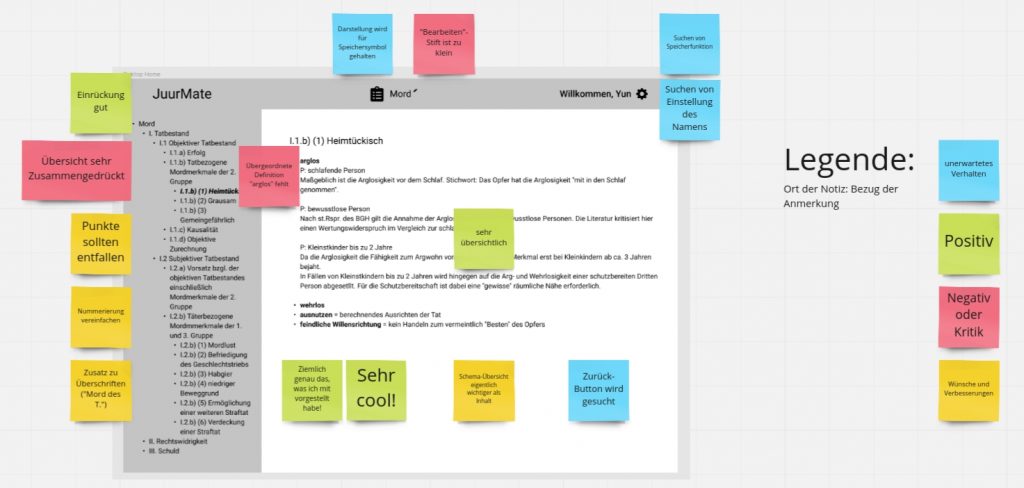
Wir haben die Ergebnisse nicht über Affinity Diagramming ausgewertet, da wir hierfür in diesem Fall keinen Mehrwert erwartet haben. Wir haben stattdessen die einzelnen Notizen direkt in Kritik, Positive Anmerkungen, Verbesserungsvorschläge/Wünsche und Unerwartetes Verhalten/Sonstiges eingeordnet und den jeweiligen Screens des Prototypen zugeordnet. Da die komplette Darstellung sehr unübersichtlich ist, haben wir hier exemplarisch ein Ausschnitt eines Screens (für den es die meisten Anmerkungen gab) beigefügt.
Takeaways
Wir haben gelernt, gesehen, dass wir im Grund auf dem richtigen Weg sind. Die Anwendung und die Bedienung an sich wurde von allen Probanden als positiv empfunden. Allerdings sind viele Kleinigkeiten aufgefallen, die Fehlen (z.B. Zurück-Button, deutlich sichtbare Speicherfunktion). Diese scheinen uns bei der Planung unbeachtet geblieben zu sein.
Darüber hinaus haben wir viele spannende Wünsche und Anregungen bekommen. Als die Probanden den Prototypen gesehen haben und ein Gefühl dafür bekommen haben, wie die Anwendung später einmal funktionieren wird, sind viele neue Ideen gekommen. Diese haben wir zu Kenntnis genommen und werden uns damit befassen, ob und wie wir diese Wünsche miteinarbeiten wollen.
Wir testen die App, nicht dich! Fragen bitte gerne stellen, ich kann aber nicht versprechen, alle Fragen direkt zu beantworten! Wir werden eine sogenannte think-aloud Methode nutzen, die uns dabei hilft, herauszufinden, was noch an unserer App verbessert werden kann.
Kontext der Anwendung erklären:
Foodie ist eine App, die dir hilft, deine Mahlzeiten zu planen und einfacher Rezepte, die perfekt auf dich zugeschnitten sind, zu finden. Besonders hilfreich ist die App für Menschen mit Nahrungsunverträglichkeiten oder mit restriktiven Diäten. Dazu gibt es einen Nahrungsmittelfilter, der die unverträglichen Substanzen direkt aus der Suche streicht und dir nur Rezepte, die du auch essen kannst, anzeigt. Des Weiteren gibt es die Möglichkeit Gruppen zu erstellen und Gerichte für diese Gruppe rauszusuchen, hier werden auch die verschiedenen, von den Nutzern ausgewählten, Unverträglichkeiten direkt angezeigt.
Szenario:
Stell dir vor, du bist vegetarier und eine Apfelallergie, kochst gerne und bist oft frustriert, dass dein ausgewähltes Rezept doch noch nach Schinkenwürfeln fragt nachdem du dich darauf gefreut hast das zu machen und du dir danach ein neues Rezept raussuchen musst. Jetzt hast du die neue App Foodie empfohlen bekommen und willst sie ausprobieren, du hast dir einen Account erstellt und benutzt jetzt die App zum ersten Mal.h
Aufgaben:
Beschreibe was du siehst und deinen ersten Eindruck.
Was wären deine ersten Schritte, um ein geeignetes Rezept zum Kochen zu finden?
Wie wäre deine Vorgehensweise, um deine Unverträglichkeiten bzw. deine Ernährungsform einzustellen?
Abschließende Fragen:
Welche Vor- und Nachteile siehst du grundsätzliche bei der Foodie-App?
Stell dir vor du könntest ein Feature bezogen auf die Rezeptsuche-Funktion verbessern, was wäre das und wie würdest du es verbessern? Warum?
Mit welchen Leuten könntest du dir vorstellen eine Gruppe zu erstellen? Freunde oder doch eher nur Haushalt?
Abschluss:
Hast du weitere Fragen oder Anmerkungen?
Vielen Dank für deine Teilnahme! Du hast uns sehr geholfen.
Who is taking what role
Nirmin und Janis führen das Interview während Rike Notizen schreibt.
Who do we invite to our testsession
Usability Test #1:
Erik, 25 Jahre alt, kocht gerne, Flexitarier und mag keine Pilze
Interviewdauer: 14:05-14:25 (20 Minuten)
Interview durchgeführt von Janis
Usability Test #2:
Rama, 20 Jahre alt, probiert gerne neue Gerichte aus und folgt keiner bestimmten Ernährungsform
Interviewdauer: 14:55-15:15 (20 Minuten)
Interview durchgeführt von Nirmin
(3) Document and evaluate the results of your testing.
Wir haben uns dazu entschieden nur schriftliche Notizen zu machen und diese im Nachhinein in ein Affinity Diagramm umzuwandeln.
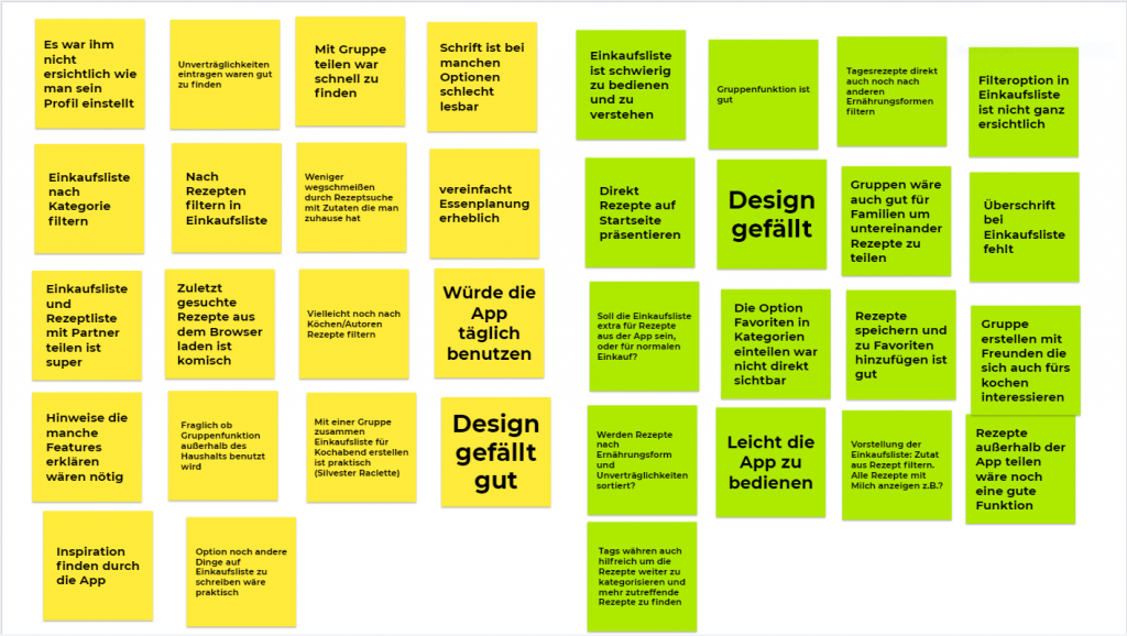
Zuerst haben wir die gesammelten Notizen Personenweise aufgelistet.
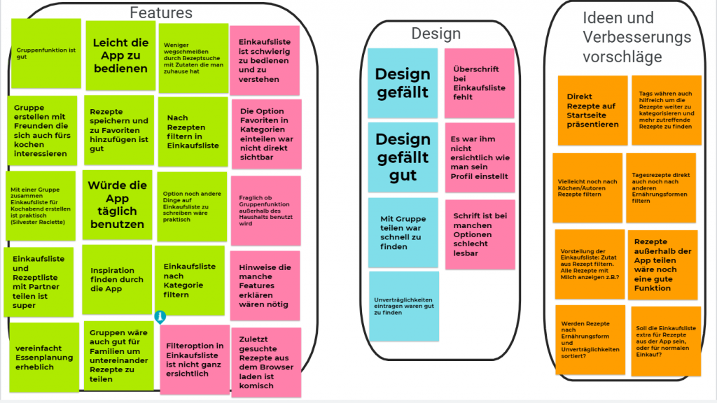
Als nächstes haben wir die Notizen unter den Kategorien „Features“, „Design“ und „Ideen und Verbesserungsvorschläge“ jeweils in Pro und Contra einsortiert, um die noch vorhandenen Probleme besser zu veranschaulichen.
What did we learn and what are the main takeways
Wir haben gelernt, dass die Grundrichtung in die wir gehen gut ist, allerdings der unfertige Prototyp öfter für Verwirrung gesorgt hat, da noch nicht alle Features nutzbar waren. Dass der Einstellungsbutton nicht klick bar war, führte dazu, dass ein Tester nicht sicher war wie er sein Profil bearbeiten kann. Erst nach genauerem betrachten des Prototyps ist der Tester auf das Profil-Icon aufmerksam geworden wodurch er zur Profileinstellung gelangte.
In our usability tests, the average time was 20 minutes. We did it in alternation so that each of us can experience the available roles at least once. The roles: The observer is taking notes while the facilitator guides the interview. All participants are affected by the solution that HelloFridge offers. Since the target group is living in our area we decided to provide the script in German:
1-Hinweis für den User
Wir testen die App, nicht dich! Fragen bitte gerne stellen, ich kann aber nicht versprechen, alle Fragen direkt zu beantworten! Bitte laut denken
2- Erklärung des Kontexts
Essen bestellen und Fast Food ist bequem und schnell, aber es schadet der Umwelt. Um diese zu schützen erlaubt unsere App HelloFridge mit einer Zutatenliste passende Rezepte zu finden. So können für die Essensreste Zuhause neue Gerichte gefunden werden.
3-Fragebogen
Alter ? Erfahrung mit dem Umgang von Smartphones ? regelmäßiges Nutzen von Mobile Apps ? Schon mal ein Food-App benutzt ? Welches ? Worum ging es ?
4-Szenario Stell dir vor du bist zu hause und überlegst ob du etwas kochen sollst oder etwas bestellen. Du öffnest dein Handy um eine Lieferdienst App zu nutzen, aber plötzlich siehst du das HelloFridge Logo und entscheidest dich der tollen App eine Chance zu geben.
5-Aufgaben
Sollten zu einem Zeitpunkt Verständnisfragen zu den Aufgaben auftreten, bitten wir dich, diese uns gegenüber zu äußern. Wir stehen dir auch gerne zur Seite falls mal etwas schiefgelaufen ist.
Log dich ein. Beschreibe was du siehst und deinen ersten Eindruck Finde heraus welche Zutaten du schon hast. Du hast bereit Hänchenbrust, Reis, Olivenöl und Gewürze. Du öffnest die App. Unter der Annahme dass diese Zutaten bereit hinzugefügt wurden, wie wurdest du einen Rezeptvorschlag bekommen ? Was ist die letzte Rezept die du gekocht hast ? Welche zutaten hast du übrig nachdem du gekocht hast ? Versuch den Topf mit Zutaten zu füllen
6- Abschließende Fragen
Welche Vor- und Nachteile siehst du grundsätzliche bei der Rezeptesuchen-Funktion der Hello Fridge App ? Was war für dich nicht intuitiv bzw schwierig zu interpretieren?
7- Abschluss
Hast du weitere Fragen oder Anmerkungen ?
What method did you use to evaluate the results of your usability tests? How did you evaluate the results?
We tried to be as passive as possible during the usability tests to not influence the test persons interaction with the user interface.
While writing the script we tried to have small tasks which can be rated separately. The difficulty of each task will be rated by us according to the performance of the user in order to identify the ambiguous and not intuitive tasks.
Since we provided as little help as necessary to our test user we received rich feedbacks and interesting questions. Those led to greater discussions because we felt that only with additional prompts the thoughts will be verbalized by the users.
What did you learn from the testing? What are your main takeaways?
We noticed that our interpretation of the user interface does not always align with the users interpretation. On various occasions, the user said that „I think the app expects me to …“ which is a clear sign of multiple uncertainties on the users side.
For the reasons stated above we decided to make some changes on our prototype:
It is not possible to design all the possible use cases that`s why we started with an already filled pot (5 ingredients). The user had some confusion with the first step of our app because it was not clear that the empty pot use case is not tested here. When the pot is empty the Get Recipe button should be disabled. The favourite button was not clear for all our users „He seems to be out of place“. After some discussions, we decided to change the approach and we will create a tabulation for the Favorites next to Already Cooked ones, which we will also change to a tabulation.
One situation that led to a greater discussion was How the user can mark a recipe as Already Cooked? In our prototype when the user is in the recipe preparation screen we have an Already Cooked? button but clicking this button was mentioned as not intuitive since the common approach is to click on the Back button (<-) . The functionality of the Already Cooked button is very important, especially for refreshing the ingredients list in the pot. This functionality was not communicated clearly to the user through the app. Again after some discussions, we decided to adopt a swiping system where the user can swipe through the recipes preparation steps. The last step asks the user to manually confirm Already Cooked? either by a simple button click or by taking a photo of the cooked meal. But the last-mentioned functionality is nice to have.
Some additional points we discovered:
we want to include drag and drop menues when choosing the ingredients
settings for multiple languages
the touch buttons have to be as big as the pictures
in the recipe preparation screen we want to see the name just once
the recipes at Already Cooked? need a star when they are also in the favourites
An open question is how long our UX prototype has to be alive.
Who did what?
The usability test script was written collectively. During the usability test, we alternated between the Moderator and Observer roles.
What did we learn?
The Usability test brought more inputs than we expected. Moreover, we understood the real value of a usability Test. We have learnt that the product looks different from the user perspective. A big usability flaw wasn’t noticed by us as we designed the prototype so it confused our test persons.
What went well?
The usability tests went well.The discussion was rich and fun.We could draw many conclusions and take some important design decisions. We are happy that we are reserving a whole day for the collaboration.It is a system that we implemented since the beginning but wz started to see the benefits now since it became a habit for us.
What do we want to improve?
We have noticed nothing this week. The tests went well and the assignment itself was rewarding since we have learned and applied new ideas.
(1) Continue to develop (or start a new) paper prototype based on new insights or feedback from your peers.
What and why you have changed your prototype?
We used the feedback we got from our first feedback round, for example to have a dream diary with voice recording. In the first version of our prototype we build functions that are important before a potential user goes to sleep (the night mode) but in order to test our prototype with its full functionality we decided to extend our prototype with the missing functions (the morning mode).
We hope that with the extension of our prototype the user will easier understand how the mobile application should be used than only with the first version.
(1) Notes for the User We test our app and not you! Please ask questions and I do my best to answer them. Please think aloud and describe your interaction with our prototype. We will record your screen and this interview as described in the Consent Form.
(2) Context of the application Sleepy Heads is a mobile application that can track your sleep. It was developed to help people to monitor and improve their sleeping problems. Furthermore you have a dream diary, relaxation methods and your sleep will be evaluated. As part of the usertest we want to test our mobile application and get your feedback.
(3) Questions How old are you? Did or do you have sleeping problems? Did or do you go to a doctor because of your sleeping problems? What helps you falling asleep?
(4) Szenario(s) You went to the doctor because of your sleeping problems and he recommended the mobile application ‚Sleepy Heads‘ to you. You owned a smartwatch and you tracked your sleeping schedule with it until now. You want some more help and thats why you want to use ‚Sleepy Heads‘. Now you want to go through a relaxation method before going to sleep and listen to a nature sound while falling asleep. After you wake up you want to write down a dream you had and rate your sleep quality.
(5) Tasks 1. Familiarize yourself with the application and describe your first impression. 2. Please choose a Relaxation method. 3. Please search for sleep sound. 4. Please add a new factor. 5. Please choose the option to record your voice while you are sleeping. 6. Start the sleep modus. 7. Please stop the sleep modus. 8. Please add a new dream in your dream diary. Where would you navigate? 9. Please rate your sleep quality.
(6) Final questions 1. What are pros and cons of our mobile application? 2. Were all of the icons that we used understandable? 3. How did you find it that you had sleep methods and sleep music in the same category? 4. What did you find very good? 5. What would you changed?
(7) Final Do you have any more questions regarding our mobile application? Thanks for your time and participation!
Document who is taking what role.
Because of the fact that everyone of us invited one friend for the usertest we decided that the person who knows the interviewee will be the moderator and the other two will document the interview.
Decide if you want to record your test session and how you take notes during the test sessions.
We want to record the voice and the screen of the interviewee but it depends on the person if they agree to it or not.
Document who you are inviting for a test session and how long the session lasted.
1. Usertest: woman, 21 years old, no sleeping problems, but it takes a long time to fall asleep. The interview took 25 minutes.
2. Usertest: woman, 28 years old, has sleeping problems and went to a doctor, melatonin helps her to sleep better. The interview took 18 minutes.
3. Usertest: woman, 24 years old, has problems to wake up because her sleep is too deep, in order to fall asleep she listens to music or podcasts. The interview took 18 minutes.
Testperson: Datum: Beginn / Startzeit: Ende / Endzeit: Max. Zeit: 30minuten
(1) Einführung
Vorstellungsrunde + Aufgabenerklärung
Wir testen die App – oder genauer, einen digitalen interaktiven Prototypen. Wir testen nicht dich!
Wir nehmen zur nachträglichen Auswertung die digitale Testung auf. Die Aufzeichnung bleibt bei uns intern und wird direkt nach der Auswertung gelöscht. Es wird nur das Audio aufgenommen. Du selbst bist nicht zu sehen.
Stelle gerne Fragen! Ich kann aber nicht versprechen, alle Fragen direkt zu beantworten!
Bitte denke laut (Think aloud)
(2) Kontext der Anwendung erklären
GoWalkies ist eine WebApp mit der es möglich sein soll, Gassirouten zu planen. GoWalkies bietet dazu an, vorgefertigte Routen auszuwählen und zu verändern. Im Rahmen dieses Usability Test möchten wir die Schnellroutenplanungs-Funktion (anhand unsere digitalen Papierprototypen) testen und Feedback dazu einholen.
(3) Fragebogen
… Hast du einen Hund oder mehrere?
… Welche digitalen Geräte besitzt Du?
… Welche digitalen Geräte benutzt Du regelmäßig im Alltag? Wie bspw. Smartphone, Tablet, Laptop, Desktop-PC.
… Wie würdest Du Dich selbst im Umgang mit digitalen Geräten einschätzen? (Anfänger/in) 1-6 (Experte)
… Wie würdest Du Dich selbst im Umgang mit dem Internet und Webseiten einschätzen?(Anfänger/in) 1-6 (Experte)
Bevor es losgeht, eine letzte Frage: Mit welchem Gerät wirst Du den Usability Test jetzt durchführen?
(4) Szenario(s)
Du kommst nach einem langen Arbeitstag im Büro (vor dem Rechner und über Akten) nach Hause und hast wenig Zeit, denn deine zwei Kinder und dein/e Partner/in warten auf Dich und erwarten, dass Du am häuslichen Familienleben teilnimmst. Dein zweijähriger Schäferhund braucht aber auch Auslauf – und Abwechslung. Denn Du hast selbst höhere Ansprüche, wenn man sich ein Haustier anschafft. Deshalb willst Du eine halbe Stunde raus mit dem Hund und es soll nicht jedesmal die gleiche Route sein.
Da Deine Zeit so knapp bemessen ist, darf die Planung nicht länger als 15 Minuten dauern.
Du setzt dich also an den Essenstisch im Wohnzimmer,
öffnest deinen Laptop,
den Browser,
tippst die Adresse der Webseite von GoWalkies ein,
meldest Dich an und
legst los mit der Planung.
Für den Test bist Du Harry Hausen!
(5) Aufgaben
1. Mache Dich mit der Anwendung vertraut. Beschreibe, was Du siehst und Deinen ersten Eindruck.
2. Wie würdest Du nun, nachdem Du Dich an Deinen Rechner gesetzt hast, einen solchen kurzen Spaziergang planen?
(6) Abschließende Fragen
Welche Vor- und Nachteile siehst Du grundsätzliche bei der Schnellrouten-Funktion von GoWalkies? Stell Dir vor, Du könntest ein Feature bezogen auf die Routenplanung verbessern, was wäre das und wie würdest Du es verbessern? Warum?
(7) Abschluss
Hast Du weitere Fragen oder Anmerkungen? Vielen Dank für Deine Teilnahme! Du hast uns sehr geholfen.
(2.1) Document who is taking what role.
1. und 2. Usability Testing: Ailis und Hanna Mitschrift, Aljoscha Moderator
3. Usability Testing: Aljoscha abwesend (Uni-Seminar), Hanna: Mitschrift, Ailis: Moderator
1. Usability Test:
Familienangehörige, Hundebestitzerin eines Hundes, nutzt regelmäßig Smartphone & Laptop
schätzt sich als erfahren im Umgang mit Webseiten und digitalen Geräten ein
Dauer: 27 Minuten
2. Usability Test:
Wer ist das? Mitbewohner, Hundebesitzer eines Hundes, nutzt regelmäßig Smartphone, Laptop, Desktop PC und Tracker
schätzt sich als Experte im Umgang mit Webseiten und digitalen Geräten ein
Dauer: 27 Minuten
3. Usability Test:
Wer ist das? Freundin, Hundebesitzerin von zwei Hunden, nutzt regelmäßig Smartphone
schätzt sich als eher erfahren im Umgang mit Webseiten und digitalen Geräten ein
Dauer: 25 Minuten
Dokumentation:
1. Usability Test: Mitschrift durch Hanna und Ailis als nicht-standardisiertes Verlaufsprotokoll
2. Usability Test: Mitschrift durch Ailis als stichwortartiges, nicht-standardisiertes Verlaufsprotokoll
3. Usability Test: Mitschrift durch Hanna als nicht-standardisiertes Verlaufsprotokoll, Ailis als Moderatorin
Wir haben uns für eine reine Audioaufnahme entschieden, um – durch die reine Digitalität der Testungen – Ängste ggü. (dauerhafter) Bildspeicherungen auf Seiten der Tester:innen zu vermeiden. Damit wollten wir eine möglichst angstfreie und offene Umgebung schaffen, die zu einem produktiven Austausch und möglichst großer Offenheit führt. Weiterhin waren wir (meist) zu dritt, sodass wir eine protokollierende Person, eine moderierende Person und eine observierende Person während der Testungen hatten. So konnte mind. eine Person sich vollständig auf die Mausbewegungen und die Aussagen der Person konzentrieren, ohne parallel (inter-)agieren zu müssen.
Die Testpersonen waren alle vor Ort bei einem aus unserem Team (bei Hanna zwei und bei Ailis). Dadurch war der Mitschriftenführer auch immer bei der Testperson und konnte so einfacher jede Regung notieren.
Ein Screencast wäre wahrscheinlich sinnvoll gewesen, wäre der Prototyp insgesamt größer. Da er sich auf wenige Bildschirme beschränkt und „nur“ einen Weg/eine Aufgabe ermöglicht, wären Screencasts zur nachträglichen Auswertung ein zu großer Overhead. Außerdem konnten wir als Gruppe nach jeder Testung direkt ein Auswertungsgespräch führen und so die wichtigen Erkenntnisse direkt herausfiltern.
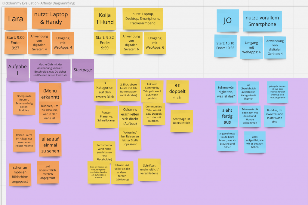
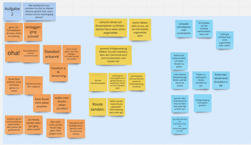
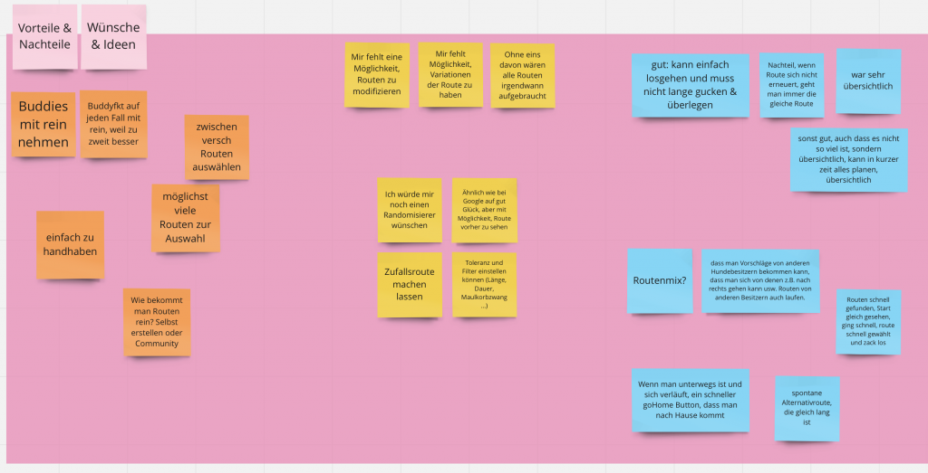
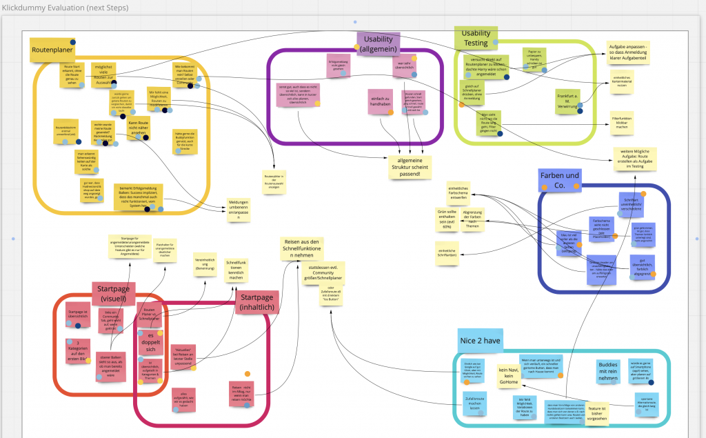
(3) Document and evaluate the results of your testing.
Gesammelte Notizen aus unseren Usability Tests – 1Gesammelte Notizen aus unseren Usability Tests – 2Gesammelte Notizen aus unseren Usability Tests – 3
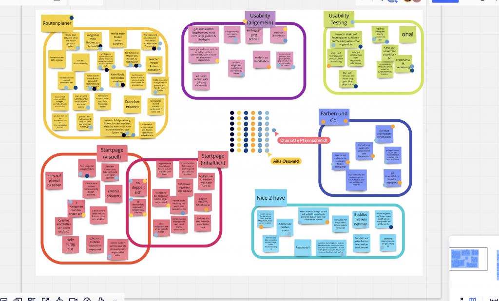
Wir haben uns dazu entschieden, alle (analogen) Notizen im Miro-Board zusammenzutragen, um gemeinsam darauf zugreifen zu können. Anschließend haben wir die Notizen in ein Affinity Diagramm übersetzt. Mit Hilfe des Affinity Diagramms und Dot-Votings konnten wir die Ergebnisse und Einsichten gewichten und so entsprechend weitere wichtige Schritte für Änderungen und Ideen festhalten.
Gruppierte und gevotete Notizen
Bei der Erstellung des Affinity Diagramm trat wieder der Prozess der Kategorienaushandlung auf: Während der Sortierung der Notizzettel sind uns weitere Kategorien eingefallen, die zur Sortierung Sinn machen könnten. Dadurch haben wir nochmal neue Perspektiven zur Auswertung gewonnen. So hatten wir begonnen, die Notizzettel nach den einzelnen Ansichten (Pages) der Anwendung zu sortieren, dort jeweils nach „Aussehen“ und „Inhalt“. Dann haben wir aber die größeren Kategorien erweitert noch mit „Accessibility“/“Farben und Co.“ sowie „Usability“ und „Nice-to-have“.
Alle unser Erkenntnisse und next Steps aus unseren Usability Tests.
Die main takeaways und nächsten Schritte haben wir dann direkt im Miro-Board festgehalten – helle Post-its. So können wir die nächsten Schritte angehen und haben dadurch auch eine Priorisierung.
Der Klickdummy auf der Startseite ist zu eingeschränkt. Einige Tester:innen wollten direkt mit der Planung loslegen. Hier ist entweder der Klickdummy auf der Startseite zu erweitern oder das Szenario anzupassen.
Auch auf der Seite der Routenplanung hätte man den Filterdialog einbauen sollen – um die Aufgabe bzgl. der 30 Minuten zu erfüllen. Denn so gab es immer ein kurzes Stocken in dem Bildschirm bezogen auf die Aufgabenstellung/das Szenario.
Es kam zu etwas Verwirrung durch die Karte von Frankfurt, weil mit Charlottenburg in der Ansicht gestartet wurde. Hier muss detaillierter an den entsprechenden Inhalten, die den Testern präsentiert werden, gearbeitet werden – zu viel Zeitaufwand für das gesamte Modul, nicht leistbar im Rahmen des Moduls.
Insgesamt: Es sollte ggf. mehr als ein Weg durch die Anwendung im Klickdummy implementiert sein, um die gestellte Aufgabe durch eine Person erfüllen zu lassen, damit die Usability Testung dafür aussagekräftiger wird.
Summarize the feedback you received regarding your storyboard.
During our last virtual classroom session, we received a lot of software and especially programming tips from various other students and because of this we have a good idea of our coding challenges in the future of our project. One of the hints was that the account is most likely the most difficult part since it needs access to our own database in every interaction and besides that, we must take care of all the necessary security that comes with an account. The general feedback was good, and we heard that the artefacts created had a good quality and that the content suites the initial presentation/pitch. An improvement can be done with a combination of the sketches with the storyboard. While all teams accepted our Moodboard as a potential solution for the assignment, we found that it was difficult to explain our project through our Moodboard. That’s why we are interested in more theory behind this presentation method. One sentence where all feedbacking students gave positive feedback was „Even if HTA provides a better understanding which subtask are included, in our current project state we mostly need a better overall understanding of the system. From the choices given BPMN is the best to achieve this because it delivers a clear visualization of the whole lifecycle.“ and it seems all of them came to a similar conclusion. We want to include the pot as a metaphor while picking the ingredients.
After a group discussion it was clear that the most efficient way of a Paper Prototype is making it completely in proto.io. We are going for that since we are skilled here and the argument for using pen and paper was just the lower time and effort it takes. Therefore, we do have the opposite opinion: a computer made prototype is more efficient for us. Additionally, an interactivity is required which is also an argument for proto.io because this tool makes this very easy.
The prototyping process was straightforward and productive with some good thoughts regarding how intuitive it is.
The use case and/or model (task analysis from last assignment) this prototype relates to is mostly the BPNM.
With the storyboard created last week we can make a good software that solves the showed situation.
We have a pretty good feeling in the group since all our discussions are constructive. The technology knowledge is on a good level for the challenges.
At this point, we think it is good to mention that we had some confusion regarding the definition of a Paper Prototype since we understood with the lectures definition that the interactivity is just played (while this additional means it is not possible to distinguish it`s to a „Wizard of Oz“ prototype) but we remember from the last session that we need interaction without a playing computer.
process-oriented gIBIS structure-oriented general QOS
Who did what?
Mouadh has strong knowledge of the prototype tool so he took the lead. The learning opportunity was used by Christian and since learning is more focused when you write while doing it this was a Win-Win situation. We are again happy afterwards that we did it this way.
What did we learn?
While Christian achieved a basic understanding in the disciplines required Mouadh was concentrated on the requirements implementation. The proto.io tool is very cool, process and structure is an interesting perspective.
What went well?
As mentioned in the second question of this assignment we are happy that we can do a lot of collaboration and this is always oriented for the good of our product. Therefore we have a lot of respect for the other person`s opinion.
What do we want to improve?
We had some struggles this week with the platforms but everything is clear at the end of the tasks. This was mostly because of an initial wrong thought regarding where we can find the correct answer.
Due to time restrictions we only met once after we already did our prototype versions. In the meeting we changed some details and extended the digital prototype further on.
The use case and/or model (task analysis from last assignment) this prototype relates to.
Our Use case describes a user adding a recipe into his list. We describe this scenario in the digital version. In the paper prototype we focused on the process to create a profile with the individual needs of our persona.
How the storyboard is reflected in your prototype.
The storyboard is reflected in our prototype in such a way that the adding of recipes to the list is shown and the individual account settings are adjustable
Self-assessment of potential strengths and weaknesses of this first step into your design space.
In our opinion, doing a paper prototype is a lot of work compared to a digital prototype. Also changes in the paper prototype are a lot expenditure because in the worst case you have to redo the whole screen in more than one state of the prototype. The strength of the prototype is that we got an idea of how the usage of the app will feel.
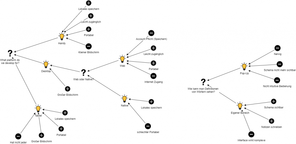
(1) Summarize the feedback you received regarding your storyboard.
Our group has received two major feedback points. One was about the platform we develop for and the other was about looking up definitions about certain words. We previously had in mind to develop an app for a phone since this is the most accessible platform for every student. But the feedback showed us that using PDF’s on phones is not very enjoyable and our persona allows a more expensive device. That’s why we started a discussion about the platform. We used the gIBIS technique in task 3 to get a better answer to this question. The other feedback was about looking up definitions. We haven’t really thought about that in our storyboard. That’s why we also discussed how we want to show definitions with the gIBIS technique.
(2) Develop an interactive paper prototype.
We had a look on our sketches and the storyboard and transfered our ideas to our low-fidelity prototype. Therefore, the prototype looks quite similar to our storyboard, except that it’s designed for desktop now.
The prototype fulfills the use case of creating a dynamic scheme by answering several questions about the legal case. We did not made a prototype for the other use case of creating this scheme manually without guidance. We think that the important feature of our application is the guided scheme creation because this solution would save the student the most time.
We used figma since it is easy to use, free and does its job quite well. The strength of our prototype is that it fits our imagination of the application quite well. However, we did not think about exception handling within our prototype for the case that the user input is different of what we expect.
Link to our prototype: https://www.figma.com/proto/xNynXhTPlGvthxMG2es7nC/JuurMate?node-id=19%3A4&scaling=scale-down&page-id=0%3A1
(3) Design rationales
As already explained in task 1, we used the gIBIS technique to answer our two questions. We think using the gIBIS technique it’s easy to think about a questions which seperates in sub questions and which has distinctive advantages and disadvantages.
Refelxion
Who made what contribution?
Anil summirized the feedback we got for task 1. Tobias made the low-fidelity prototype for task 2. We all together did task 3 and talked about the low-fidelity prototype. I did the blog post in the end.
What did you learn?
We had a look onto the different tools for low-fidelity prototyping. Additionally, we reviewed QOS and gIBIS model for answering our questions we had after the feedback. We were surprised that pen and paper prototyping as we did for the storyboard is quite helpful to create a low-fidelity prototype afterwards.
What went well?
Everything went quite well. Nothing to complain about.
What would you like to improve?
There is nothing specifically we could improve currently.
For our prototype we worked with Figma. As we had already agreed on the functions we wanted to provide, we didn’t have to discuss them during the prototyping process and could simply concentrate on creating the pages.
Relation to our use cases
The use case our prototype relates to is the process of when the user wants to go sleep.
Storyboard reflection
For our prototype we followed the first part of our storyboard where the user is preparing to go to sleep.
Self-assessment
We were happy with the fact that we used the system-internal back-button, so that we didn’t have to build an extra back button into the design.
Our colour selection was spontaneous, we believe this could be improved in the future.
We weren’t absolutely sure if the icons for the buttons and functions are unique – some might not fit so well or be difficult to understand.
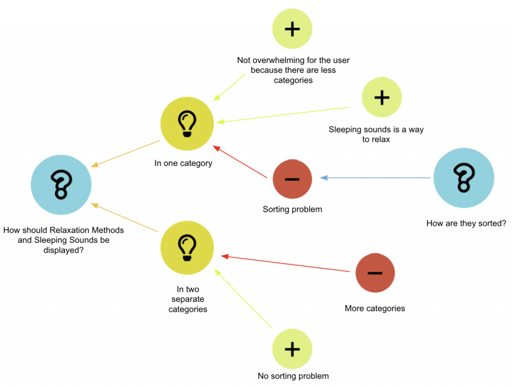
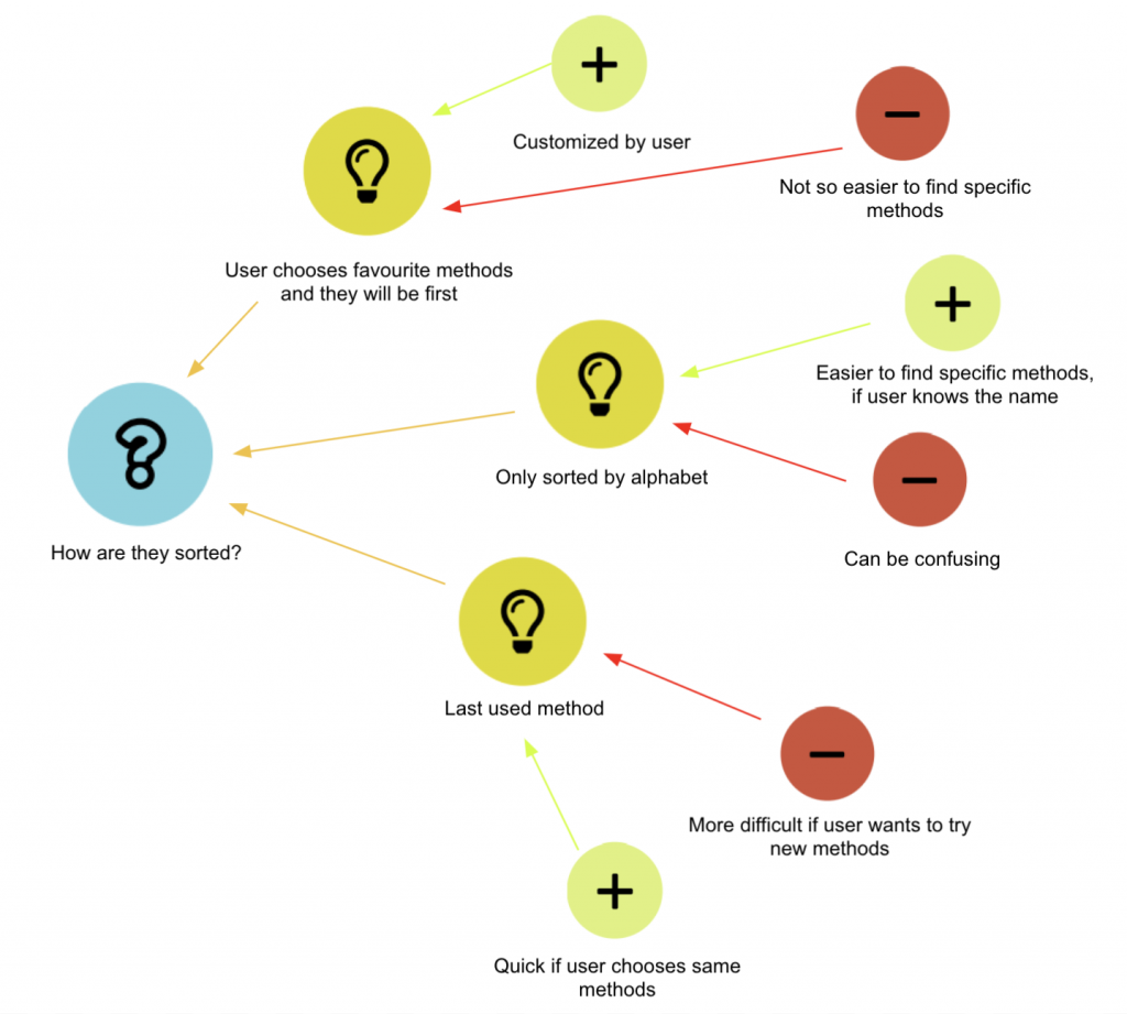
Design rationales
Design Rationale 1: Categorisation of relaxation methods and sleeping sounds
Design Rationale 2: Sorting the two functions when combined in one category
Our design rationales were created using the process-oriented gIBIS technique.