The prerequisite for this chapter is that you have downloaded and preprocessed at least one Landsat 8 scene. If you completed the EarthExplorer exercise successfully, you should already own the Landsat 8 Level-2 scene of June 2, 2017 (ID: LC08_L1TP_193023_20170602_20170615_01_T1). You can download the preprocessed scene here. We will use this image to explain the basic visualization tools in QGIS.
Import a Dataset
First of all, open QGIS.
QGIS is very similar to ArcGIS/ ArcMap, which you already know from the second semester (GIS course: “Geographische Informationssysteme”).
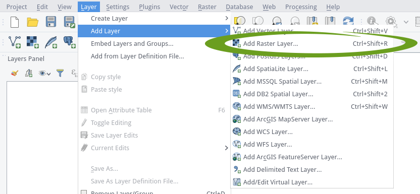
As with all operations, there are several ways to open a raster dataset here: Either navigate via the main menu to Layer > Add Layer > Add Raster Layer…, or press the corresponding icon ![]() in the toolbar or press the shortcut Ctrl + Shift + R to open a file explorer window.
in the toolbar or press the shortcut Ctrl + Shift + R to open a file explorer window.
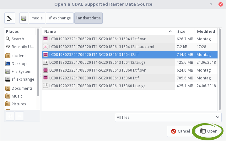
In the file explorer window, navigate to the data folder which holds your L8 data. In the meantime, due to preprocessing, you may already have quite a few files in this folder. Click on a tif-container (extension “.tif”) and then on Open.
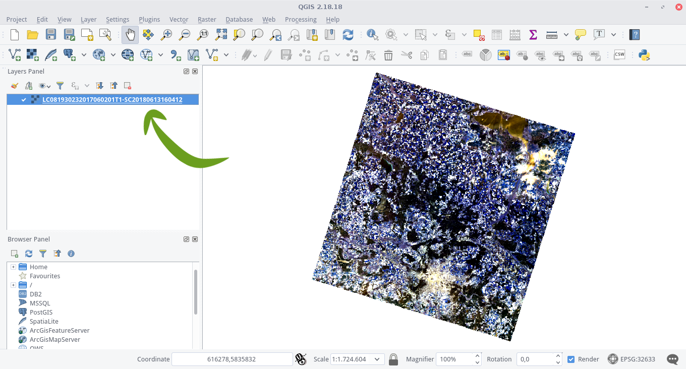
If you have clicked Open, your data shine in full glory for the first time in QGIS! The file name will automatically appear in the Layers panel and the image data will be visible in the Map View:
Navigate through your data with the mouse buttons and the mouse wheel, or with the navigation tools ![]() in the toolbar.
in the toolbar.
Singleband Visualization
By default, QGIS maps the first three bands of a given rasterstack to the red, green and blue “slots” to create a color image. But we can also look at all the bands in the L8 layer stack individually.
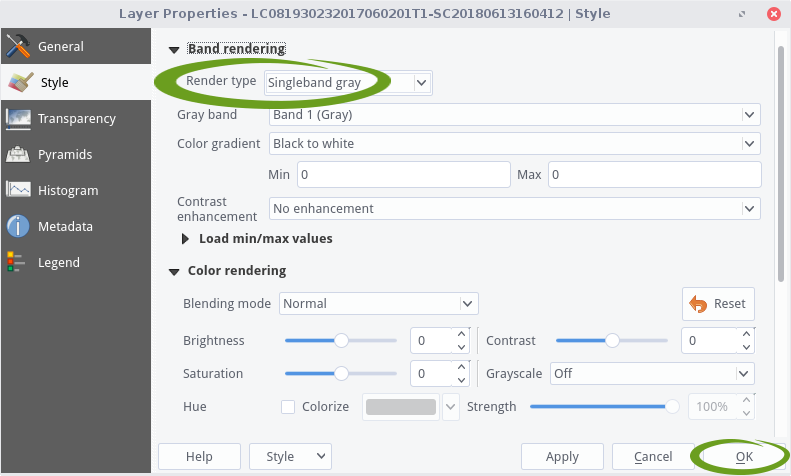
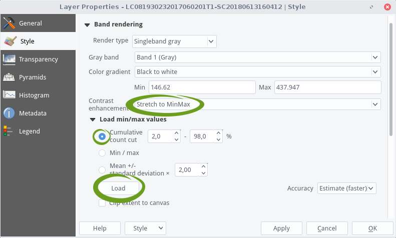
Open the Layer Properties dialog for the image layer by right-clicking on it in the Layer Panel and selecting Properties option or simply double-click the image layer. Switch to the Style tab and set Singleband gray in the drop down menu for the Render type option. You can choose the spectral channel you want to visualize by setting Gray band directly below. Confirm by clicking OK:
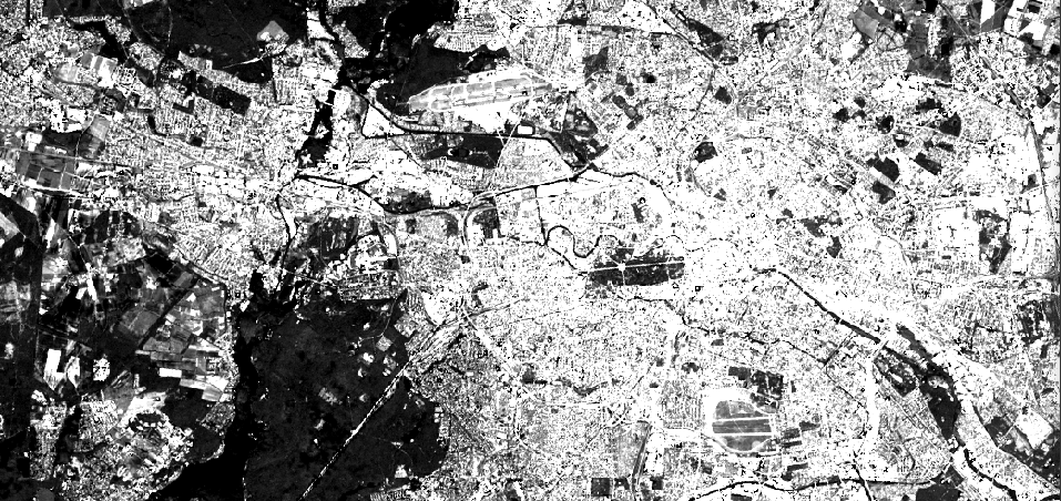
Whoops! You will now see a totally gray rectangle which has no use at all. That is because we did not do any contrast stretching yet. We have to tell QGIS to scale the digital numbers to the whole bitspace (16 bit). In a grayscale visualization, this is black, white and all shades of gray in between. So open the Layer Properties dialog again, choose Stretch to MinMax as the contrast enhancement method. Unfold the Load min/max values section directly below. The Cumulative count cut setting helps to eliminate very low and very high digital numbers, e.g., as a result of clouds. The standard data range is set from 2% to 98% of the DNs and can be adapted manually. Now click on the Load button and you will notice that values for minimum and maximum values are generated in the fields above:
Confirm everything by clicking on Apply or OK after that. For the following picture we zoomed closer to the West of Berlin and its surrounding countryside:
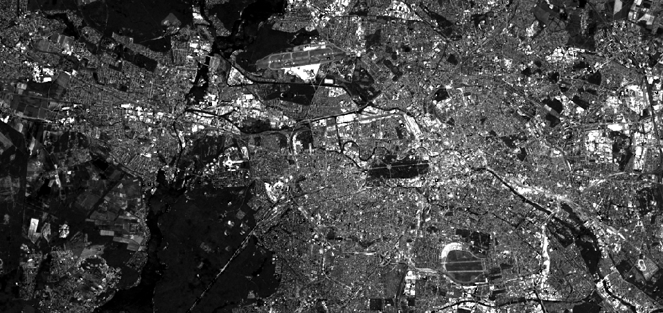
The city looks a bit oversaturated and offers little contrast. So far, we have used the information of the entire scene for contrast stretching. Since possible cloud fields and other edge areas of the scene are included in the calculation of the min/max values, it is advisable to zoom in on a cloud-free area and recalculate the values based on the currently visible canvas.
So search for a cloud-free spot in your image, open the Layer Properties again and select Clip extent to canvas just below the Load button. Then click the Load button and OK:
Okay, but now it is time to bring some color into play.
Multiband Visualization
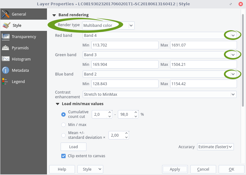
And again, open Layer Properties dialog for the L8 image layer by right-clicking on it in the Layer Panel and selecting Properties option or simply double-click the image layer. Now select Multiband color as the Render Type and select three spectral bands for the three RGB slots. First let us ave a look at the true color composite, which is band 4,3,2 for the RGB slots. Search for a cloud-free spot in your image, and select the remaining settings as described in the previous section as follows:
The resulting image is quite appealing, isn’t it? Feel free to play around with other band combinations!


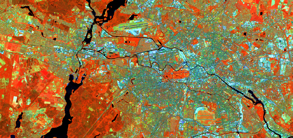
Look at the forest areas in the southwest of the clipping (Berlin, Grunewald). The trees look so much more differentiated in the NIR and MIR bands – what an information gain!